SMALL ADDITION, BIG GAIN
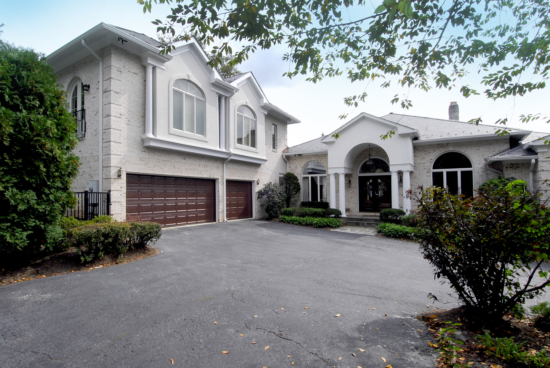
The guest suite built above the garage is flawlessly integrated into the L-shaped Mediterranean-style home. To match the existing masonry cladding, design/builder Michael Nash developed a perfect tonal complement using three different sets of brick.
Remodeler Michael Nash Finds Potential Living Space In Every Part of an Older Home
By John Byrd
Sonny Nazemian, founder and CEO of Michael Nash Design Build and Homes, says that homeowners are increasingly maximizing available living space by combining new square footage with a reconfiguration of the existing floorplan.
“You can expand a house in almost any direction,” Nazemian says. “ But configuring the floor plan to take full advantage of added space is critical to getting the most out of a budget.”
The thirty-year-old remodeling firm which maintains a sprawling Lee Highway showroom initially specialized in interior design, plus kitchen and bath remodeling – until the market dictated otherwise.
“Customers began asking us for larger-scale projects in the mid-1990s,” Nazemian says. “They didn’t want just a kitchen makeover, but a kitchen addition – plus a new family room, so we expanded our new construction capabilities.”
That said, the demand for innovative solutions has never been stronger.
“The size of a new addition is nowhere near as important as how effectively it satisfies the homeowner’s lifestyle agenda,” Nazemian says. “Developing ideas that will meet the full range of personal needs is what inspires us. We pride ourselves in how much value we can provide within a budget.”
Three recent projects below illustrate.
Garage “Pop-Up” Bcomes Elegant Guest Suite
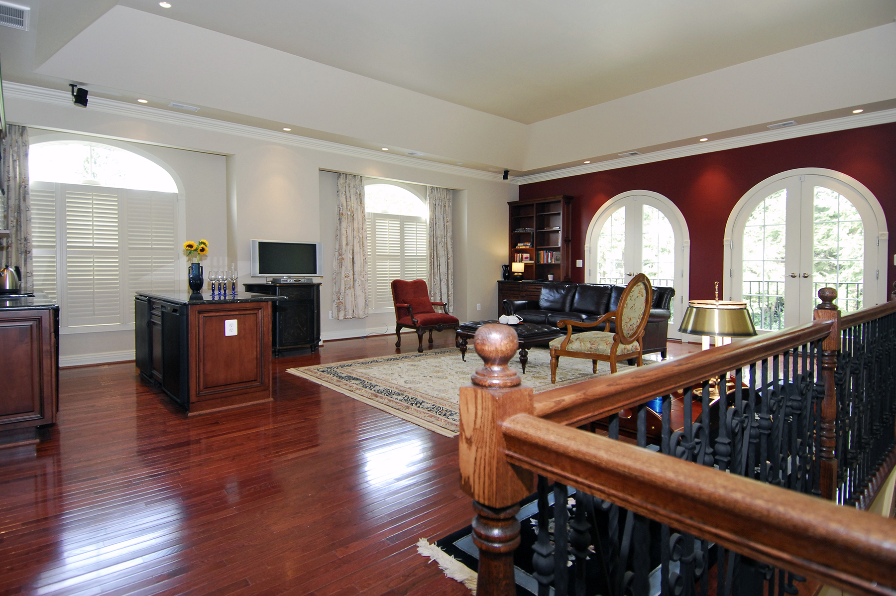
The suite’s interior further develops several front elevation design elements—most notably the arches and columns, which are used to differentiate the living area from the sleeping quarters within an appreciably open floorplan.
From the project’s outset, the primary concern was assuring that the structural supports of a 15-year old three-car garage could support the weight of a 1,110 square foot brick-clad residence above. Since bolstering existing walls would reduce space needed for cars, the Michael Nash plan disburses loads via ground level footings combined with specially engineered joists.
With sewer and hot water sources are on the opposite side of the house, the design/build team also had to develop routes for new lines.
The facade’s cross-gabled architecture is noteworthy. The new elevation repeats the front door’s arch-and-column design motif by introducing paired gables, each featuring stilted arch windows and Tuscan columns. Quoins elaborating the corners of the existing house are crisply replicated, as is the hipped roof.
The interior design further explores relevant design themes. A pair of tray ceilings help distinguish the suite’s two primary chambers. Cherry wood built-ins, crown-moulding, and Adam-style window- and door- frames lend formal accents.
The luxury master bath boasts marble walls and floors, granite counter tops and a large frameless shower. One enters the suite via a rear glass door that accesses a five-by-six foot foyer finished in rojo allacante marble.
Privacy beautifully presented.
——————————————————————————————
Two One-Level Components Expand Kitchen, Master Suite
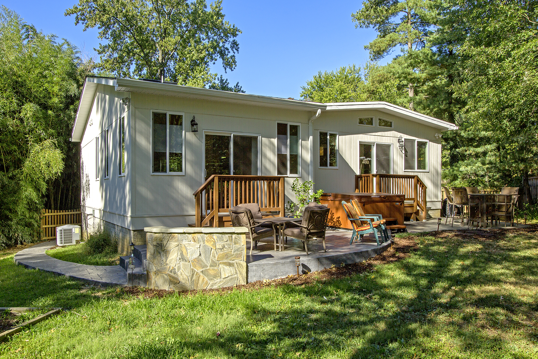
A two component addition to a Fall Church wraps the northwest corner of the existing structure. The left side houses a master bedroom suite complete with spa bath; the right is a new kitchen and breakfast area. One of the project’s biggest challenges was tying off the roof in a way that projects architectural unity.
“Yes, you could say we were cramped for space,” Christine Child admits, describing the challenges of a forty year old, three bedroom California contemporary to a family of four.
The Child’s home consisted of 10′ x 12′ kitchen. A small dining room and living room; two bathrooms. The 12′ x 20′ screened porch on the rear served as a family recreation room in warmer months. The house itself was built on a slope.
“We wanted a larger kitchen and a master bedroom suite– and more storage,” Child recalls.
Everyone involved understood that “adding-on” to a house on a slope presented difficulties.
“There was no textbook solution to adding space,” Nazemian recalls. “The sloping roof meant we would you will have to find an architecturally-plausible way to tie the existing house to the new square footage. We wanted a seamless look.”
What emerged was a plan for 900 square feet of new enclosed space to be comprised of two separate components. One would house a master bedroom suite complete with spa bath. The second an expanded kitchen and breakfast room.
To assure an appropriate scale on the exterior, it was determined that the two addenda should wrap the northwest corner of the existing house.
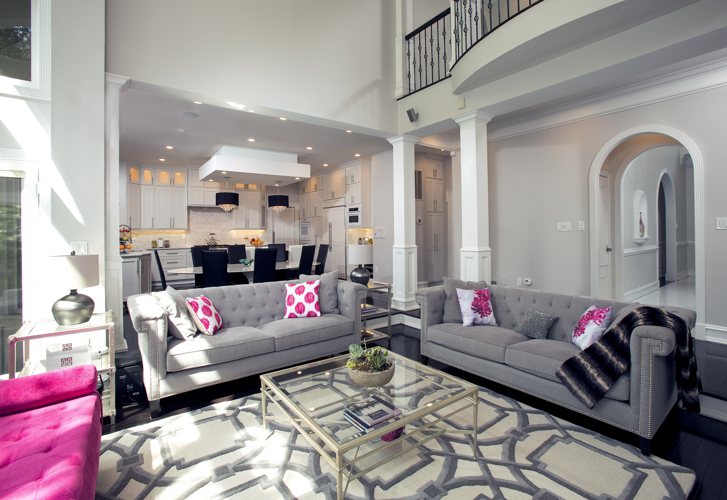
Even as site planning got underway, the Child family collaborated with the design team on ideas for a new interior. The “transitional-style” that emerged perfectly balances the home’s old and the new elements.
For instances, the earthy mosaic tile kitchen backsplash picks up the rustic flavors of exposed cedar rafters and knotty pine in the older part of the house. Granite surfaces, cherry wood cabinet facing and a glass canopy ventilating hood present reiterate the warmly textured tone and fine detailing.
Yet the new plan has also “doubled” kitchen storage capacity. A spacious breakfast nook on the one side of the room has become family’s favorite gathering spot. Even the bench to the breakfast table offers concealed storage options.
In the master suite, a nine foot cathedral ceiling surrounded by eight windows presents a generously-sized personal retreat imbued with natural light and well-defined sight lines. The spa bath is large, light and airy. A curved wall festooned with glass tile conceals a curbless walk-in shower, custom cubbies and many bathing fixtures.
“This is an enormous quality of life improvement,” Christine Child adds. “The changes have given all of us a huge boost in personal satisfaction.”.
The kitchen’s earthy mosaic tile back splash (left) picks up the rustic flavors of exposed cedar rafters and knotty pine in the older part of the house. The transitional-style interior proved a perfect way to balance the home’s old and the new elements.
——————————————————————————————
Two Story Addition Plus Attic Conversion Turns 1930’s Colonial into Spacious Modern Home
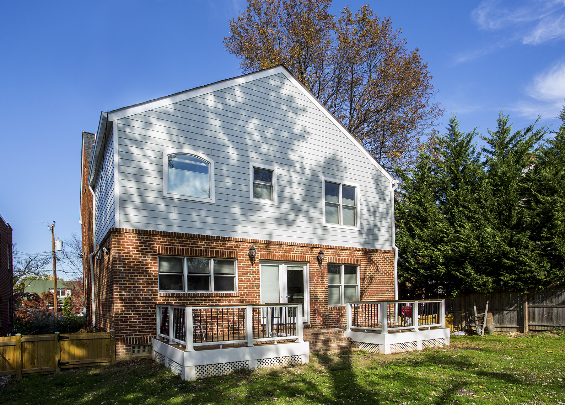
A two story addition on the rear elevation of an Alexandria home houses an all-purpose family gathering and dining area on the first level; a master bedroom suite above. To create a well-integrated exterior, the remodeler matched the brick used in the original 80 year old structure. The coursing to the second level is Hardie board.
“When a reconfiguration plan is carefully integrated into a two level addition, the result is a whole new house: one much more functional, spacious and pleasing to occupy,” Nazemian observes.
Case in point: a circa-1930s center hall colonial in an older section of Alexandria. An eight-by-ten galley kitchen is located on the back right rear of a first floor linked to a front-facing dining room. The kitchen opens to a seldom-used Florida room that blocks much of the available light. Upstairs: three bedrooms; one full-bath. There’s also a partially finished attic. In all, 1,100 square feet per level; 2,200 square feet in all.
Now in their early sixties, owners Jim Smith and Charlene Campbell had been been contemplating changes for years– uncertain of what’s possible. The vision: a spacious gourmet kitchen; a family entertainment area zone; a first floor full bath; a first floor laundry, and– while we’re at it: a master bedroom suite; a guest room with its own dedicated bath.
In sum, a considerable increase in living space; a top-to-bottom retrofit suitable for many more years of continued occupancy.
The makeover proposed by Nazemian is straight-forward– yet innovative. To retain basement access from the outside, designers create an exit corridor on the right side of the house before deleting the Florida room and digging a foundation nine feet deep.
Above the new foundation, a two story addition accommodates two major components: an all-purpose family gathering and dining area; a retreat for Smith and Campbell.
At nearly 600 square feet, the addition’s first level houses a kitchen/ family room. The 100 sq feet designated as a family room employs a leather sofa as a room divider.
The kitchen space plan itself presents well-defined work triangles. The L-shaped counters on the south and west walls are supported by a marble-topped food prep island with seating for five. Dark cherry cabinetry, complementary granite surfaces and detailed molding reinforce the original period detailing and color schemes. Reconfiguration to existing rooms in the older part of the house forms space for a revised den, and a full bath and laundry.
One level above, the team creates an 18’x 32′ master bedroom suite complete with spa bath and custom-designed walk-in closet. With 300 feet of sleeping quarters, the suite is generously apportioned and private.
Meanwhile, the unfinished attic has been converted into a guest room with a full bath. A walk-in shower finished in warm Mediterranean accents has been installed under the sloped gables.
“The changes have added a lot of convenience to our day-to-day lives,” Charlene says, “and the master bath room is so relaxing– exactly what I wanted.”
Want to see more Michael Nash additions and extentions?
https://www.
John Byrd has been writing about home improvement for 30 years. He can be reached @ 703/715-8006, www.HomeFrontsNews.com or byrdmatx@gmail.com

