McLean home makeover is national Chrysalis Award winner
Michael Nash solution named nation’s “best whole house remodel under $300,000.”
Master designer/remodeler Sonny Nazemian shares trade secrets
By John Byrd
A comprehensive makeover to a Mediterranean-style home in McLean has won a national Chrysalis award for Michael Nash Kitchens and Homes. Founded in 1993, the Chrysalis has long been regarded as the remodeling industry’s most prestigious peer award; Qualified Remodeler Magazine and Kitchen and Bath Design News are among the national media sponsors.
The winning design solution– in which two levels of a 20-year old year old single family home were selectively reconfigured and upgraded– was executed in the residence of George and Rima Bita. The project was named the nation’s “best whole house remodel for under $300,000.00”. Other judges include editors and writers for Southern Living Magazine and Better Homes and Gardens.
 The makeover had earlier won a regional (11-state) “Contractor of the Year” (COTY) award from the National Association of the Remodeling Industry (NARI); previously it was judged a COTY Grand Winner (“Best Entire House Under $250,000.00”) by NARI’s metro DC chapter.
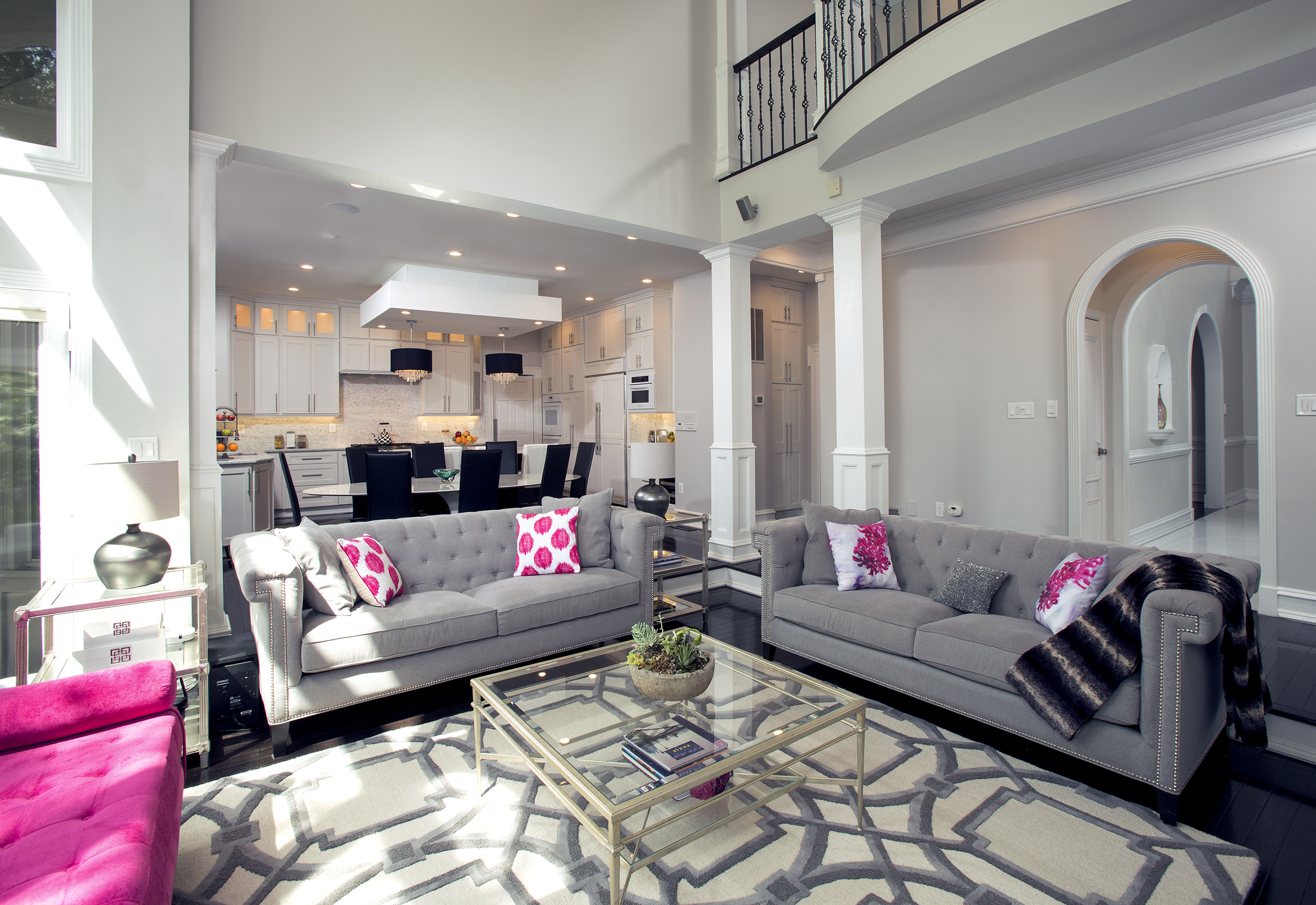
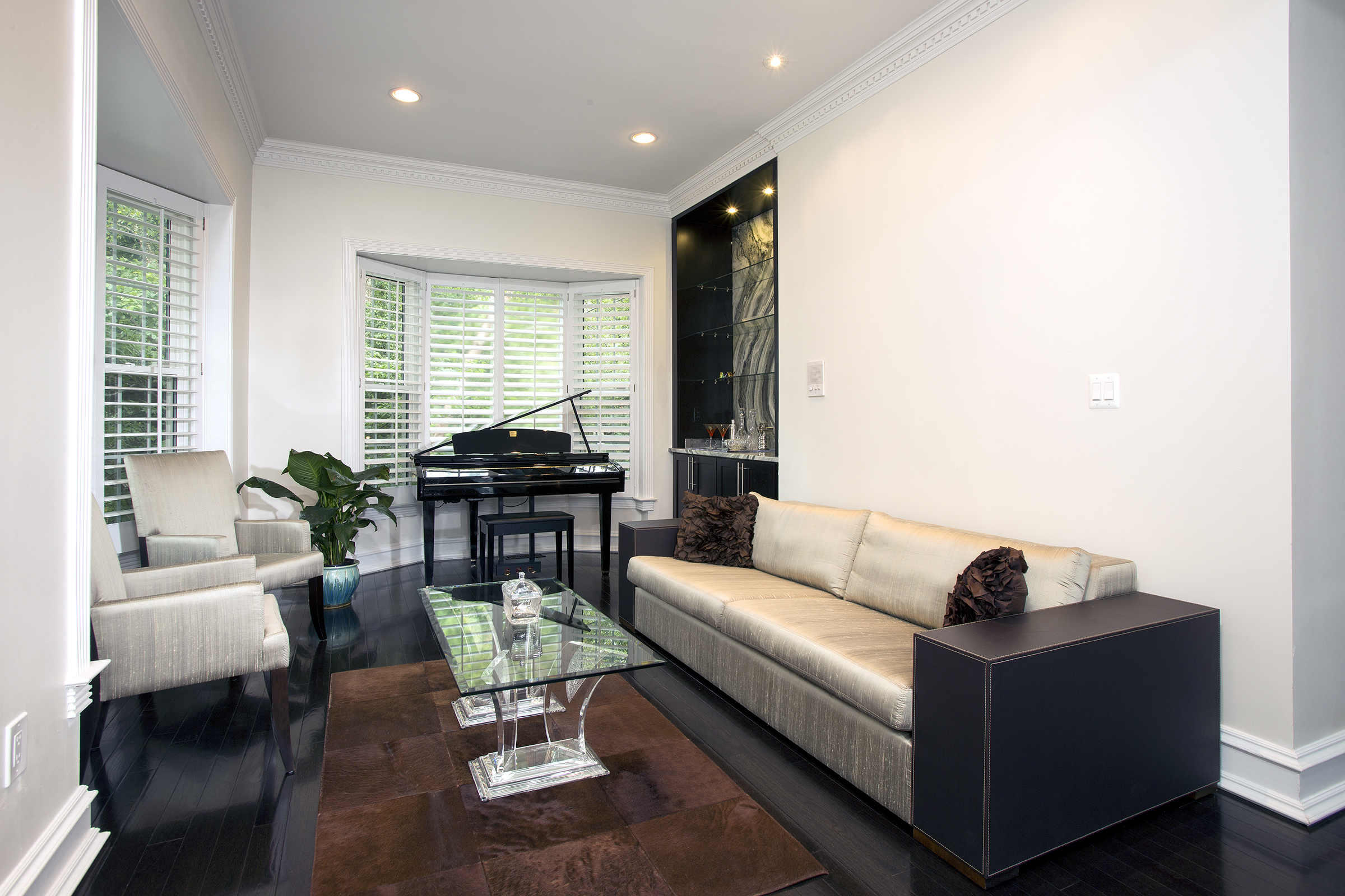
Remodeler Sonny Nazemian proposed relocating a misplaced powder room, eliminating a needless back office, and forming a front-to-back great room consisting of a parlor and music room. To allow more natural light and visual continuum, a bearing wall separating living room from rear chambers was opened up by introducing a structural beam mounted vertical supports encased in period paneling. The new flooring is wide-plank espresso-finish cherry wood.
In accepting the prize, Michael Nash president and founder Sonny Nazemian acknowledged his company’s innovative design team– which contended with space planning and interior design challenges while staying entirely within envelop of the 4,800 square foot structure.
“The owners had been looking for a larger house with a pool their growing family could enjoy long into the future,” Nazemian recalls. “After searching the real estate market for several years, they found a property with many of the right components. However, the configuration of rooms on the first floor didn’t meet their needs, the kitchen was pretty dysfunctional, sight lines from family room to pool were blocked and the interior was too dark and dated for their tastes.”
As Rima Bitar saw it, the house had “lots of potential”, but much of it was unrealized. A particular problem was a sequence of rooms on the left side of the foyer.
“There was a great view of the pool from the rear of the house,” Bitar says. “But from the foyer one entered a small living room on the left– which, in turn, revealed a doorway on the back wall linked to rear office with a bay window. A powder room in between flanked right. Overall, the left side of the house was too dark from front to back. Plus, we didn’t want a first level home office, and the powder room was in the wrong place.”
 Bitar talked to several contractors, but none seemed see the home’s systemic flaws as anything more than several rooms needing a fix-up.
National Chrysalis Award winner. Michael Nash reinvigorated the interior of a circa-1990’s home in McLean starting from the front foyer. To endow the flooring with a bright, seamless look, hairline grouting was applied to 20” x 20” crystal marble tiles. A basket rope wrought iron railing replaced the builder-grade wooden original. White staircase risers contrasting with dark stained treads establish the new interior’s “transitional-style”. The suspended crystal chandelier at the top of the stairs draws the eye and in and up.
“They didn’t grasp the big picture,” Bitar says. “One wanted to start on the kitchen and leave the powder room for a future date. Another had ideas for the foyer. No one seemed to recognize our requirements: we were looking someone with seasoned experience who could help use completely reinvigorate the interior.”
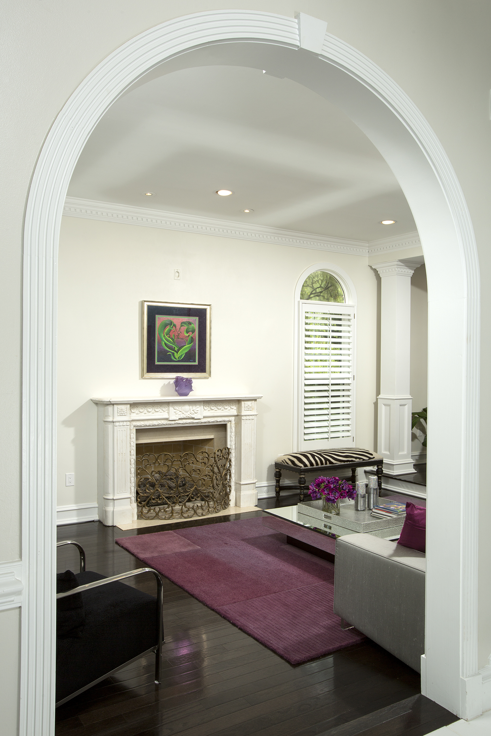
Designers converted the door linking the foyer to the living room to an arch, and widened the opening. Fluted mullions trimming the new entrance provide an elegant profile reinforced by fine detailing throughout the new interior.
As such, Sonny Nazemian, chairman and founder of Michael Nash Kitchens and Homes, came as a breath of fresh air.
“Sonny got our vision”, “Bitar says. “For instance– he recognized immediately that we could find a more central location for the powder room because we already had plumbing routed to a unused wet-bar situated in central part of the house which was the designated family room.”
Building-out the new powder room footprint would be a comparatively simple matter. More importantly, removing the old one would allow the remodeler to reconfigure the home’s entire left side from front-to-back.
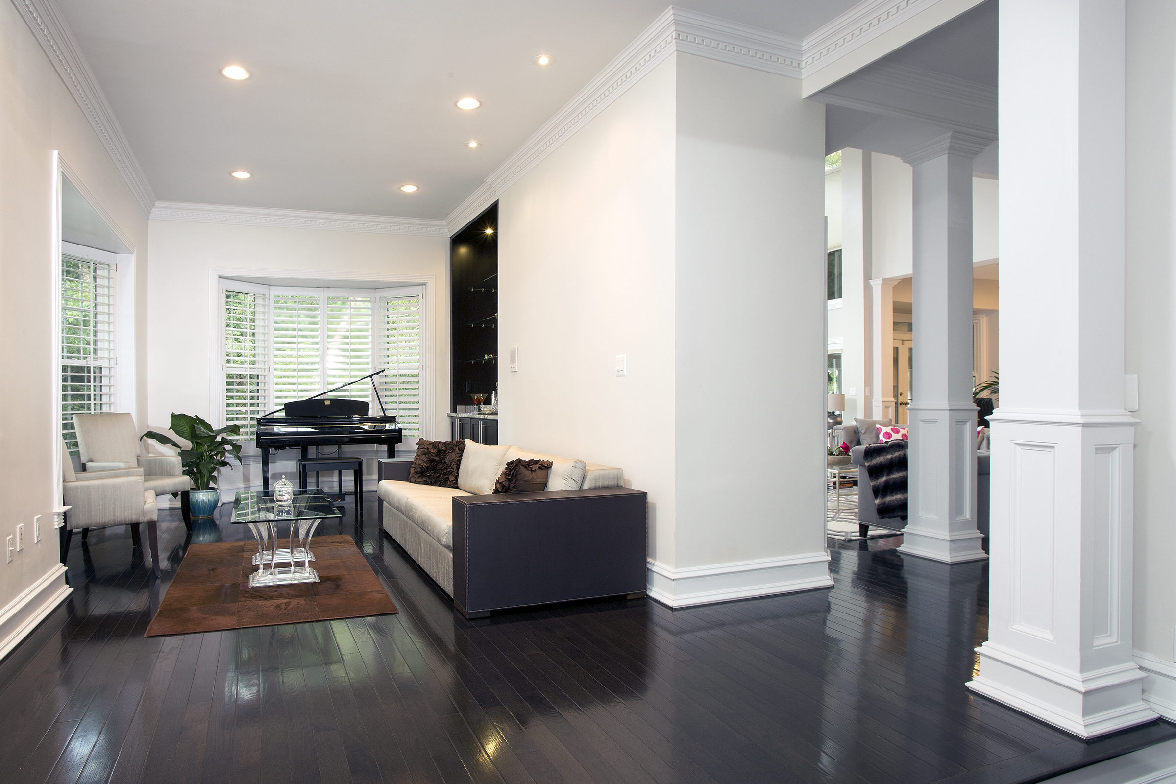 From the start, Nazemian conceived the front-to-back space on the home’s left side as a “great room” that would feature two well delineated activity areas: up front, a formal salon with fireplace accessed from the foyer; to the rear, a music room where Rima would keep her classical piano.
By eliminating a wet bar and relocating the powder room to a newly-created footprint between the family room and the music room, the new floor plan better rationalizes existing square footage. The two-level fireplace (formerly stacked stone) was re-surfaced in grey striped porcelain tile; the recessed niche over fireplace was designed to accommodate a flush-mount TV.
To allow more natural light and visual continuum, the remodeler introduced a structural beam mounted on vertical supports mid room and removed the obstructive bearing wall. The vertical supports are encased in visually-sympathetic recessed paneling.
Meanwhile, the entrance from the foyer has been widened, and changed to an arch which reiterates existing window shapes. Fluted mullions trimming the arch provide an elegant profile reinforced by fine detailing throughout. The new flooring is wide-plank cherry wood with espresso-finish. In the back half of the room (next to the piano) a “built-in” cadenza speaks to the room’s very particularized design sensibilities.
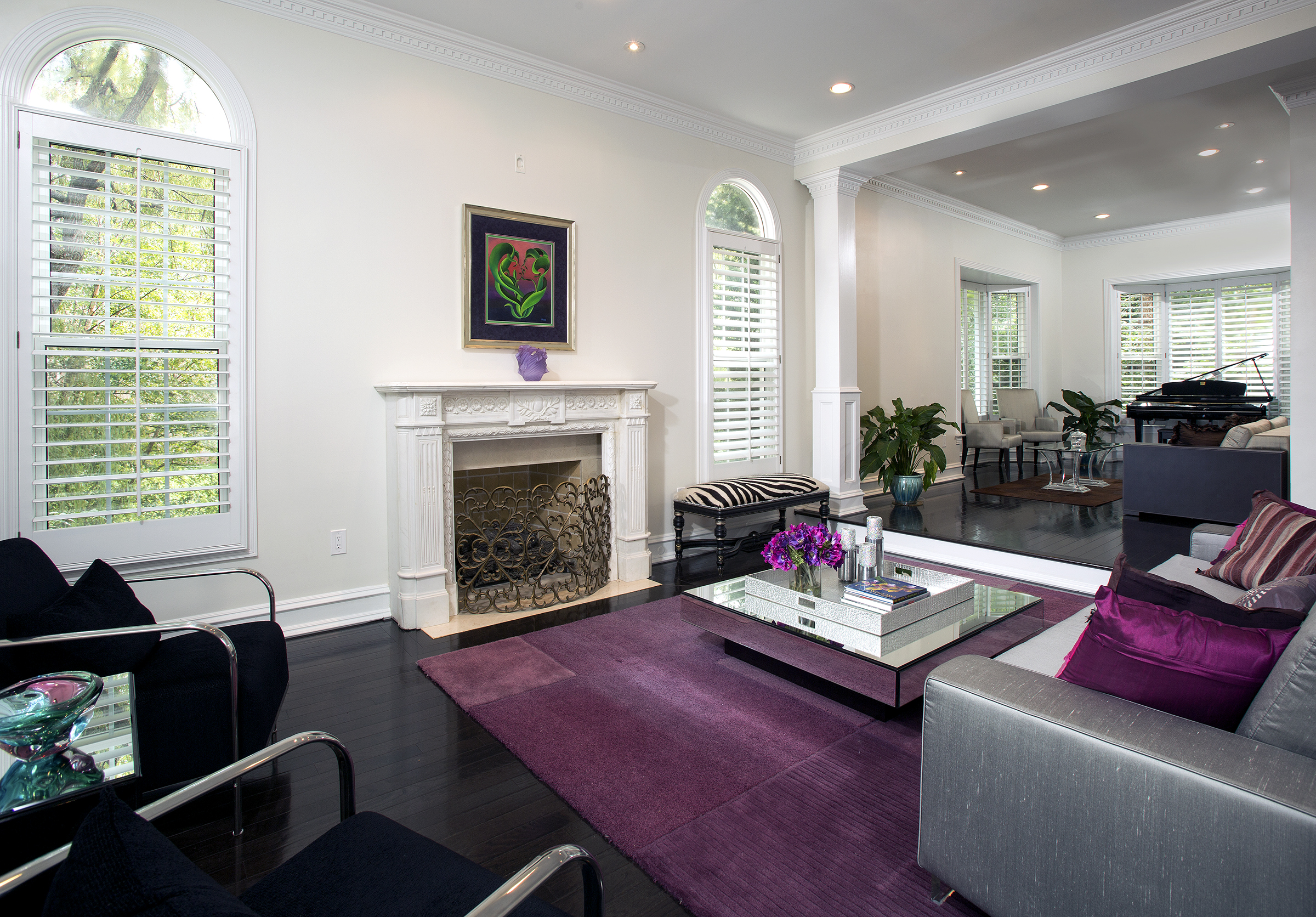 “We found the green onyx featured in the cadenza backsplash while shopping for kitchen counters in a stone center,” Bitar recalls. “I told Sonny I’d like to see it incorporated into the interior in some way, and he showed me how it could be designed-in to a serving station. That’s the kind of inspired collaboration that occurred throughout this project.”
The fundamental challenge within the two-level rear-facing family room were several round fluted pillars which were used as structural supports. The pillars were 1.5 feet in diameter and topped with florid Corinthian caps. In many parts of the room, they were squarely in the middle of the potential sight lines linking a quiet seating area to the lovely pool. The columns also obstructed views between the kitchen and the family room with features a dramatic two level fireplace.
“Rima wanted a softer, more cohesive interior,” Nazemian says. “Finding ways to remove existing columns and open up sightlines was part of the solution– but she also wanted interior elevations that would support a subtler interplay of tones, colors and textures. The stacked stone fireplace couldn’t be part of this picture.”
To make sense of the new palette, Nazemian installed new structural supports that open up views in two directions. The square narrower-gauge columns introduce a discrete design element that is developed throughout the makeover. The fireplace was re-surfaced in gray striped porcelain tile; the recessed niche over fireplace was designed to accommodate a flush-mount TV.
 Throughout, Nazemian advised on interior design fundamentals.
“Sonny asked me if I wanted color undertones to be cool or warm,” Rima Bitar says. “The cooler undertone I chose allowed me to choose brighter colors as accents for some accessories, but the compositional balance is well-maintained.”
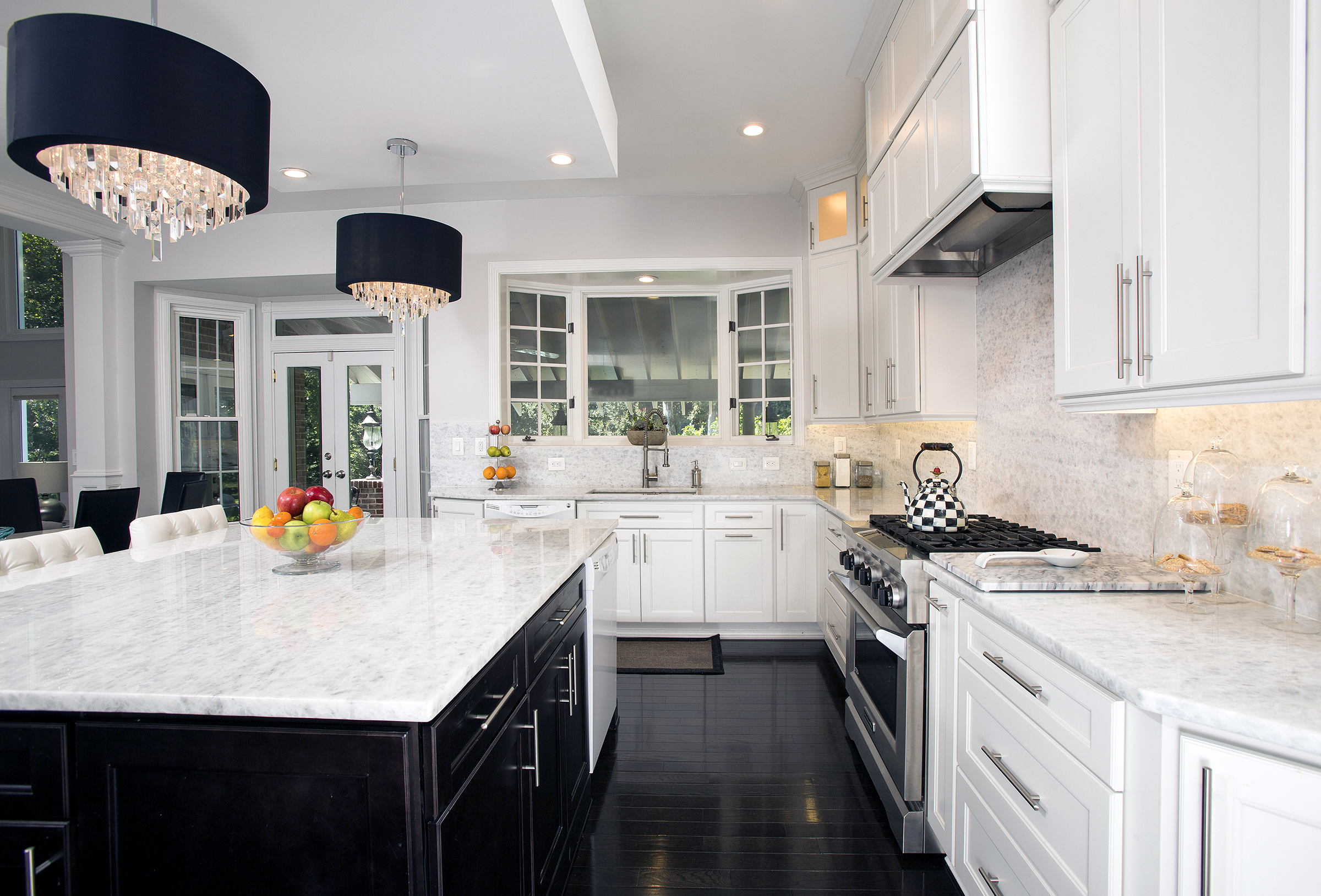
The Michael Nash team moved the cooktop range to a backwall and installed a new hood above. The ceiling was raised to accommodate taller glass-facing cabinets. The quartz top backsplash and white marble counter surface present a balanced contrast to the black walnut counter base and espresso-finish flooring.
In the kitchen, problems were many. The cooktop island was not only in the wrong place, but struck Rima as a safety hazard in a household with small children. The space was not well organized relative to work triangles, either. Storage was limited. Overall, the room was too dark; the HVAC bulk heading created the appearance that the ceiling was too low.
To remedy this scenario, the design team moved the cooktop range to a backwall and installed a new exhaust fan hood above. By re-routing the HVAC, the wall surface needed accommodate taller glass-facing cabinets was formed.
 With the sink relocated under a bay window, the stove top in an L-shaped counter configuration, and the food-prep island an easy pivot from either station, the new kitchen’s primary work triangle has greatly facilitated meal preparation and clean-up.
As interior design, the quartz top backsplash and white marble counter surface offer a balanced contrast to the black walnut counter base and espresso-finish flooring.
Backlit glass-facing cabinets, quartz countertops and JAS lighting pendants hanging from a tray ceiling confer a warmly textured look consistent with the ambiance throughout the entire makeover.
But a visit to the house begins at the front door.
To set the appropriate welcoming tone, Nazemian began conceptualizing the renovation from the foyer. To assure the flooring with a bright, seamless look, hairline grouting was applied to 20” x 20” crystal marble tiles. A basket rope Wrought-iron railing replaced the builder-grade wooden original.
White staircase risers contrasting with dark stained treads establish the new interior’s “transitional-style”. The suspended crystal chandelier at the top of the stairs draws the eye and in and up.
“There’s such a wonderful play of light everywhere,” Rima says. “Sonny really understood what we wanted, and we’re very pleased with the results.”
For Information: 703/641-9800 or MichaelNashKitchens.com
John Byrd has been writing about home improvement for 30 years. He can be reached @ 703/715-8006, www.HomeFrontsNews.com or byrdmatx@gmail.com.

