COUPLE’S SEARCH FOR PERSONAL BATHING RETREAT FINDS AN INSPIRED COLLABORATOR
Master designer/remodeler Sonny Nazemian shapes space plan, finishwork and mood for a stand-out spa bath
By John Byrd
 “My husband and I enjoy working out home improvement ideas, so we were searching for an inspired collaborator who would work with us closely.”And as they soon learned, their personal criteria still closely echoes that of Sonny Nazemian,who had helped the couple remodel their kitchen five years earlier.
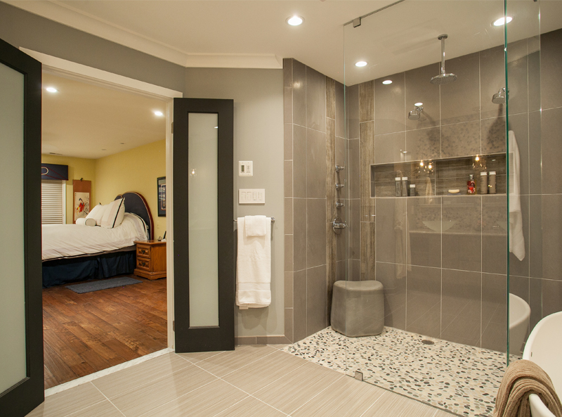
The newly-designed master bath beckons warmly beyond double doors leading in from the bedroom.
“Helping homeowner’s find their vision is the most important part of what we do,” says Nazemian, president and CEO of Micahel Nash Kitchen and Homes “Obviously, we bring our expertise to bear… but it’s the dream the homeowner is chasing that really inspires us.”
This time around, the Curtis “wish-list” included a dramatically reconfigured master bathroom; an aroma bubble tub installed under the suite’s only window; a walk-in shower with a footprint five times larger than the previous “phone booth” model; several custom-designed Asian-style vanities; a wall-mounted working water feature; and sound equipment discretely wired into the cathedral ceiling.
The bigger point, however, was ambiance. What would Brian and Amanda find aesthetically-pleasing and, especially… relaxing?
It’s at this juncture that interior design ceases to be mere decorating and becomes something more: a quest for self-discovery and self-expression.
“Our first step was formulating a space plan that would give Brian and Amanda the elbow room they wanted,” Nazemian says. “We weren’t going to add any square footage– but we can design-in the impression of a substantially enlarged interior.”
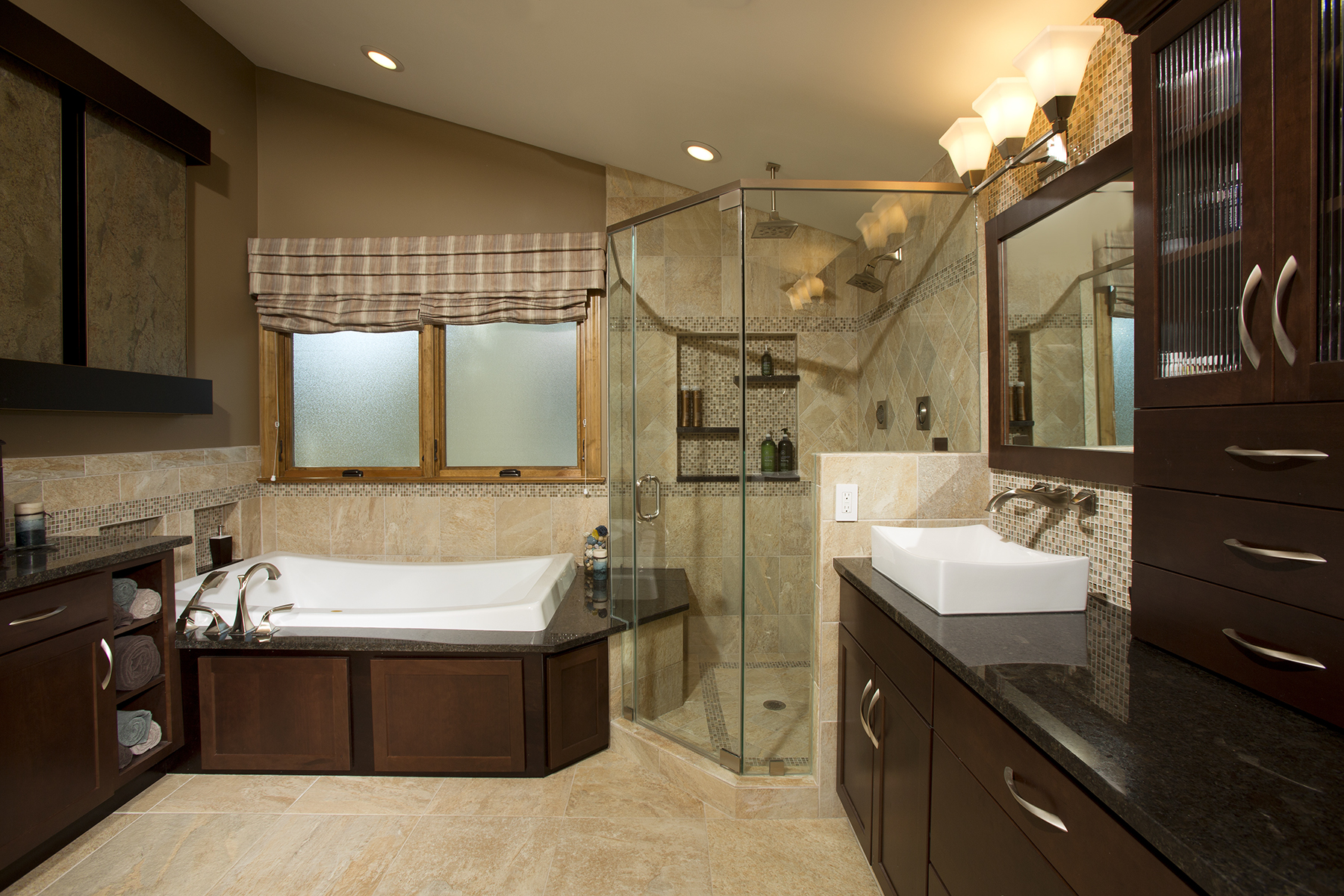
Shower — Removing a wall between the old shower and vanity created the footprint needed for a 5′ x 6′ glass surround shower. The black marble tub surround is extended into the shower to form a bench. The shower is equipped with four body sprays and an overhead rainforest nozzle. The three-level wall niche was custom-designed for personal items..
Such impressions were called for in this case. From the start, the old master bath was an impromptu affair, formed when the previous owner borrowed space from an attic garage adjacent to the master bedroom and routed-in the requisite plumbing. Not surprisingly, the room had its peculiarities: an oddly angled Jacuzzi on an elevated platform that took up too much floorspace; an outsized two-step landing linking the master bedroom to the bathroom.

On the other side of the equation, the existing shower was a tiny 1.5′ x 1.5′ cubicle; the commode offered just enough room for fundamentals; there was a make-up table that didn’t have much utility; moreover, there were few places for storing towels and other bathing items readily at hand.
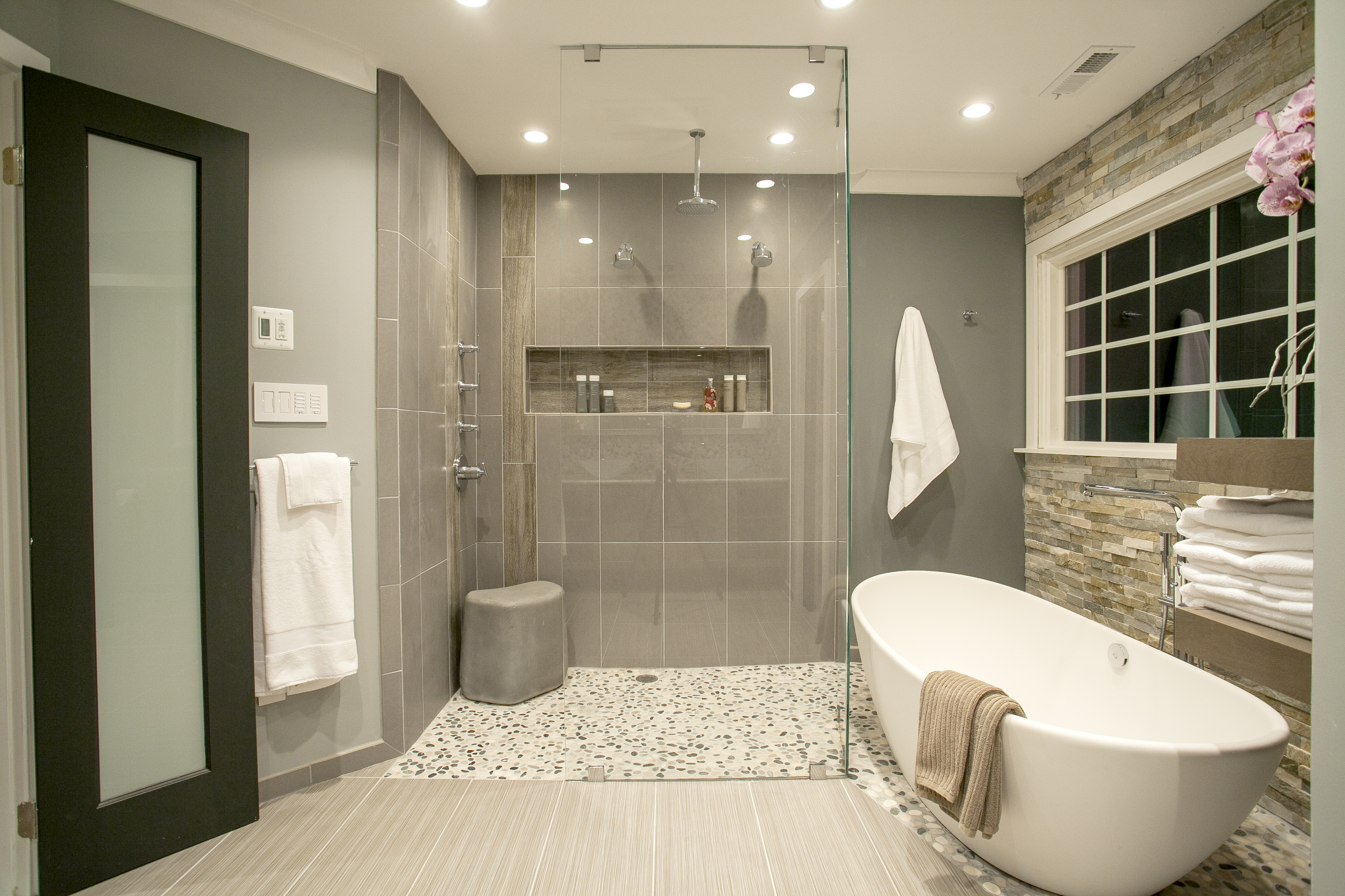
Zen and The Art of Bathing. An aroma bubble tub installed under the suite’s only window offers a strikingly summons to deeper relaxation. There’s also a wall-mounted water feature, and a sound system discretely wired into the cathedral ceiling.
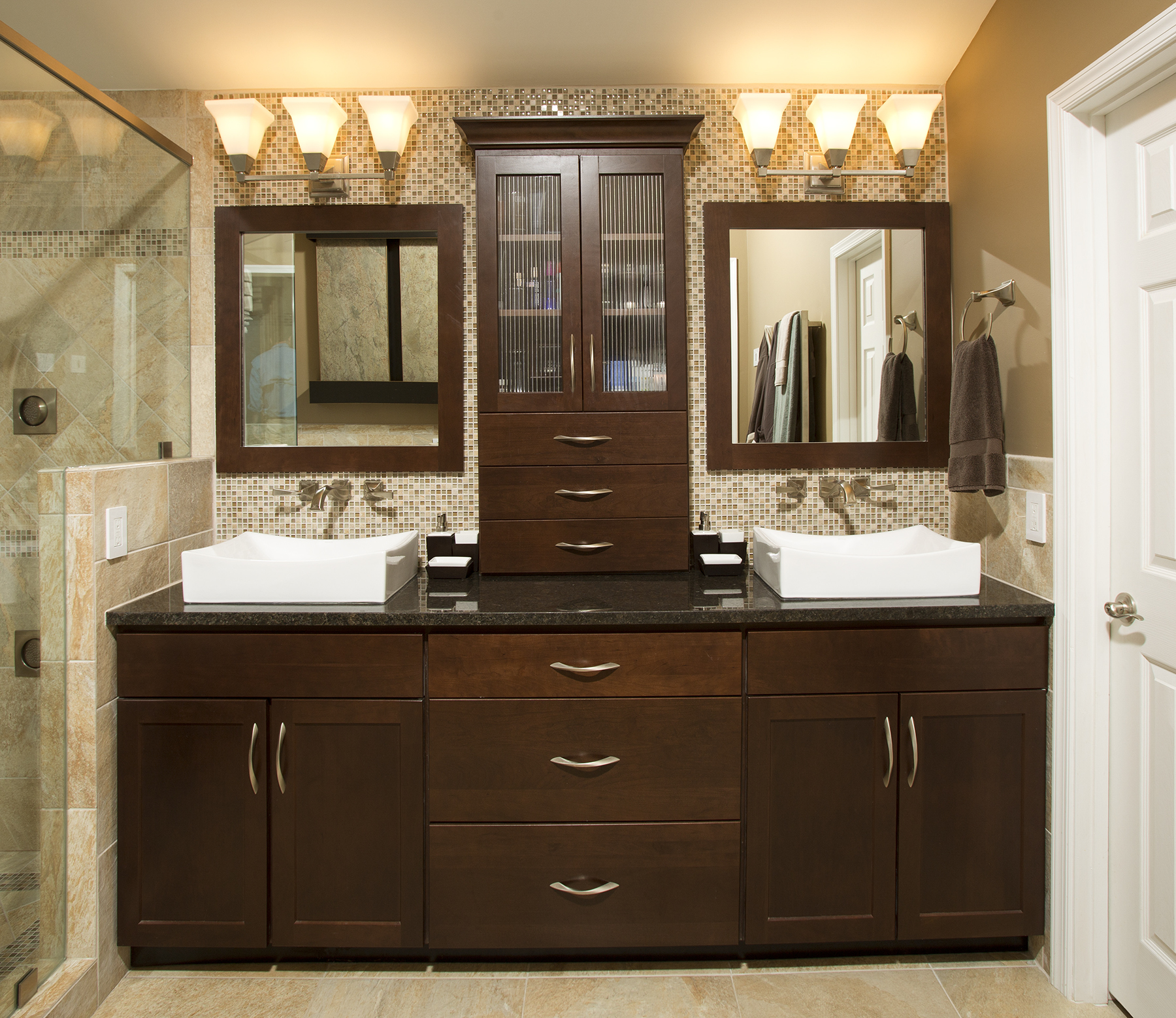
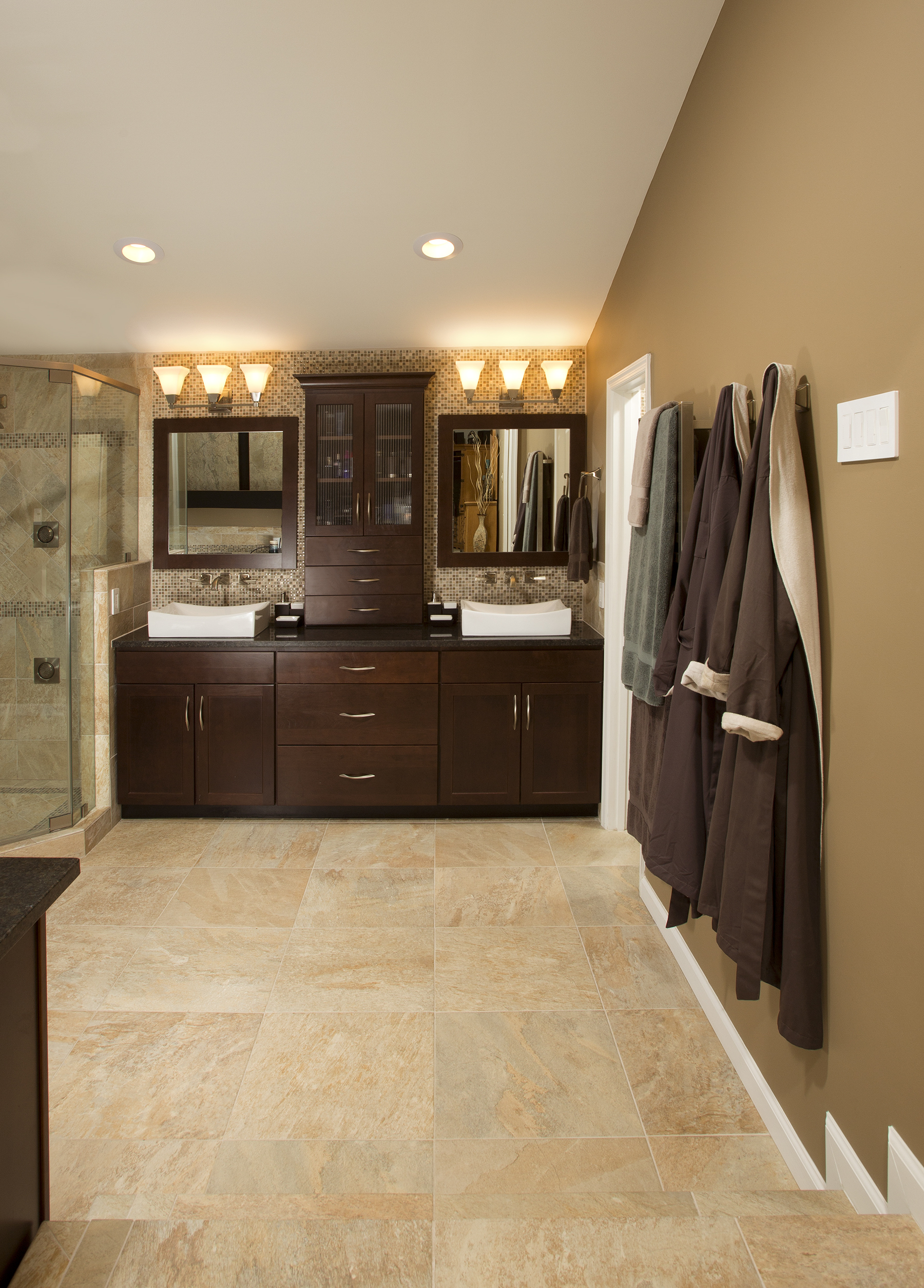
The Vanity sink—Wall elevations are textured and low-key, Personal space is clearly defined, and uncluttered.
 “Inches count in master bathroom design,” Nazemiam observes. “Our goal here was to scale-back anything that was in the way, while adding usable extra space wherever we could find it.”Hence, the landing was deleted, replaced with a more compact single-step variant.Removing the jacuzzi and its ziggurat platform, likewise, freed up some 90 square feet of floor space. More importantly, the modifications created room for a custom-designed Asian-style vanity with towel cubbies now situated between the new hot tub and the re-designed landing.
Understated colors and textures create the restful ambiance Brian and Amanda Curtis were seeking in a private and personalized spa bath retreat. To make the space plan work, Sonny Nazemian (of Michael Nash Kitchen and Homes) removed a Jacuzzi and scaled-back the suite’s entrance to make room for a 42”x72” aroma bubble tub and an Asian-style vanity with towel cubbies.
“The change has made the bathing area much more functional and comfortable,” Amanda says. “And the room feels a lot larger.”
On the suite’s opposite corner, Nazemian removed a wall between the old shower and vanity, creating the footprint needed for a 5′ x 6′ glass surround shower equipped with four body sprays and an overhead rainforest nozzle.
As a further demonstration of the plan’s tight tolerances, the black marble surface surrounding the hot tub extends into the shower as a convenient bench. On this note, a three-level wall niche inside the shower was custom-designed to accommodate specific personal items. [NOTE: Brian provided a bottle of his favorite shampoo to assure accurate specifications.]
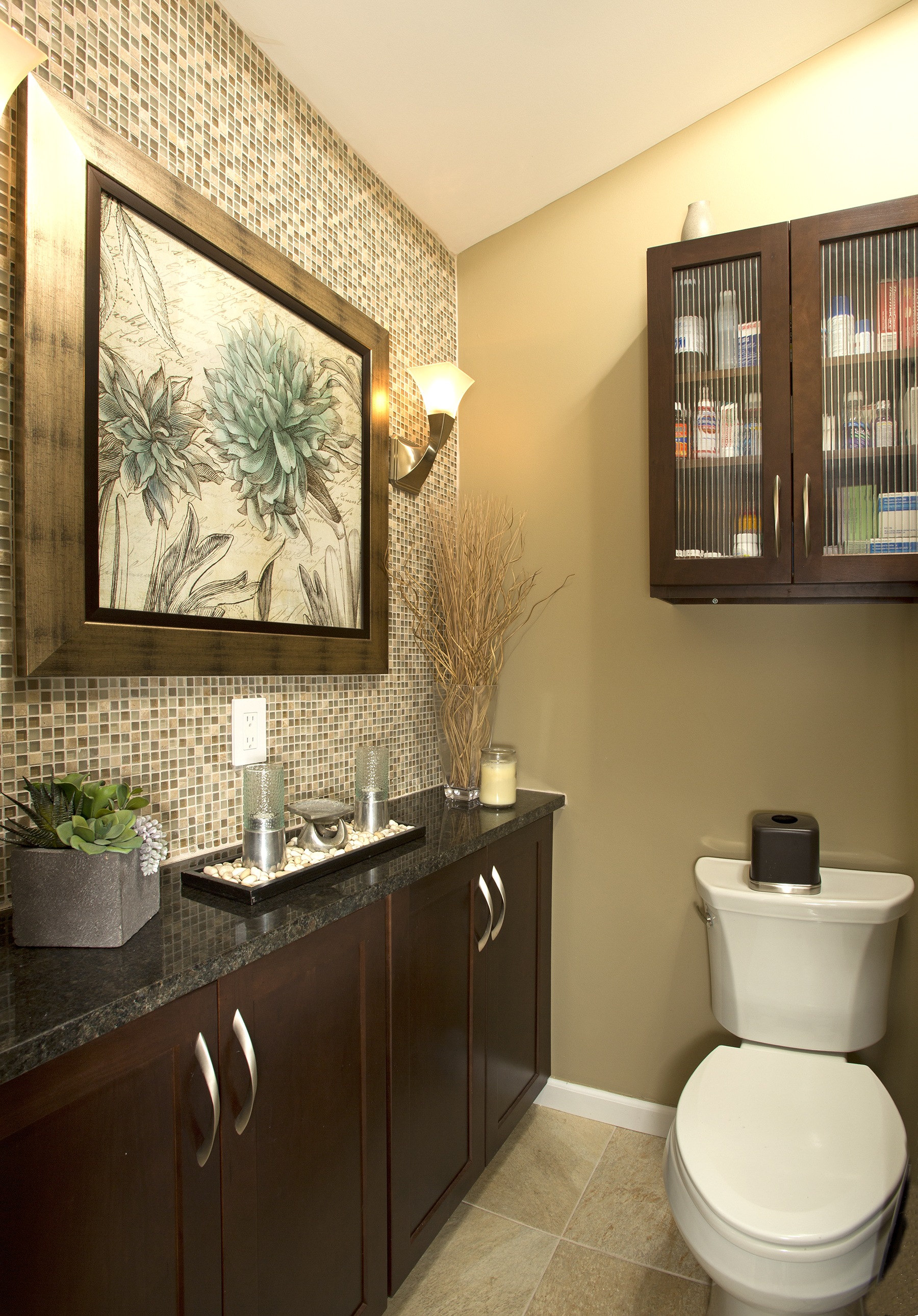
Water closet — A few feet of unused attic behind the wall (left) provided just enough room for the wall-flush vanity inside the commode; the vanity now houses the equipment used to power the spa’s sound system.
A “His” and “Her” vanity adjacent to the shower also shows the designer’s knack for turning thin air into usable space. More capacious than it appears, the tall built-in cabinet between the two vessel sinks actually extends 18” into unused attic space behind the wall. Meanwhile, its custom-sized drawers keep everything organized and orderly.A few feet of unused attic also provides just enough room for the wall-flush vanity inside the commode, which now houses the equipment used to power the spa’s sound system.
On the interior design front, elaborating the suite’s intricate wall elevations, flooring and other details largely became a labor of love for all parties.“
Exposing the homeowner to the universe of finishwork ideas we provide in our showroom is an important part of our process,” Nazemian says, referring to the extensive display space available in the company’s Lee Highway offices. “Often this is where the project really comes together.”On this point, Amanda says she utilized the show room often as the project got underway.“
The staff were very knowledgeable,” she says. “A lot of the innovations we’re especially proud of were conceived in our conversations with designers on the showroom floor.”
Certainly the effect of conscientious choices are everywhere visible in the final product. Subtle contrasts of textures and lines; lights and darks. The trompe l’oeil of the black granite that mysteriously passes through the shower’s glass surround. The large two panel wall-mounted water feature that offers a non-stop sound/visual montage.
“It’s so just personalized,” Amanda says. “That’s why it feels so wonderfully comfortable.
For Information: 703/641-9800 or MichaelNashKitchens.com John Byrd has been writing about home improvement for 30 years. He can be reached @ 703/715-8006, www.HomeFrontsNews.com or byrdmatx@gmail.com.

