Seniors Retrofitting Their Homes
Seniors Remodeling in Phases.
After deciding to continue occupying the house they’ve owned for 17 years, John and Roxanne Andersen have executed two major home improvements in two years.
By John Byrd
The remodeling industry isn’t quite sure how to categorize the current tendency of older Americans to stay in their existing homes well after retirement. Some point to phases of self-recognition and financial consideration followed by prudent decisions to retrofit evolving living and lifestyle requirements,
“Aging-in-place” is not the applicable term. Aging-in-place (AIP) is a trade name for remodeling specialty aimed making bathrooms, kitchens, hallways, staircases safer for persons with reduced mobility. Yet there can be no question that a market comprised of “Seniors Staying-Put” (SSP) exists, and on a large scale.
David Foster who has operated Foster Remodeling Solution in Lorton for 35 years, in fact, estimates that 51% of his clients have hired his company for two or remodeling projects in the past decade, each successive revision reflecting a commitment to explore a new dimension of a favorite dwelling place that has become as comfortable as a second skin.
“Sometimes its a quilting studio over the garage, or a place to house a sports car or an Italian motorcycle,” Foster says. “In other cases, it’s about refinements that will simply make the house more pleasant and manageable in the years ahead.
John and Roxanne Anderson of Alexandria are in the later category. After raising two kids in a 2,800 sq ft circa 1960s split level they had purchased in the year 2000, the empty-nesters decided two years ago to introduce an open kitchen plan in the rear of the house. They had read about a split-level not unlike theirs Foster had remodeled and–after interviews–decided her was the man for the job.
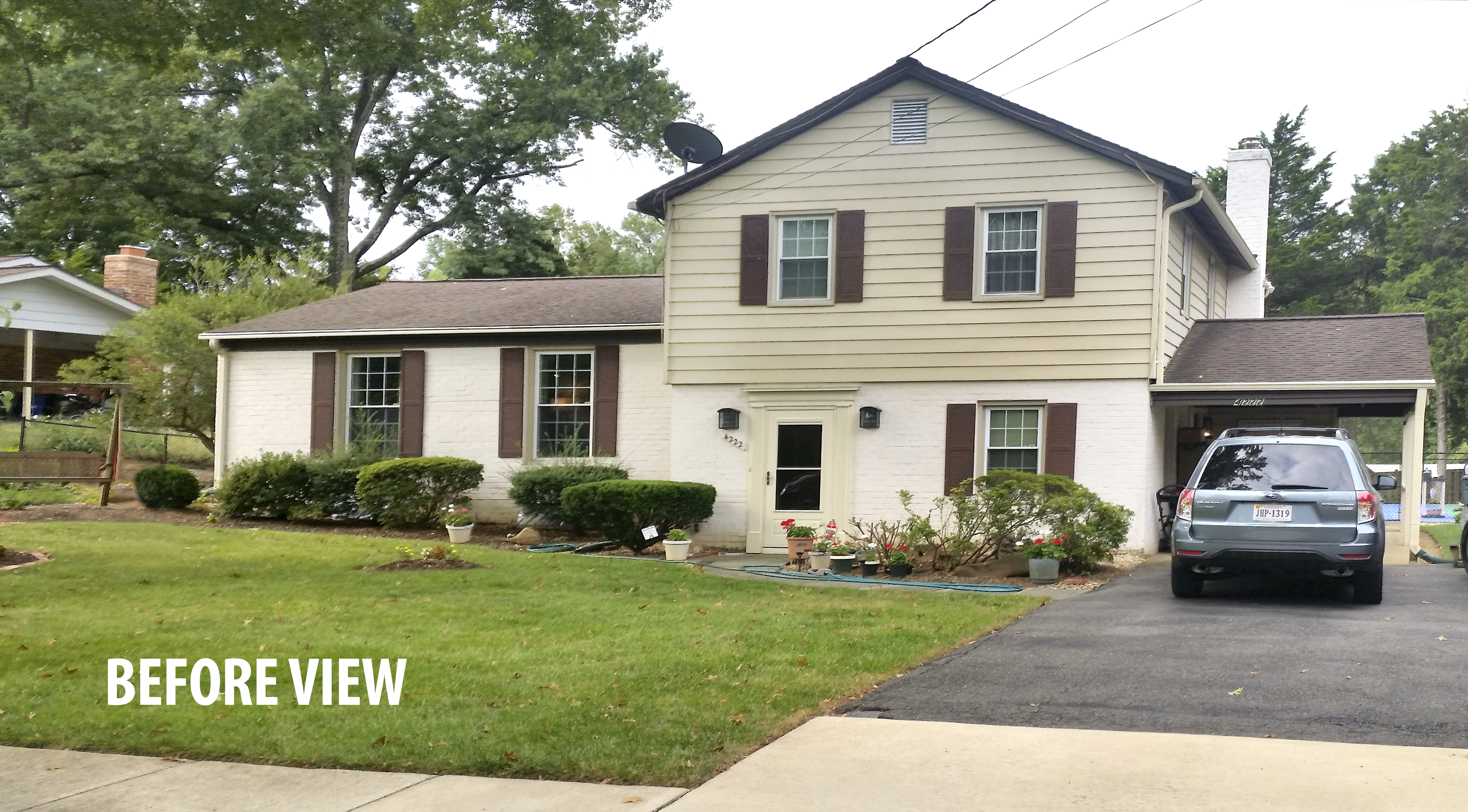
The old facade lacked curb appeal,” Roxanne Andersen says. “The house did not appear welcoming from the street– and with no garage, the cars were always visible.
———————————————————————————————————
“The kitchen floorplan was would stay the same size (15′-by-12′)”, Roxanne admits, “But what we wanted a more efficiently organized, upgraded and attractive working kitchen that would interact easily with a dining room, living room and sun room off the rear of the house.”
The starting point was removing a wall between the kitchen and the dining room and adding a combination serving station and two seat dining counter in the now open area.
Since the wall had provided a necessary surface for both the refrigerator and a tall panty, Foster extended the wall between the kitchen and the living room, adding 2.2 linear feet of floor-to-ceiling cabinetry in which a new 36”-by-73” refrigerator/freezer is neatly ensconced.
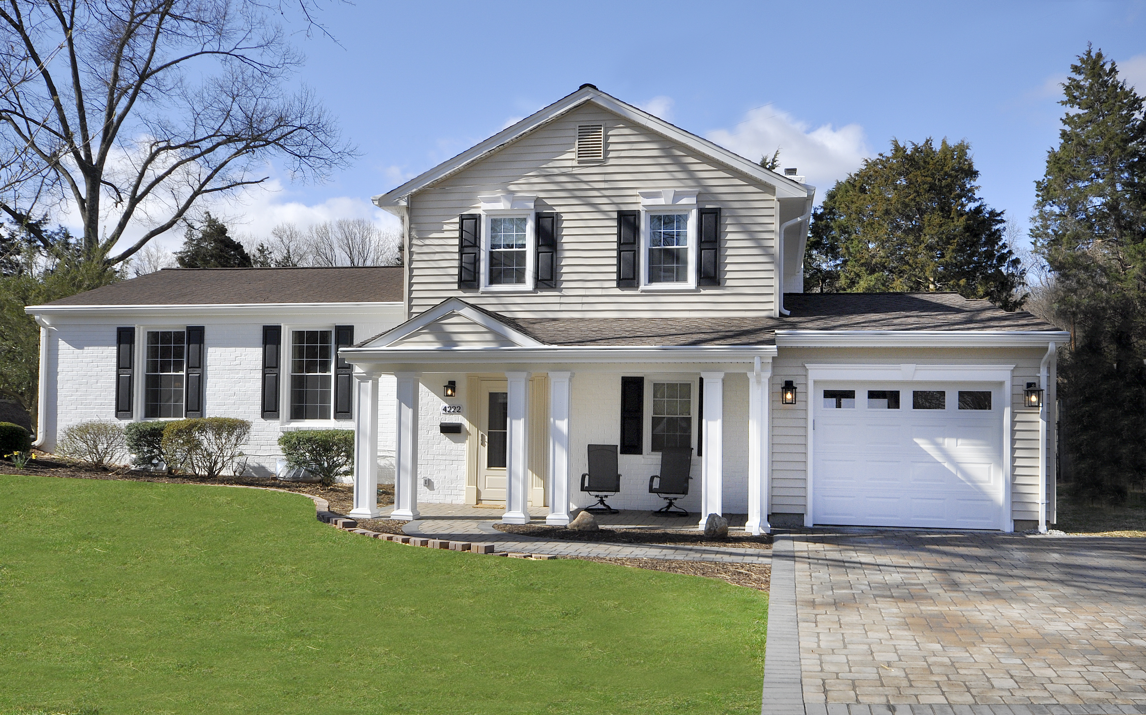
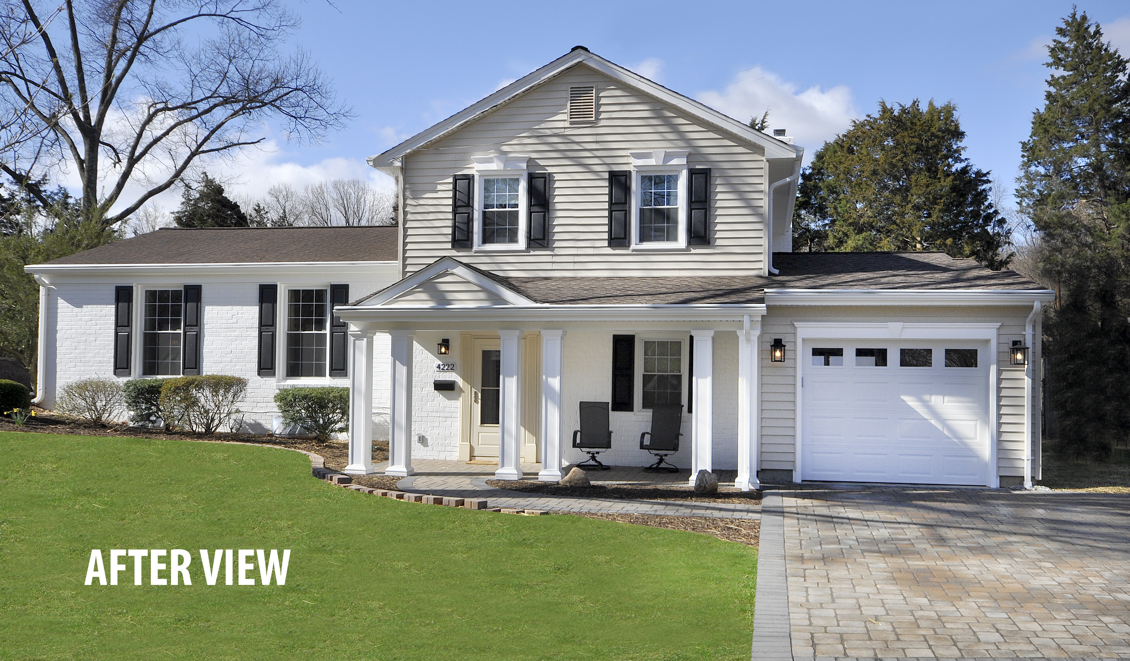
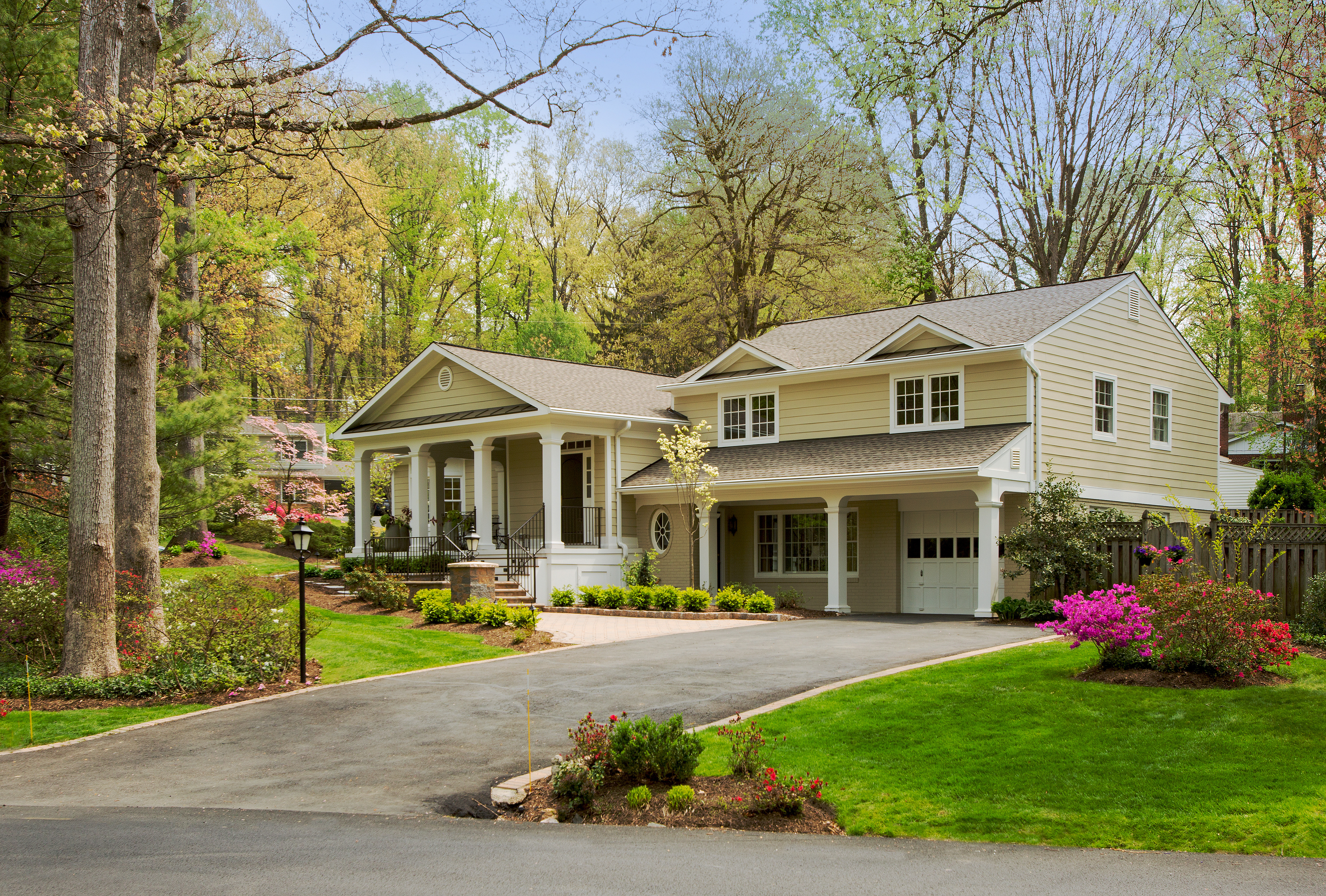
The new facade presents a balanced architectural statement comprised of a central block with flanking wings. With a front-facing gable that draws the eye to the front door, the new porch is a ‘welcoming piece’ in a procession that starts with a 600 square feet of paver-clad drive way. Keystone lintels over two upper windows lend a formal accent to the second level, as do projecting cornices at roof top. Carriage lights, transom windows and a sympathetic door frame reinforce a cohesive architectural integrity.
———————————————————————————————————
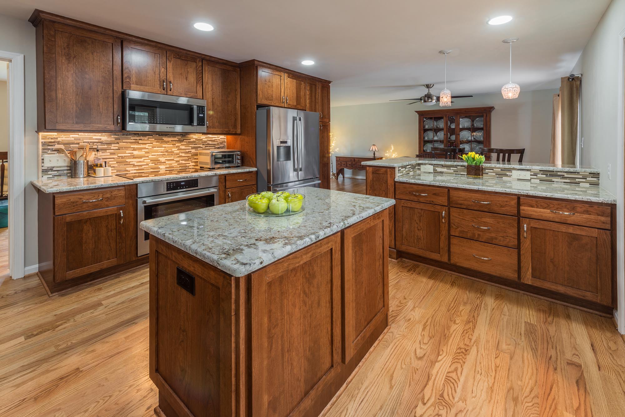
As per Roxanne’s requirements, the dining/ serving counter built-in includes shelving for collectibles which are now visible from the dining room. The 6′-by-3.3′ granite surface functions beautifully as a serving station for both the dining room and sun porch. It’s also one leg in meal preparation work triangle that incorporates the cooktop and a second stand-alone for prep island.
“Every new built-in has a definite role in serving our needs” Roxanne says, “so I’ll only double up on serving surfaces when an entertainment situation calls for it.”
With its Shaker-style cabinets facings and White Galaxy granite surfaces, the new kitchen more than fulfills the Andersen’s aesthetic requirements–but the real bonus is what’s not visual to the naked eye.
“Pull-out cabinet drawers have been installed throughout the entire kitchen, except for the upper cabinets,” Roxanne explains. “Before, I was always trying to find a particular pot or cooking implement buried in the back of a dark cabinet. The pull-out drawers were custom-designed to accommodate every necessity. I would estimate that we have gained a 20 percent increase in storage capacity–in addition to hours of time-saving convenience.”
Better yet, the new suite of rooms that–including kitchen, dining room and living room–is visually unified by newly refurbished hard wood floors.
“The old kitchen was carpeted,” Roxanne recalls. “The original hard wood flooring was under the carpet, and we decided to expose it. The impressive part to me was how seamlessly the designers matched new flooring to the existing wood. With the wall gone and floors really unified, the space feels twice as large as it was.”
As the re-flooring got underway in earnest, Foster team matched and reinforced two sets of steps linking the split-level’s mid-floor to a foyer six steps down and bedrooms 10 steps up.
With the house feeling far more “finished”, the Andersen’s next turned their attention to two issues they had overlooked in almost two decades of occupancy: the home’s front elevation and their long-latent need for a garage.
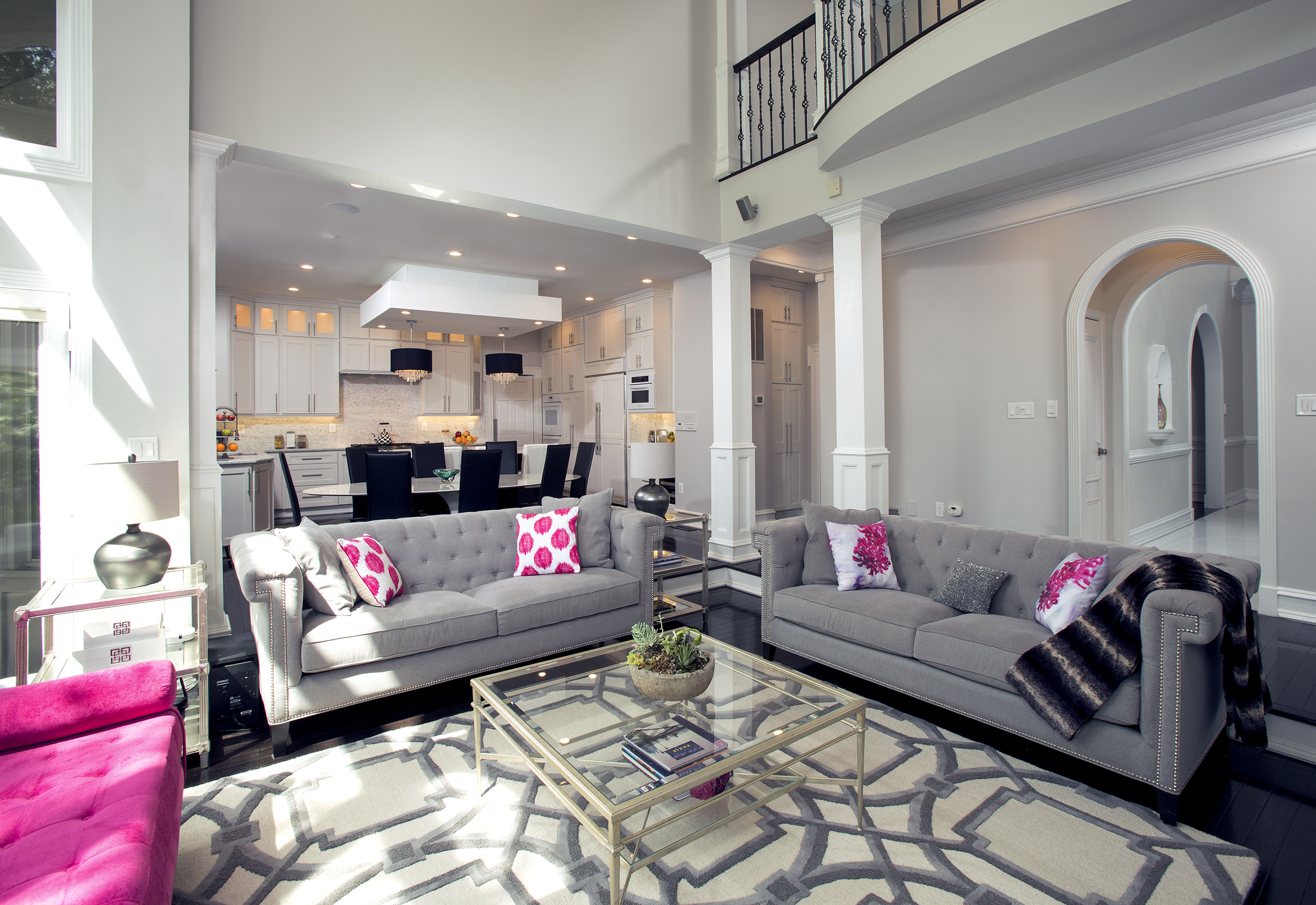
To create the “open kitchen” plan John and Roxanne Andersen wanted, Foster Remodeling designers removed a non-bearing wall between the kitchen and the dining room, and extended an interior wall to create the surface needed for the relocated refrigerator. The now-open space accommodates a serving station (and two seat dining counter) surfaced in white Galaxy granite. Foster also removed kitchen carpet and matched existing hardwood flooring to create a unified interior throughout the primary living area. Shaker-style cabinet facings and a linear Mosaic backsplash are part of a distinctively articulated new interior.
———————————————————————————————————
“We saw the next phase as really making the house our own,” Roxanne says. “ The old facade lacked curb appeal. The house did not appear welcoming from the street–and with no garage, the cars were always visible.”
A meeting with Foster’s Dorey Clemons, however, soon lent perspective.
“There were a lot unknowns,” Roxanne recalls. “We pictured a ‘front porch’, but didn’t have much clarity on how it should look. By the same token, we weren’t sure how much garage we wanted, or how we could make the most of it.”
The home’s new front elevation is, thus, both simple and far-reaching.
A 9′-by-19′ stone paver-clad patio with six posts is topped by a roof with a front-facing gable that draws the eye to the front door. New flat panel keystone headers over two upper windows lend a slightly formal accent to the second level. Projecting cornices refining the upper level roof also provide style articulation to what was formerly non-descript.
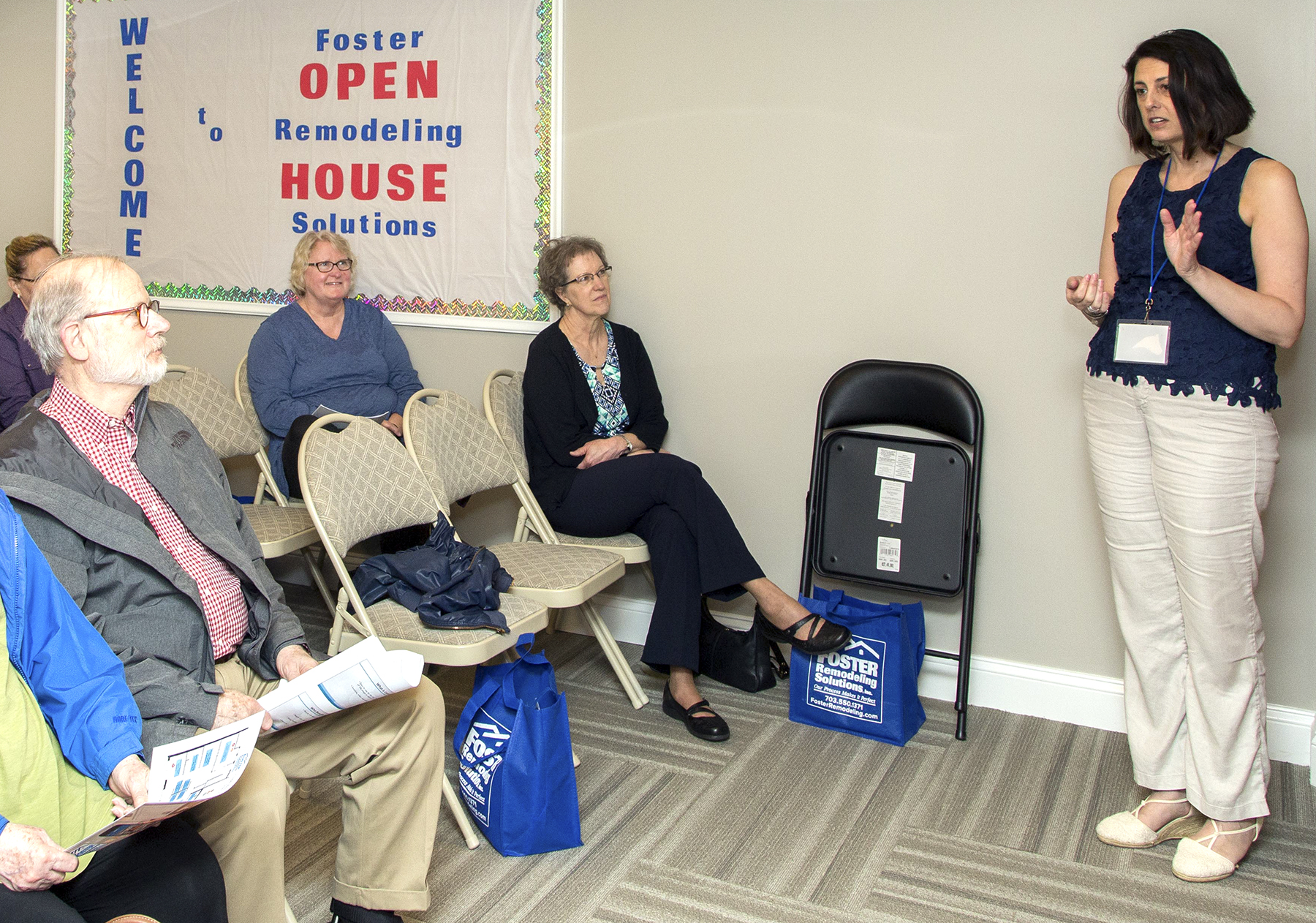
Roxanne Andersen (second row right) listens to tips onAging-in-Place retrofitting strategies offered by Foster’s Dorey Clemons at Foster’s Open House April 22.
———————————————————————————————————
With its carriage lights, transom windows and sympathetic door frame, the new garage is also integral to a balanced architectural statement comprised of a central block and flanking wings. The former driveway has been replaced with 600 square feet of pavers which also continue along a front walk linked to the veranda.
“The point is to create a visual procession from the street to the house,” Foster says. “It’s just one strategy that helps to strengthen a home’s curb appeal”
But function and practical execution have been equally critical in the Andersen plan. To assure the new plan works well on the site, Foster re-graded the sloping right side of the lot eliminating a potential drainage problem. Pipes hidden under the veranda also play a role.
The foot print of the garage itself consists of three progressively smaller components that “step back” from the front of the lot to the rear. For easy access there is also a new side door, and a rear elevation garage door that makes it easier to reach gardening equipment.
Looking ahead, Roxanne was recently in attendance at an “Aging-in-Place” seminar held at the re-opening of Foster’s Design and Selection Center two weeks ago.
“It was very informative,” Roxanne says. “Lots of points to Aging-in-Place I hadn’t considered. That said, I’m very glad this useful resource is nearby.”
Foster Remodeling Solutions periodically offers workshops on home remodeling topics. For Information call: 703/550-1371, or www.fosterremodeling.com, or sign up directly now: http://www.fosterremodeling.com/remodeling-resources/seminars-and-sign-up/. John Byrd has been writing about home improvement for 30 years. He can be reached @ 703/715-8006, www.HomeFrontsNews.com or byrdmatx@gmail.com.

