Remodeled Home “Open House” Demonstrates
Holiday Entertainment Solution
Sun Design Frequently Provides Access To Renovated Homes, Allowing
Neighbors to See Emerging Improvement Trends Up Close.
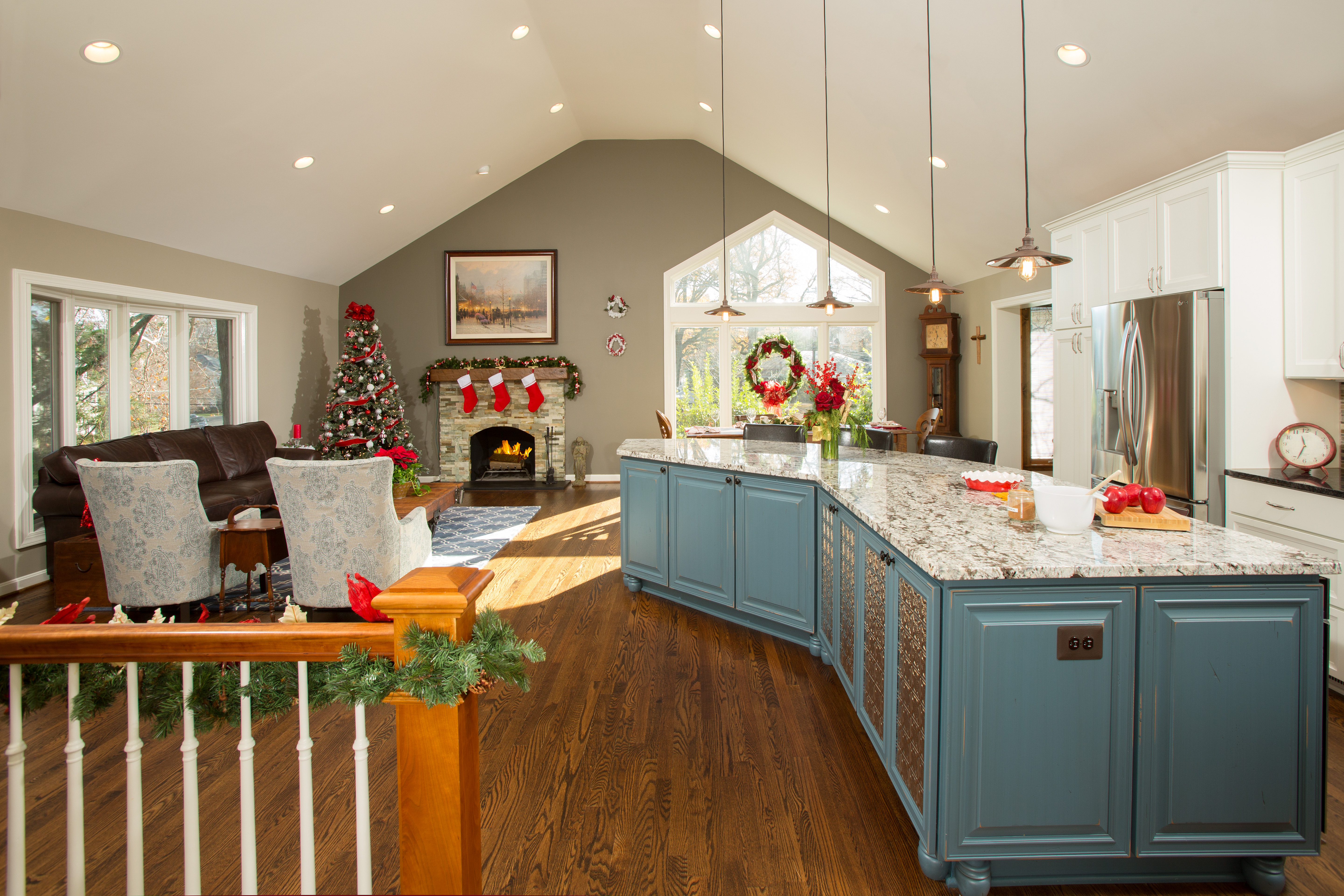
Steve and Louise Brooks of Arlington wanted a primary living area that would serve a multitude of purposes, including a place for frequent gatherings of friends and family. The existing floor plan configuration consisting of a small kitchen with its adjacent living room and dining room was prohibitive. A new space plan introduced by Sun Design Remodeling proved out in a holiday fete for 50 guests held this past Saturday.
To effectuate needed changes, Sun Design concentrated on strategic improvements inside the envelope of the existing structure: a nearly 800 square foot great room was formed by eliminating walls separating the kitchen, dining room, living room and foyer; to create the 14-foot cathedral ceiling, the new interior incorporated a seldom-used attic.
By John Byrd | Photos by Greg Hadley
It’s one thing to talk a good game; quite another to put your ideas to the test by inviting a long list of perceptive critics to inspect your wares.
“We like to see how well our plans work first hand whenever we can,” Bob Gallagher explains, as he describes a holiday tour his home remodeling firm held at one of this client’s homes last Saturday.
“Our designers spend a lot of time conferring with clients on specific needs and learning from case histories– but what really counts is seeing your plan in action. A Holiday tour is a test drive, but it’s also a chance to explore ideas, brainstorm on breaking trends– and just enjoy being around people who are enjoying what we create.”
Case in point, the Arlington home of Steve and Louise Brooks.
Two years ago, the Brooks hired Sun Design to convert the primary living area of their raised rambler into space that would serve a multitude of purposes, including a place for frequent gatherings of friends and family.
Last weekend, the remodeler hosted an Open House for anyone who wanted to see how their freshly-minted new space plan would perform under real life home entertainment conditions.
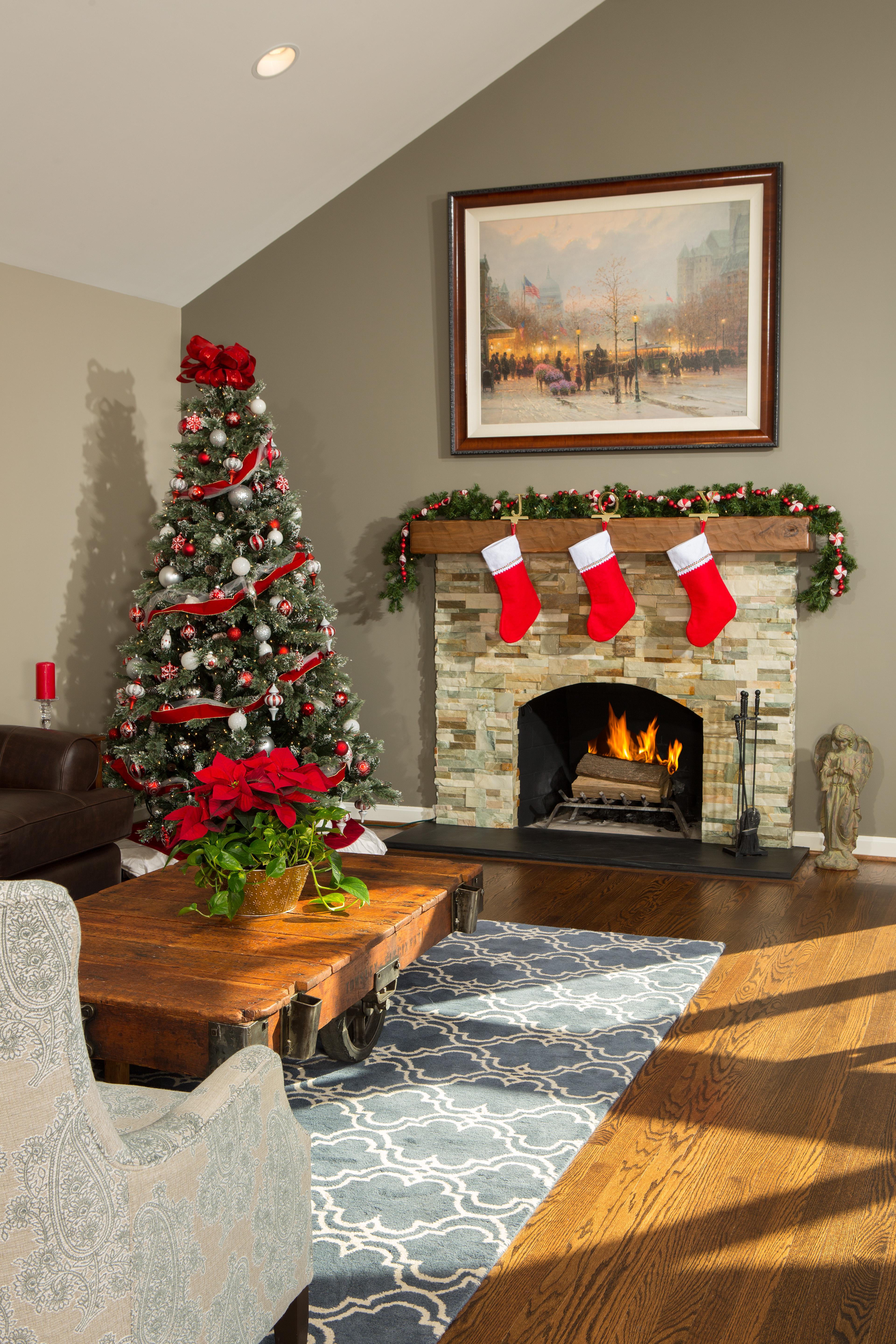
The new makeover features well-defined, appreciably-private activity zones within a warmly cohesive ambiance that affords generous sight-lines in all directions.
There were about 50 visitors in all. Standing in one corner, one could see fluidly organic pockets of revelers– but all flows smoothly, a far cry from the past.
In the past, one’s guests were usually in another room.
The existing small kitchen with its adjacent living room and dining room actually felt crowded whenever the head-count exceeded six or seven.
The eight-foot ceiling and small-scale windows didn’t help either; ditto, the “builder grade” interior finishes and restricted space-use options.
“We’re a host site for our church, so we wanted a place that would allow us to comfortably meet with friends,” says Louise Brooks. “We just weren’t at all sure how to make that happen within our existing floor plan.”
Fortunately, Gallagher and team knew the way. In fact, Gallagher notes that there’s been something of a revolution in how homeowners are now configuring living space:
“Emergent interior design styles now allow for well-articulated activity zones integrated into a visually distinctive spatial continuum. The end result feels generously-sized, yet unified.”
To effectuate the changes Brooks sought, Sun Design concentrated on strategic improvements inside the envelope of the existing structure: a nearly 800 square foot great room was formed by eliminating walls separating the kitchen, dining room, living room and foyer; to create the 14-foot cathedral ceiling, the new interior incorporated a seldom-used attic.
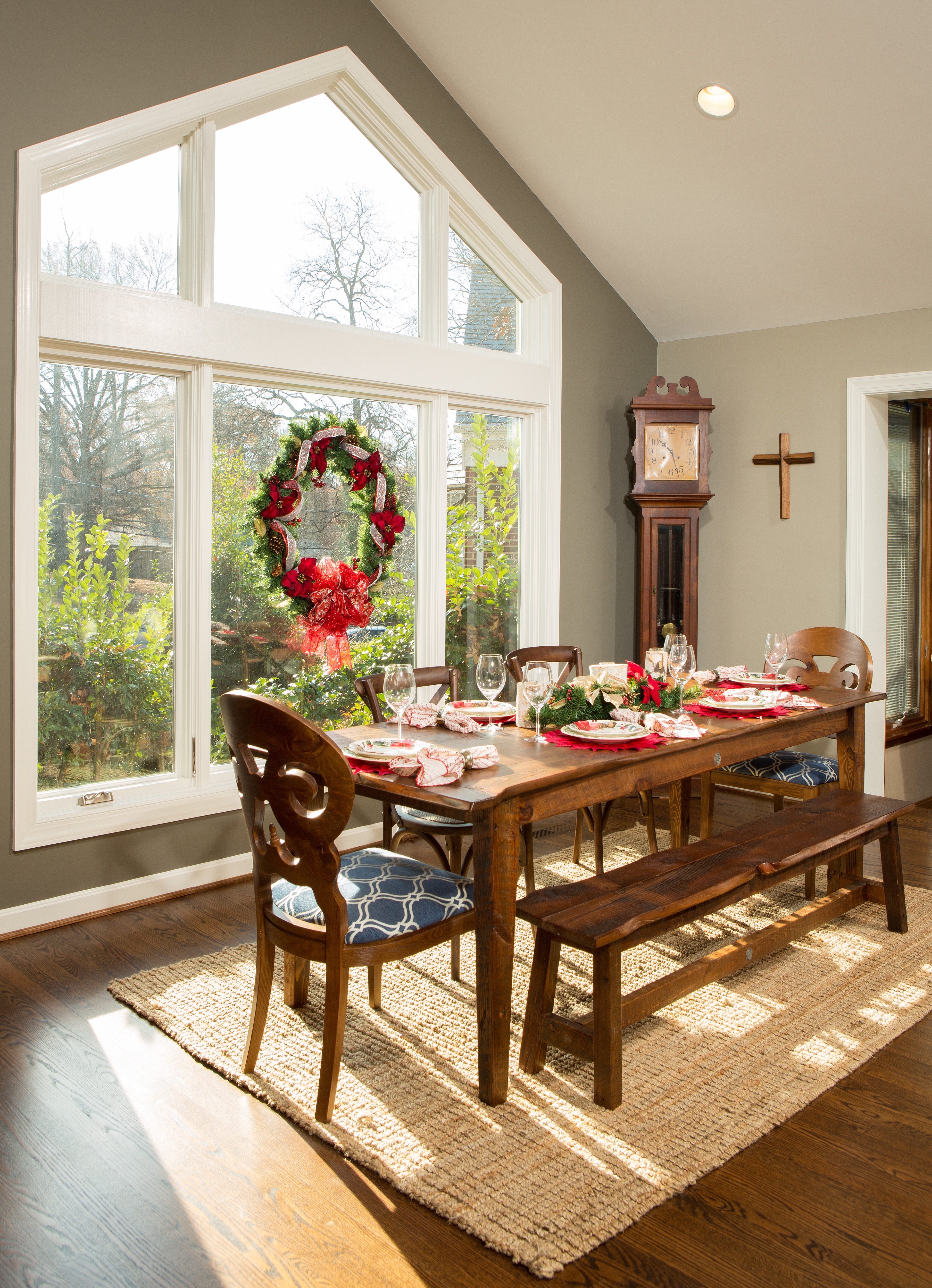
The changes radically increased natural light. A south-facing trapezoidal-shaped window in the dining room provides a hilltop view of the neighborhood.
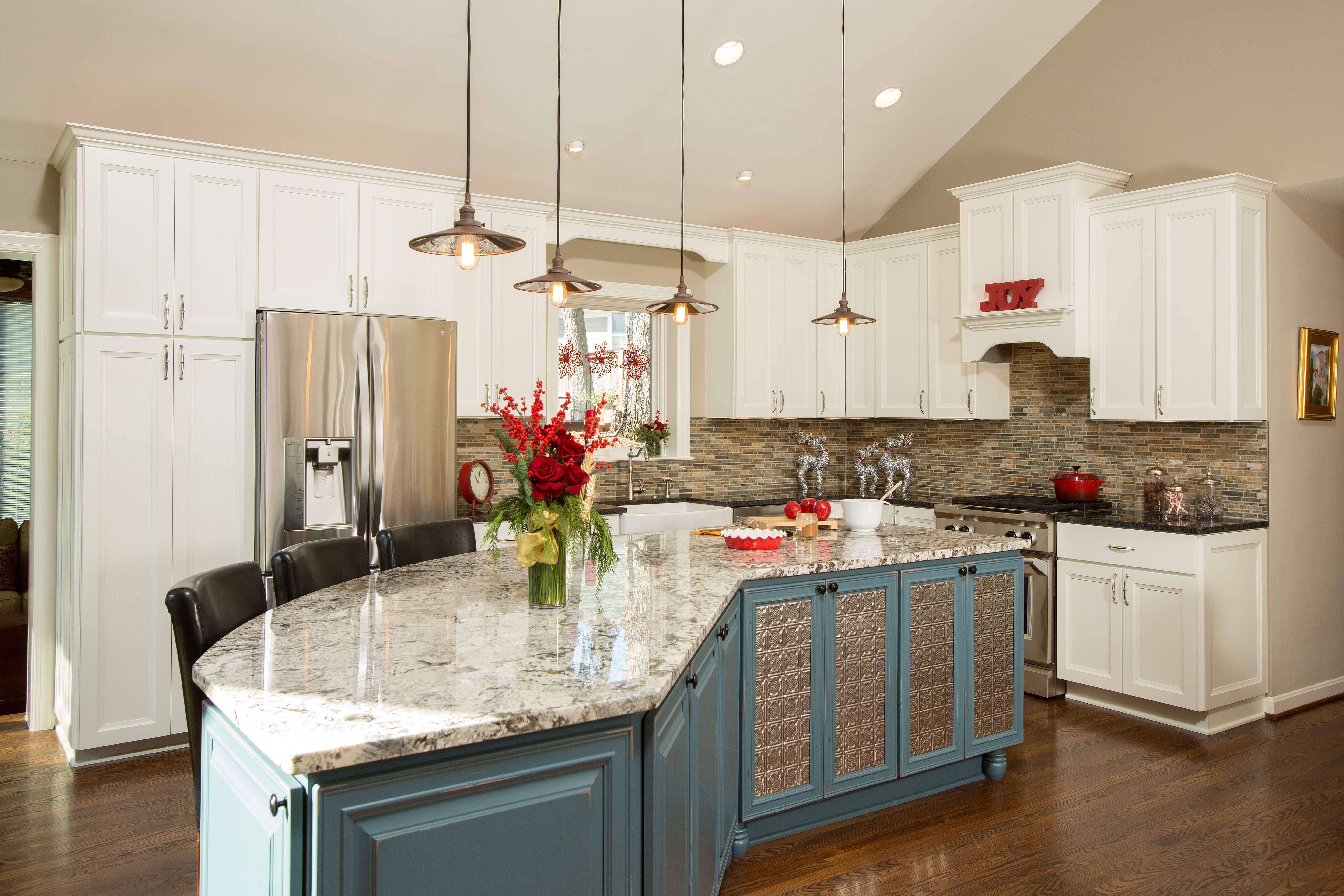
A granite-surfaced food preparation island and dining counter now facilitates the easy circulation needed for gracious entertaining; the “built-in” was custom-designed to support a wide-range of storage, cooking and clean-up requirements.
The plan also radically increased natural light. A south-facing trapezoidal-shaped window provides a hilltop view of the neighborhood. Skillfully distinctive finish work details delineate key activity zones within a warmly cohesive ambiance that features generous sight-lines in all directions.
Meanwhile, back at the tour, Bob Gallagher is talking to a drop-in guest about how the new space is used on an everyday basis.
“It works extremely well,” he observes. “The open plan allows people to happily pursue different tasks within the same continuum without loss of personal space. You have privacy, but you’re in eye-contact. It’s a very popular trend.”
Gallagher also stresses the value of an open house to homeowner’s looking for ideas.
A granite-surfaced food preparation island and dining counter now facilitates the easy circulation needed for gracious entertaining; the “built-in” was custom-designed to support a wide-range of storage, cooking and clean-up requirements.
“We’ve been doing tours of newly remodeled homes for about 10 years,” he says. “We’ve found that the open houses often become neighborhood meet-up opportunities where people naturally start exploring matters of mutual interest. It’s a great way to help the community.”
Sun Design Remodeling frequently sponsors tours of recently remodeled homes as well as workshops on home remodeling topics. Headquartered in Burke, the firm recently opened a second office in McLean. FOR INFORMATION: 703.425.5588 or www.SunDesignInc.com.
—————————————————————————————————————————————————
John Byrd has been writing about residential architecture, building and remodeling for 30 years. His work has appeared in House Beautiful, Architectural Digest, Southern Living and many national and regional publications. He has also written and produced segments for HGTV and other cable outlets. His work has received numerous Press Association awards for excellence in journalism. He can be reached at byrdmatx@comcast.net or www.HomeFrontsNews.com
When it comes to Improving the Kitchen and its Satellites, a Well-conceived Space Plan Makes All the Difference.
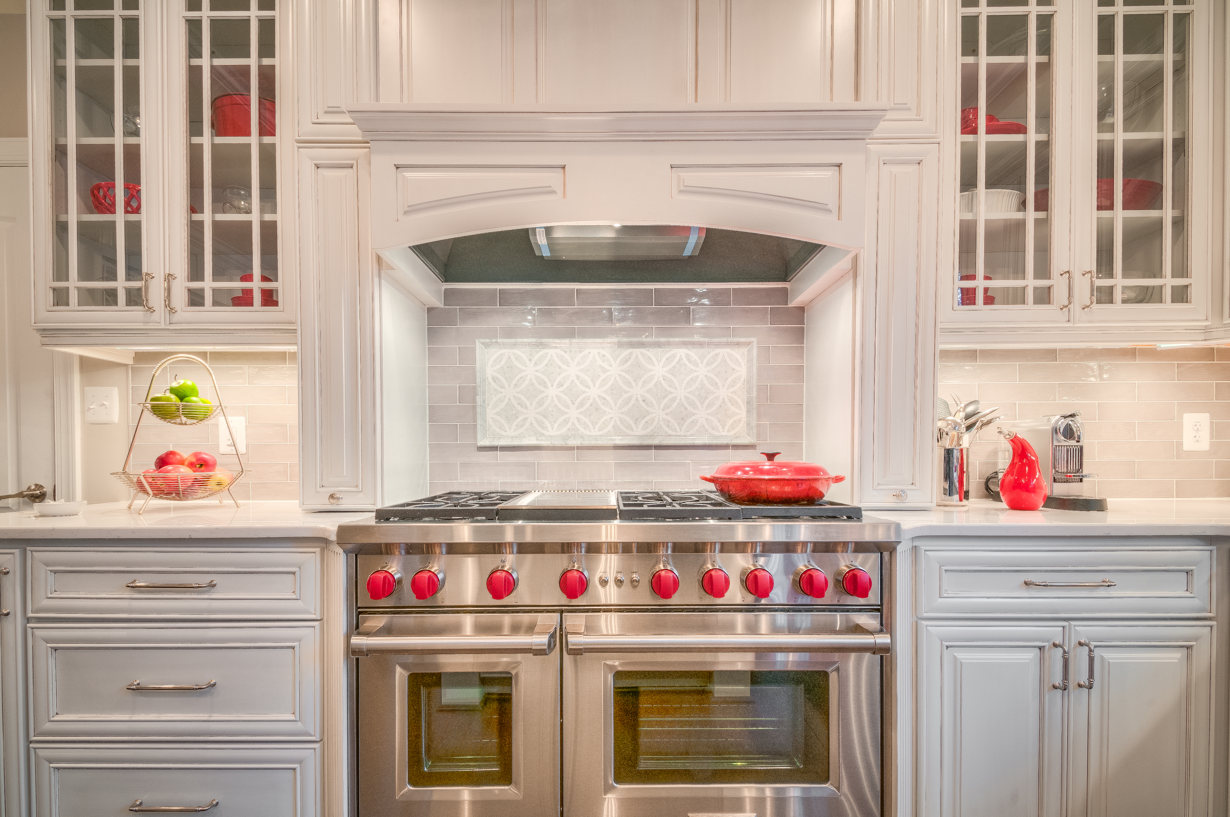
The new cooks’ work station features a six-burner gas range. The decorative pillars supporting the Tuscan
cooktop hood conceal pull-out spice racks.
By John Byrd
Yes, the kitchen is the heart of the family home. But its not simply the association of meals and nourishment that makes it so. In any home where the first level is 1,000 square feet or more, the kitchen is most likely the hub around which a whole series of activity zones must orbit.
There’s the link between the kitchen and the muddy outdoors; access to the garage, laundry, decking; the adjacent family entertainment area; the quiet spots for homework and managing accounts; the segue to the dining room.
Seen as a system, the kitchen commands a vital suite of interconnected spaces. It’s the vibrating center for emotional warmth and replenishment; it’s also a hive buzzing with life that only functions to capacity when there’s an orderly infrastructure guiding everyday behavior.
Thus, for many homeowners: formulating a plan for the kitchen and environs that is truly tailored to family needs can be a journey of self-discovery.
Case in point: Alex and Michelle Del Pizzo
When the couple and their young children moved into their nearly 5,000 sq ft Colonial house in Vienna five years ago, all were pleased with the home’s spaciousness, location and local schools. One of Alex’s first thoughts, though, was that the 20 year old kitchen would have to be remodeled some time soon.
With three growing children and busy careers, the Del Pizzos wanted a hub that not only reflected their tastes, but also supported daily lifestyle requirements. Instead, they were contending with a circa-1990s builder-grade kitchen, which (as Alex describes it) “had a lot of dead space, out-of-date appliances and didn’t circulate well.”
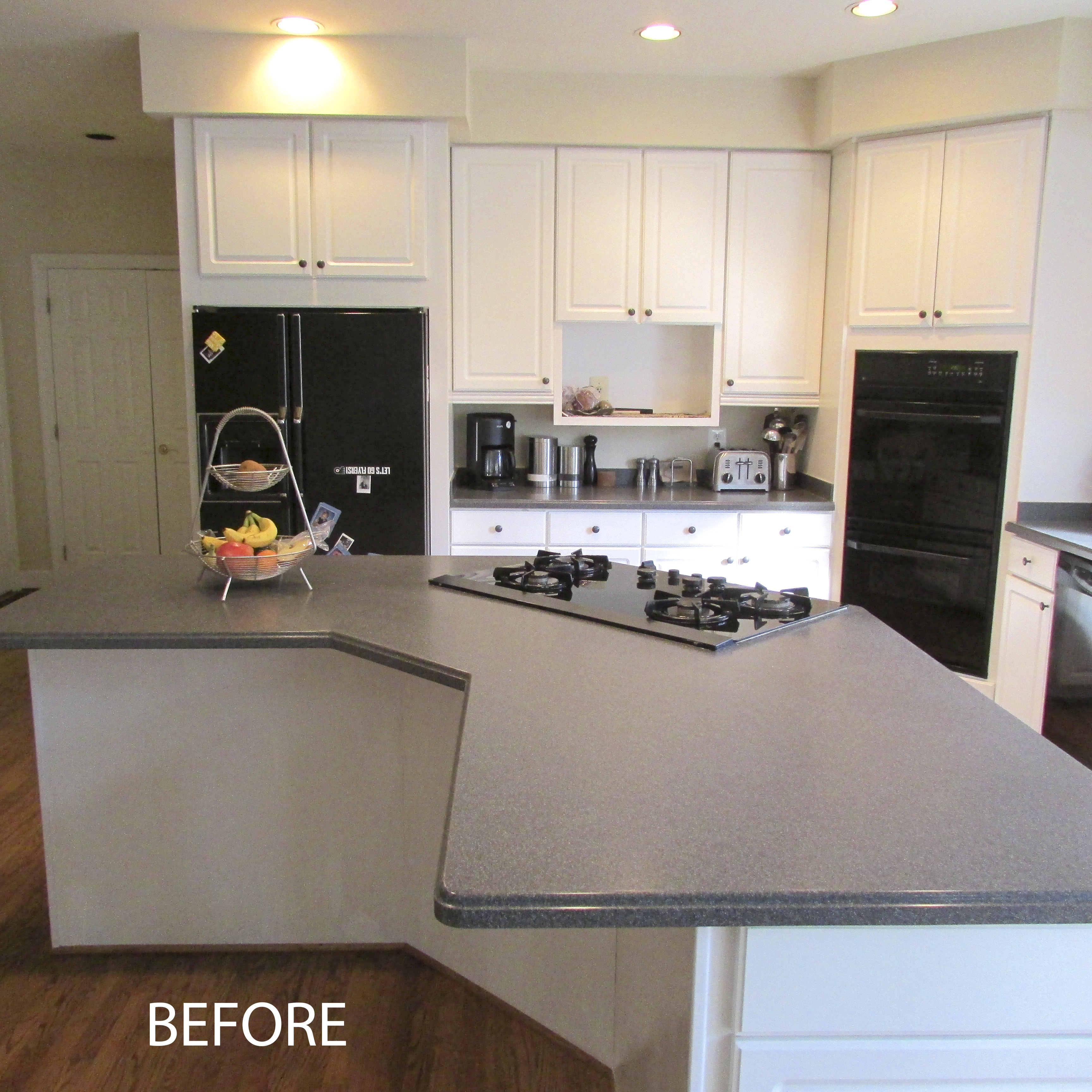
“There was much about this kitchen’s design that just didn’t work for us,” Del Pizzo recalls.
For starters, he 4’x9′ crescent-shaped cooktop island tended to be more of an obstruction to traffic than a useful serving station– a far cry from the professional caliber gas range the family wanted.
The stacked ovens in the corner didn’t figure into regular cooking needs either. The refrigerator was too small. Ditto, the dishwasher.
At nearly 500 square feet, the footprint should have been large enough by any standards– yet work triangles were constricted. Worse, there was no in-kitchen dining spot for the kids. No place to re-charge your cell phone.
Meanwhile down the hall, the laundry room offered a similar travesty. It wasn’t so much space-constricted as inadequately designed, a shortcoming that had made it a “catch-all” for kids’ jackets, athletic equipment and missing shoes.
Kitchen/ Great Room: Alex and Michelle Del Pizzo wanted a spacious “family kitchen” in the circa-1990s Colonial they had purchased in Vienna five years ago. Among changes, Glickman Design Build deleted a row of cabinets separating the original kitchen from the family room and added a 60 square foot prep island and dining counter. The tray ceiling reinforces visual unity in an otherwise “open” plan with many designated activity zones.
Even the butler’s pantry between kitchen and formal dining room lacked the means to a cool beverage. With so much dysfunction all around, the unspoken question was: where will we find the space for all the needed upgrades without adding on?
“It was clear that our 1990’s floor plan wasn’t configured for our requirements,” Del Pizzo says, “and that’s about when our research phase began in earnest.”
Of course, the exercise of due diligence can be time-consuming.
It was nearly four years later, in fact, that Del Pizzo found the change-agent he had been looking for in the form of Glickman Design Build, a thirty year old home remodeling firm with a reputation for executing precise solutions.
“We had done a lot of research into our choices for larger built-ins and appliances, and had stockpiled interior design ideas for years” Del Pizzo says. “What we needed was someone who got our vision and could put it all together into a coherent whole.”
After interviewing four contractors, the couple chose Glickman who started sketching out interior design concepts the following day.
“Our collaboration with the design team really worked well from the start,” Del Pizzo says. “They were very focused on delivering the outcome we wanted, which kept the whole process within our budget.”
The design process lasted seven months. Early meetings explored options for optimally allocating square footage needed for key activity zones.
Several goals emerged early on, to wit:
• Introduce a larger (60 square foot) island with a dining counter– a place where the kids can do homework while dinner is underway;
• Accommodate a 6-burner Wolf range oven; a second dishwasher; a 36” sub zero refrigerator; a wine refrigerator; a cell phone charging station;
• Create personalized closets with bench space for children’s outer wear, provide personal cubbies and other containers;
Moreover, while pursuing a fundamentally “open” floorplan, the interior elevations to kitchen/ great room had to be distinctive; handsomely articulated; soft, yet balanced.
 “The interior design goals pointed towards transitional-style,” Russ Glickman, founder of Glickman Design Build, explains. “It’s a design language that calls for finely elaborated formal elements within an appreciably open space. The details help to delineate the primary activity zones– which are independent from one another yet interact fluidly.”
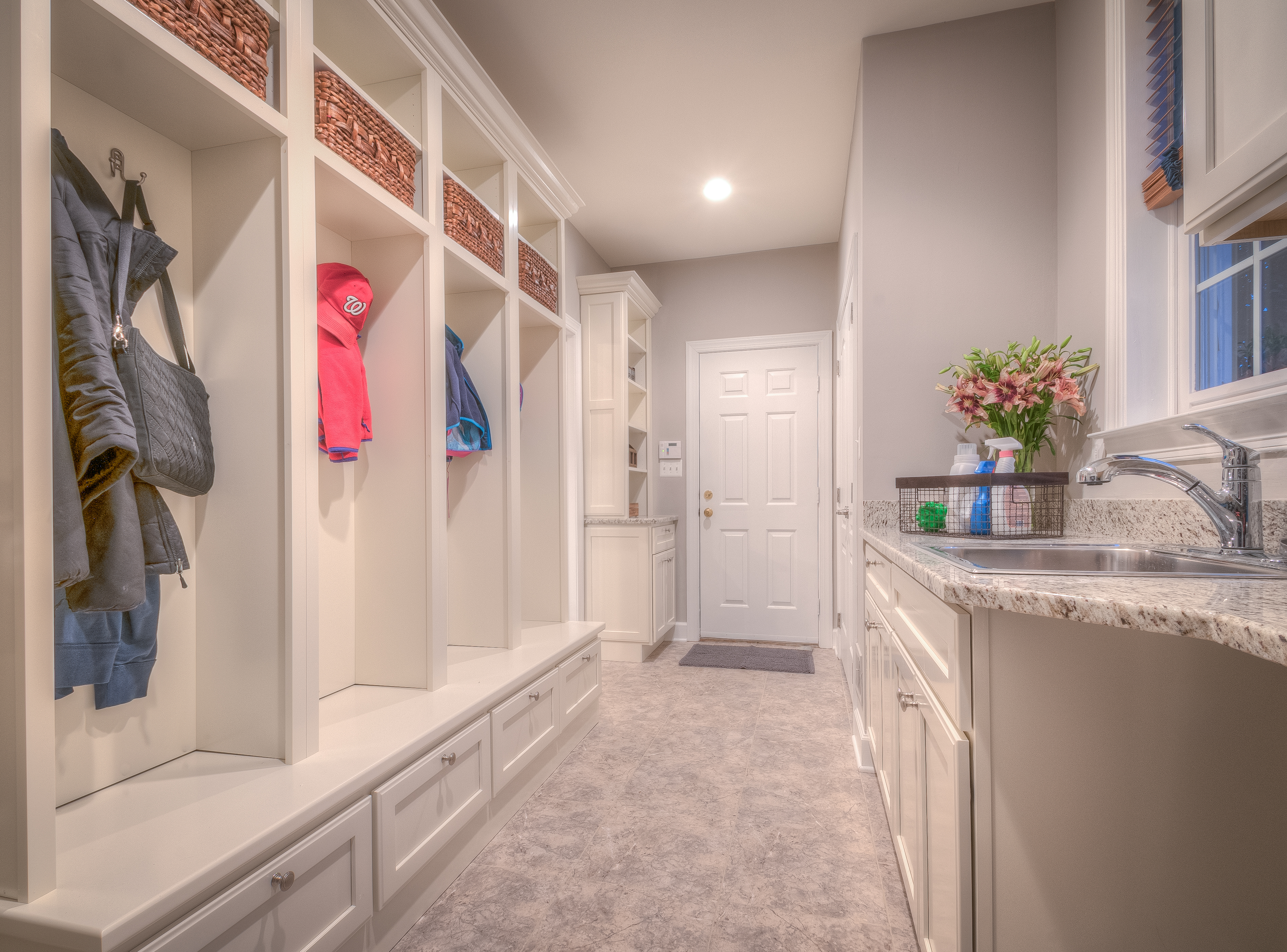
Mudroom: Glickman incorporated the foyer between garage and laundry room into the footprint for the new mudroom. The personalized cabinets– each with bench-seating, a pull-out drawer and overhead basket– provide a way for the children to clean-up before entering the kitchen from the outside.
“Cabinet facings, counter surfaces, back splashes are critical in executing this design style successfully,” he adds, “In effect, you are creating compositional surfaces much as a photographer or painter might.”
To begin again with a blank canvas, designers deleted a row of cabinets separating the kitchen from the family room, creating the floor space needed for the new 5′ x 12′ food prep island and three stool dining counter.
Kitchen work station: A 36” refrigerator/freezer is positioned to support the cook’s work triangle which include the gas range and the food prep island. The work station is for household accounts.
Appliances on the inside interior wall were, likewise, eliminated to make room for a six burner Wolf range oven complete with a Tuscan cooktop hood. As a space-saver, the hood’s two decorative pillars conceal “pull-out” spice racks. To facilitate cooking activity, the range forms one leg of a work triangle that includes a prep sink on the island immediately parallel to the burners and 36” sub zero refrigerator now on an interior wall to left.
The “clean-up” triangle (which is independent of food prep) incorporates the primary sink on the home’s south elevation. There is now a second dishwasher embedded in the food prep island, which is surfaced in a bright white Quartz Cashmere Carrara.
Meanwhile, the island’s three dining stools are a perfect spot for the children to tackle homework while meals are being prepared, or clean up is underway.
To configure the new mudroom, Glickman incorporated the 5’x5′ foyer between garage and laundry room into an enclosed space that would serve/ multiple purposes. Washer and dryer were re-located to a back wall, creating the square footage needed for a counter with sink.
On the opposite wall, a floor to ceiling console comprised of four cubicles– one for each child plus a “bonus” unit to be shared by adults.
Each cubicle features bench-seating, a pull-out drawer for shoes, overhead basket for miscellaneous personal items.
There’s also a cell phone charging-station just inside the mudroom as one enters from the garage.
Finally, the butler’s pantry now includes an under-counter wine refrigerator, and back splashes and cabinet facings that match the kitchen’s new interior décor.
“This is a very specific execution,” Del Pizzo says, “and we’re very pleased with it.”
FOR INFORMATION: see www.GlickmanDesignBuild.com, or call 301/444-4663.
—————————————————————————————————————————
John Byrd has been writing about residential architecture, building and remodeling for 30 years. His work has appeared in House Beautiful, Architectural Digest, Southern Living and many national and regional publications. He has also written and produced segments for HGTV and other cable outlets. His work has received numerous Press Association awards for excellence in journalism. He can be reached at byrdmatx@comcast.net or www.HomeFrontsNews.com
—————————————————————————————————————————————————————————————————
Space Plan For a Winning Gourmet Kitchen
Emerges from Living Room Conversion
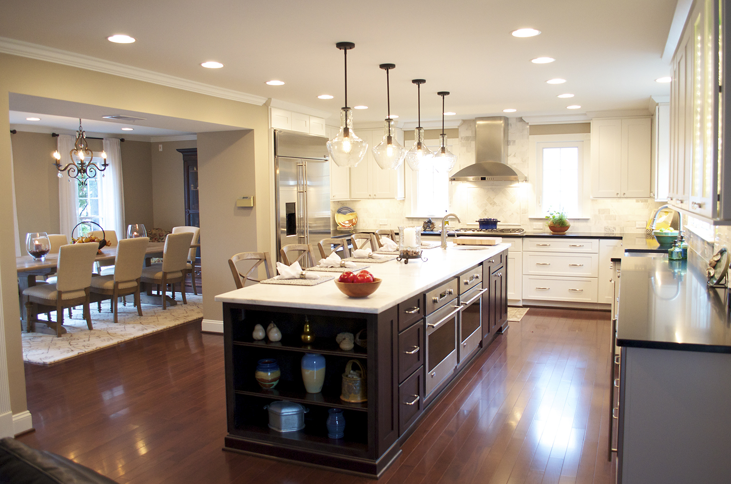 Gourmet kitchen — Marcelo Dobrauchi of Terranova Construction K&B combined a former family room and tiny kitchen to create a gourmet kitchen nearly three times the size of the original for seniors Helmut and Joy Green. The former living room was converted to an adjacent formal dining room.Walnut flooring and crown molding complete a unifying “transitional” style interior design statement.
By John Byrd
The family kitchen has been radically altered in the past few decades. Homeowners are comfortable with fewer walls; more visual continuum. They’re also exploring zoning ideas that make it easier for a hostess to shift between entertaining guests and feeding them.
But what if the only way to gain more kitchen space is to “lose the living room”?
“Unthinkable” at first; but then — “really innovative — a huge breakthrough.”
Such were the revelations of Joy Green, owner of a 3,000 sq ft Hill colonial, as she contemplated ways to introduce a large gourmet kitchen into the rear of her three level home.
Joy and husband Helmut, both in their mid-sixties, had purchased the house new in 1983; raised three boys and, like most homeowners of the period, had happily adapted to available space.
What the home offered was a 1,000 sq foot first level template consisting of a front foyer with a living room to the left; a family room, kitchen and dining room (moving from right to left) on the rear of the house.
 One could walk from the foyer to the family room directly, but each room was less than 150 sq feet. ”And,” Joy adds, “there was an excess of doors.” (Five in the family room alone, in fact).
“The traffic in the kitchen was often clogged,” she says.
Yet, curiously, the spacious front-facing living room was scarcely used.
—————————————————————————————————————————————————
Glass-Facing Cabinets — The natural stone herringbone pattern backsplash and backlit glass-facing stemware cabient give the new space an elegant touch nicely integrated with the detailing in the dining room.
—————————————————————————————————————————————————
“When the kids were small, the living room was a kind of containment area for games, “ Joy explains. “ “As the kids got older, we stopped using the living room. Which made our first floor plan odd — since the kitchen was too dark and cramped and lacked the kind of storage I really needed.”
Fast forward 15 years. The Greens have finally removed a wall between the family room and the kitchen. There’s more light. But the wall separating the kitchen from the south-facing dining room still blocks out the morning sun, and the space remains restricted.
“Storage remained a problem. I had to keep certain cooking implements in the basement. Just keeping track of what was where was really inconvenient.”
As the Greens became empty-nesters and then retirees, however, thoughts of retrofitting the first floor to better satisfy a new agenda prevailed. Joy began to research kitchen design ideas in magazines and online. Soon she came across an article about kitchen designer Marcelo Dobrauchi of Terranova Construction K& B and set up meeting in her home.
 “I had been playing around with new space plan ideas for months, and I was stumped ” Joy confesses. “Fortunately, Marcelo put everything into perspective almost immediately. In the end, he presented eight floorplan variations. He was thorough on every issue — and there were many.”
———————————————————————————————————
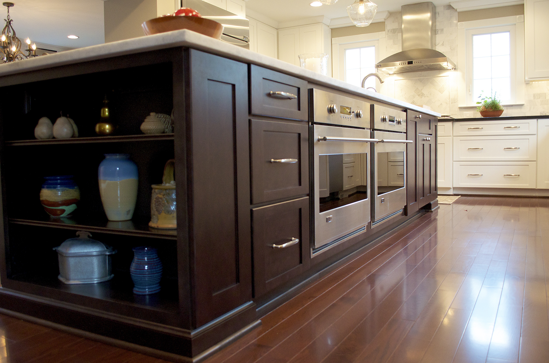
Food Prep Island — features two baking ovens positioned to help Joy Green enjoy one of her favorite culinary pursuits. The baked goods are a special diet supplement for Helmut.
———————————————————————————————————
“An open plan seemed better suited to what Joy and Helmut wanted,” Dobrauchi recalls, “so I sketched out a concept showing how they could covert the living room to a formal dining room while reconfiguring the adjacent kitchen/family room space as a large open kitchen revolving around a food prep island and dining counter.”
Since this would entail deleting three interior walls concealing much of the electrical wiring and plumbing, Dobrauchi devised a way to re-route much of the critical infrastructure into a specially-designed 12′ x 8′ passageway conjoining the kitchen to the relocated formal dining room.
Meanwhile, by rerouting HVAC vents, the designer eliminated the need for ceiling-flush bulk-heading, adding the vital inches needed for higher, more capacious cabinets. To accommodate an assortment of pots, pans, cooking utensils, the design team built an L-shaped system of floor cabinets fitted out with custom-designed slots and cubbies.
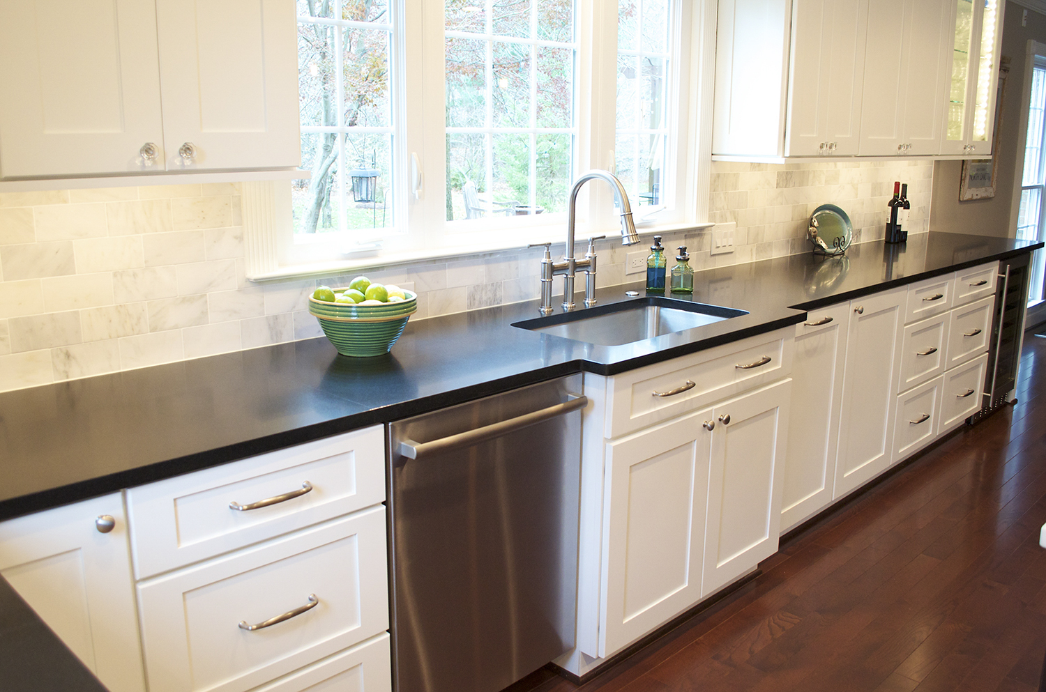
At 16′ x 3′, the handsome food prep island and five stool dining counter is the kitchen’s focal point. A pair of state-of -art baking ovens are within easy reach of the white quartz counter surface — which parallels a black quartz surface that includes a wine refrigerator and a glass-facing stemware cabinet.
 The built-in works perfectly for the couple’s everyday dining requirements, but is also an ideal staging area for the buffet-style service they generally employ for larger parties.
Jana Neudel, a Terranova interior design expert, worked closely with Joy in developing the kitchen’s finish work elevations.
———————————————————————————————————
The kitchen’s well-conceived work triangles — include a farm sink and custom designed cabinetry supporting spacious work surfaces. The built-in parallels the food prep island facilitating both cooking and clean-up.
———————————————————————————————————
Nordic white mission-style cabinet facings present a pleasing shade contrast to the truffle-colored facings of the food prep island. Natural stone tiles with herringbone detail in a 3” x 6” brick pattern, meanwhile, present a softly neutral back splash that lends texture to an open sunny space.
Completing the “transitional”-style interior design statement, walnut flooring and crown molding create a unifying visual unity. Natural light floods in from all directions.
A perfect space for entertaining, and gourmet cooking pursuits.
Designers at Terranova Construction K&B periodically offer workshops on home remodeling topics at their Tysons Corner show room. FOR INFORMATION: 703/761-0604 or Info@terranovaCKB.com
—————————————————————————————————————————
John Byrd has been writing about residential architecture, building and remodeling for 30 years. His work has appeared in House Beautiful, Architectural Digest, Southern Living and many national and regional publications. He has also written and produced segments for HGTV and other cable outlets. His work has received numerous Press Association awards for excellence in journalism. He can be reached at byrdmatx@comcast.net or www.HomeFrontsNews.com
—————————————————————————————————————————————————————————————————
THERAPEUTIC SOLUTIONS
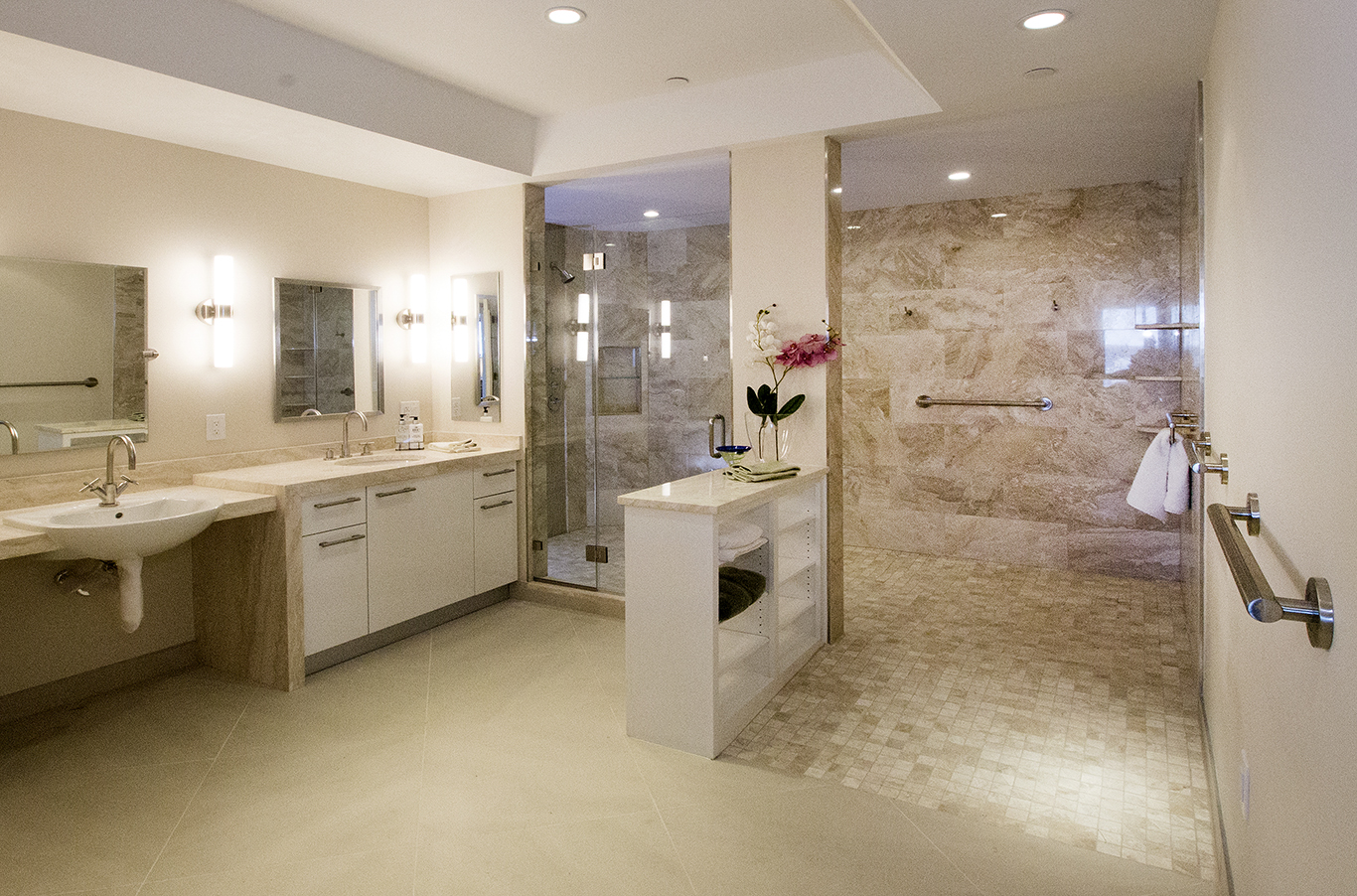
Glickman Design Build converted a traditional bathroom in an Arlington condo into a wheel-chair-friendly spa while the owner was vacationing in Florida. The project won a Chrysalis award for “Best Accessible Bath Design”.
Converting an apartment’s traditional bathroom into a wheel-chair friendly spa.
By John Byrd
Looking at trend lines, it is evident that older homeowners want readily-available therapeutic solutions, even in quarters that might once have been considered too small for larger amenities.
A north Arlington condo dweller struggling with a progressive neuro-degenerative disorder recently decided during a stay Florida that in the time had come to convert his apartment’s traditional bathroom into a wheel-chair friendly spa.
Despite the off-premise challenges, the owner asked Russ Glickman of Glickman design Build to complete the makeover before his return from the sunbelt—a period of about four week.
Experienced with condo build-out requirements, Glickman established the project’s logistical priorities immediately and went to work
Presented with some design option limitations, the remodeler selected finish work details on the owner’s behalf, careful to make choices that could be accommodated within the tight timeline.
The resulting solution was honored with a Chrysalis award for the nation’s “best accessible bath design.” Among the stand-out amenities: a wheel chair accessible shower; a sink and toilet complete with strategically placed grab-bars, skid-proof tiling.
Glickman periodically offers workshops on accessible living and Aging-In-Place topics.
FOR INFORMATION: see www.GlickmanDesignBuild.com, or call 301/444-4663.

