TOP-TO-BOTTOM MAKEOVER FEATURES SMALL SPACE SOLUTIONS, EYE-CATCHING FOCAL POINTS
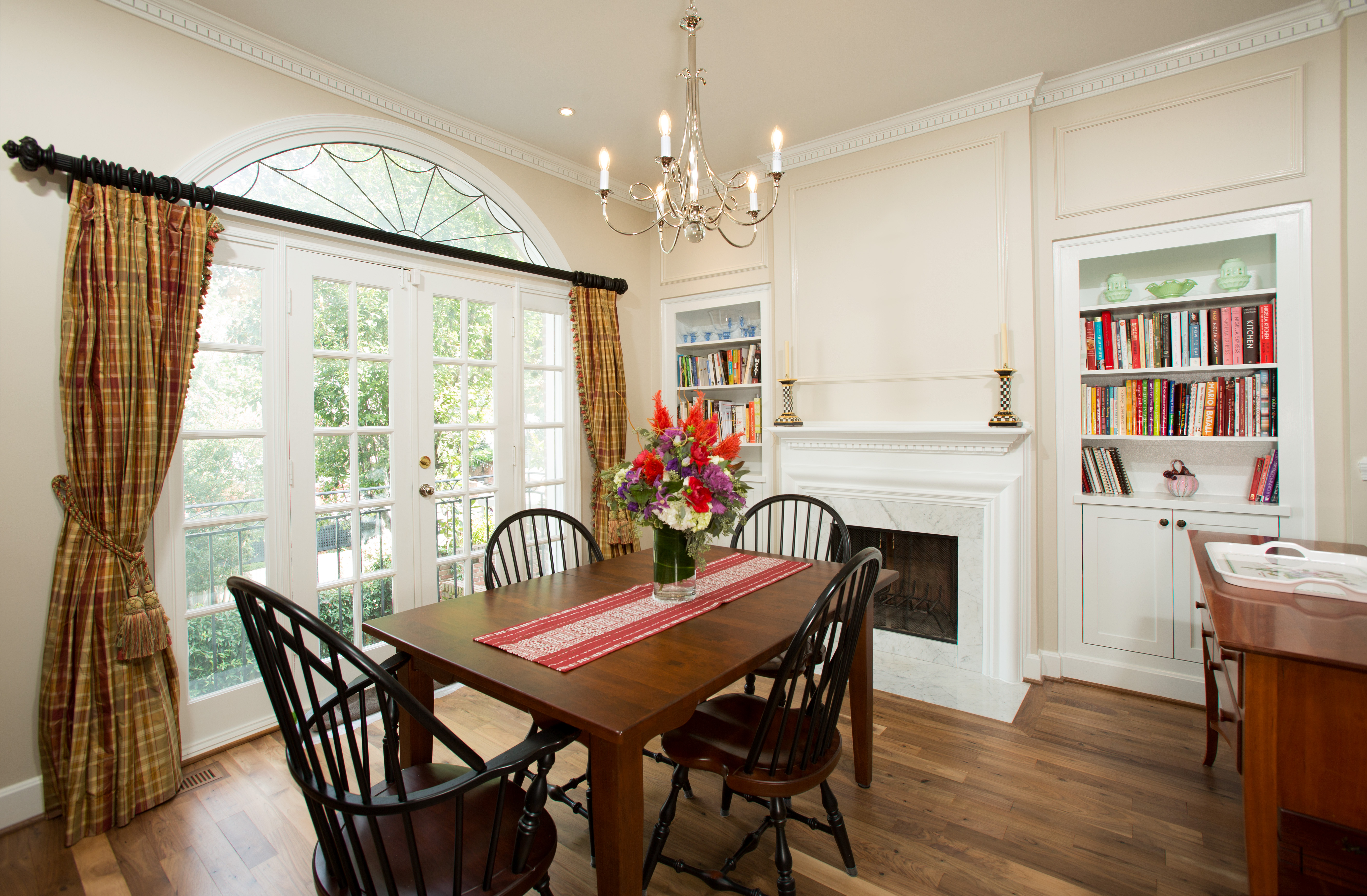
As a starting point, Sun Design’s Craig Durosko proposed “swapping-out” the existing living room and dining room, which offered a higher ceiling and a beautiful floor-to-ceiling window wall.
By John Byrd
When does a townhome become dated? The answer is subjective. But forty years is a long time in the life cycle for a style preference. And it’s not simply that surfaces become tired, or that formerly sparkling appliances are now anachronisms.
The bigger point: the home’s best assets are not being presented in bold relief. What you have you have seen so often that it’s invisible. The impulse is to renew — and not just the house, but your enjoyment of it. It’s a situation that calls for new thinking, and a new era.
Such are the motivations behind many a modern makeover, says Craig Durosko, founder and chairman of Sun Design Remodeling, and the skilled professional who guided the 1,575 square foot town home from vague proposal to the gleaming showplace the public had an opportunity to view first hand late last year.
Located at 417 Pitt Mews in Alexandria, the Colonial-style townhouse has been owned by Steven and Mary Rushen since 2006. The recently executed top-to-bottom makeover incorporates a fully renovated kitchen with walk-in pantry, a master bedroom suite with an enlarged master bathroom, and a completely re-invented living room/ dining room with enhanced built-ins and a stunning view of Alexandria’s Old Town district.
“This is an exceptional transformation,” Durosko says, pointing to the redesigned second level great room, the significantly upgraded master suite, four remodeled bathrooms and the newly-appointed kitchen with walk-in pantry. “The ideas implemented here respond to a broad range of owner requirements, and the interior design is eye-catching on every floor.”
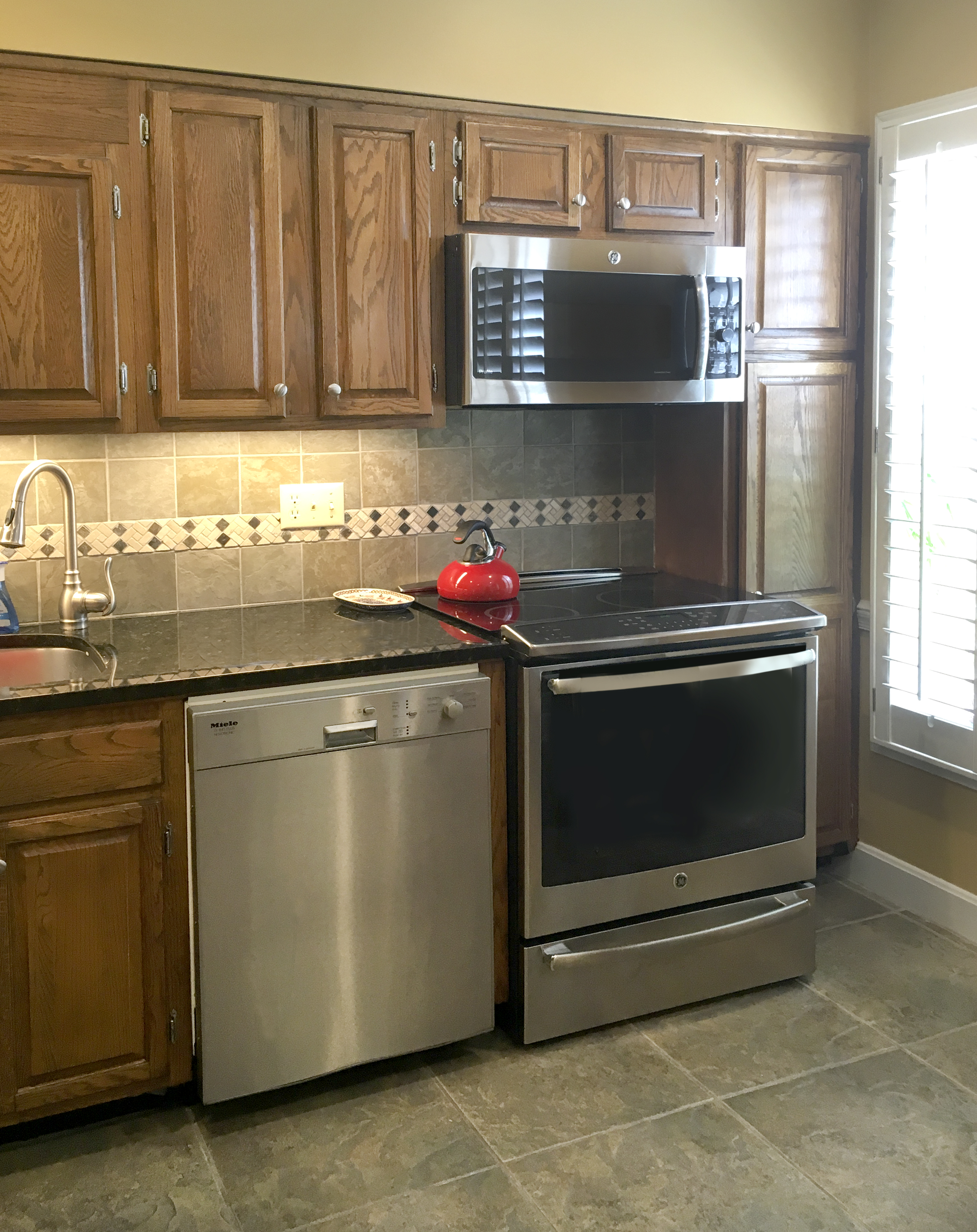
Kitchen BEFORE
“We’ve learned how our Open Houses can serve the community,” says Sun Design president Bob Gallagher, who grew up in Clifton. “Homeowners enjoy seeing what their neighbors are doing to improve their homes, but they’re also happy to help less fortunate people around them.”
To simplify the food donation process this years, CCDA will have a van near the Open House all day.
Meanwhile visitors searching for remodeling ideas will find fresh design concepts and space plan innovations throughout the Rushen residence.
“This is an exceptional transformation,” Durosko says, pointing to the redesigned second level great room, the significantly upgraded master suite, four remodeled bathrooms and the newly-appointed kitchen with walk-in pantry. “The ideas implemented here respond to a broad range of owner requirements, and the interior design is eye-catching on every floor.”
Where did it all begin?
Looking back, Mary Rushen says the couple started thinking about remodeling the day they moved into the house eleven years ago:
 “Steve and I had been commuting to our jobs in the District from Fredericksburg, and wanted to live closer-in. Since the Fredericksburg house was about 1,000 feet larger, we immediately began looking for ways to make the new house feel larger, more functional and more personal.”
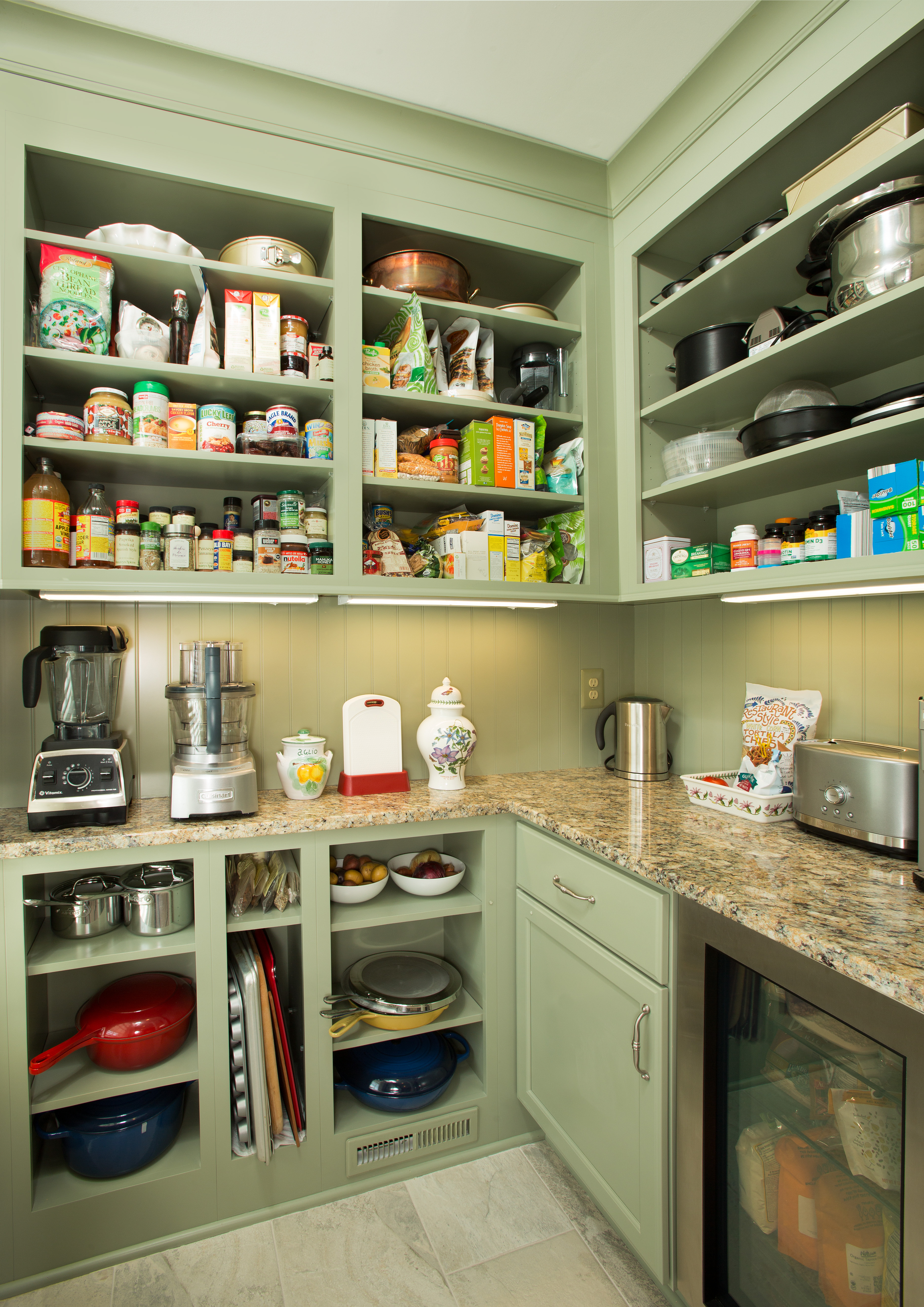
Homeowner Mary Rushen says she got ideas for the pantry’s design by studying photos of Julia Child’s kitchen. A beadboard backsplash painted in Tarragon matte evokes late Victorian elegance. There’s a small refrigerator below a marble surface. Custom cubbies accommodate sauce pans and baking tins. Under counter lights provide illumination.
Some of shortcomings included:
• Outdated surfaces, flooring, wall coverings and fixtures throughout;
• Restricted kitchen storage, no cutting-edge appliances;
• An open living room/ dining room that did not provide an out-of-the-way spot for the television;
• A master bathroom with only one sink and a small shower;
• A master bedroom short on personal storage considerations;
• A poorly-conceived first level laundry;
• A top-to-bottom stair case handrail intermittently disrupted by vertical columns that made moving between floors potentially hazardous.
• Overall: uninspired, lifeless, and dull interior elevations;
In the big picture, the Rushens envisioned incremental improvements with lively well-differentiated focal points. Some spatial reconfiguration was called-for where feasible.
“But our requirements were all over the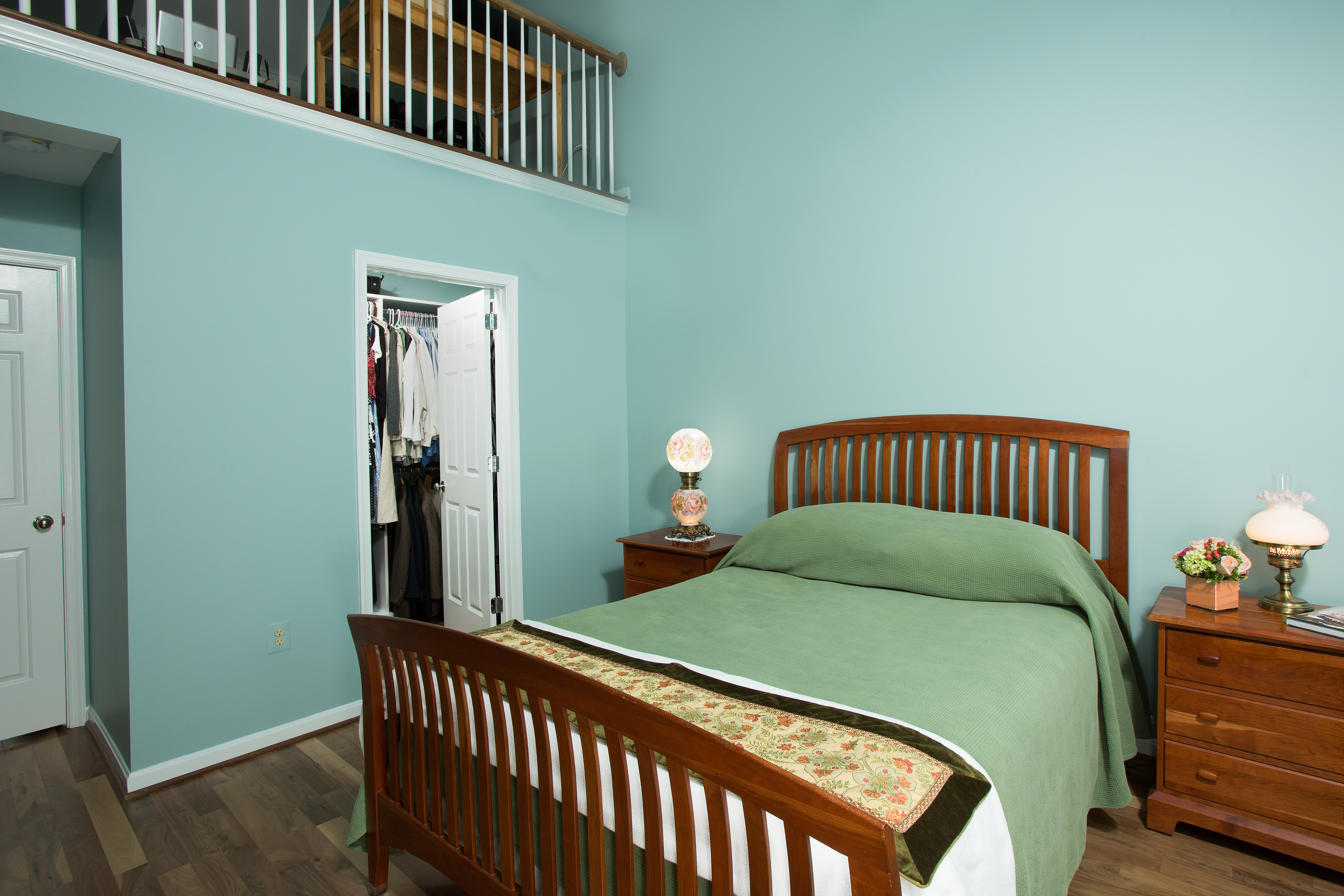 house,” Mary recalls, “and we didn’t have a clear idea what changes would work, or how they should interact.”
Working closely with the owners, specialty designer Morgan Hutchinson developed a top-to-bottom color scheme for the entire townhouse. Here “wedgewood gray” wall paint provides distinctive highlights. Morgan is now assisting Mary with furniture selection.
Moreover, several contractors contacted seemed reluctant to take on the project’s scope and design ambitions.
“We had the sense that the combination of answers we wanted—small space solutions and seasoned interior design counsel– was more than most contractors wanted to handle. Fortunately, we visited a Sun Design open house during this period.”
Enter Craig Durosko:
“The first time I looked at the Rushen’s house Mary pointed out that there wasn’t a discrete place for a television anywhere in the great room. The existing set was actually in front of a beautiful floor-to-ceiling window wall and really disrupted the privacy of other gathering zones.”
Durosko’s proposal: swap-out the living room and dining room.
“This made immediate sense to us,” Mary recalls. “With the television gone, we could conceptualize a much bolder treatment for the dining room where the ceiling is actually a foot higher.”
 To sharpen the symmetry, Sun Design created custom cabinet doors at the bottom of the existing open bookcases and trimmed the tops with new valances. The chandelier has been re-located the new dining room.
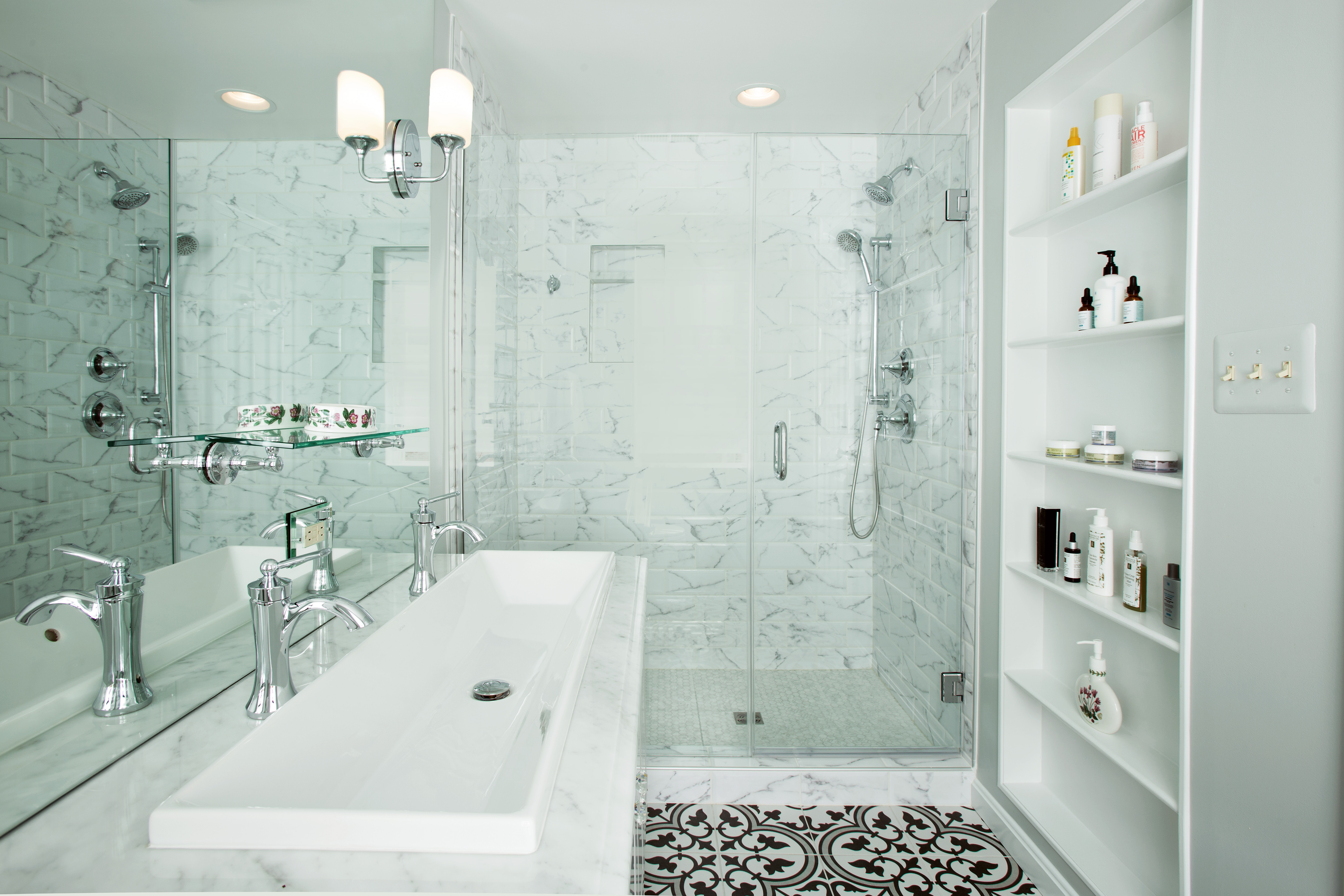
To create a more functional vanity in a room that previously had space for a single basin, designers proposed a two-faucet “trough-sink” custom-made in Italy. It’s a space-saver, but also a “big improvement,” Mary says.
By mounting the new plasma TV on the wall between former dining room and the kitchen, an informal viewing area has been formed– away from the dining zone.
“It’s like a completely separate room,” Mary says.
To better rationalize the kitchen, Sun Design formed 25 square feet of the L-shaped kitchen footprint into a retro-style pantry with open shelves. Mary Rushen says she got ideas for the pantry’s design by studying photos of Julia Child’s kitchen. A beadboard backsplash painted in Tarragon matte evokes late Victorian elegance. There’s a small refrigerator below a marble surface. Custom cubbies accommodate sauce pans and baking tins. Under counter lights provide illumination.
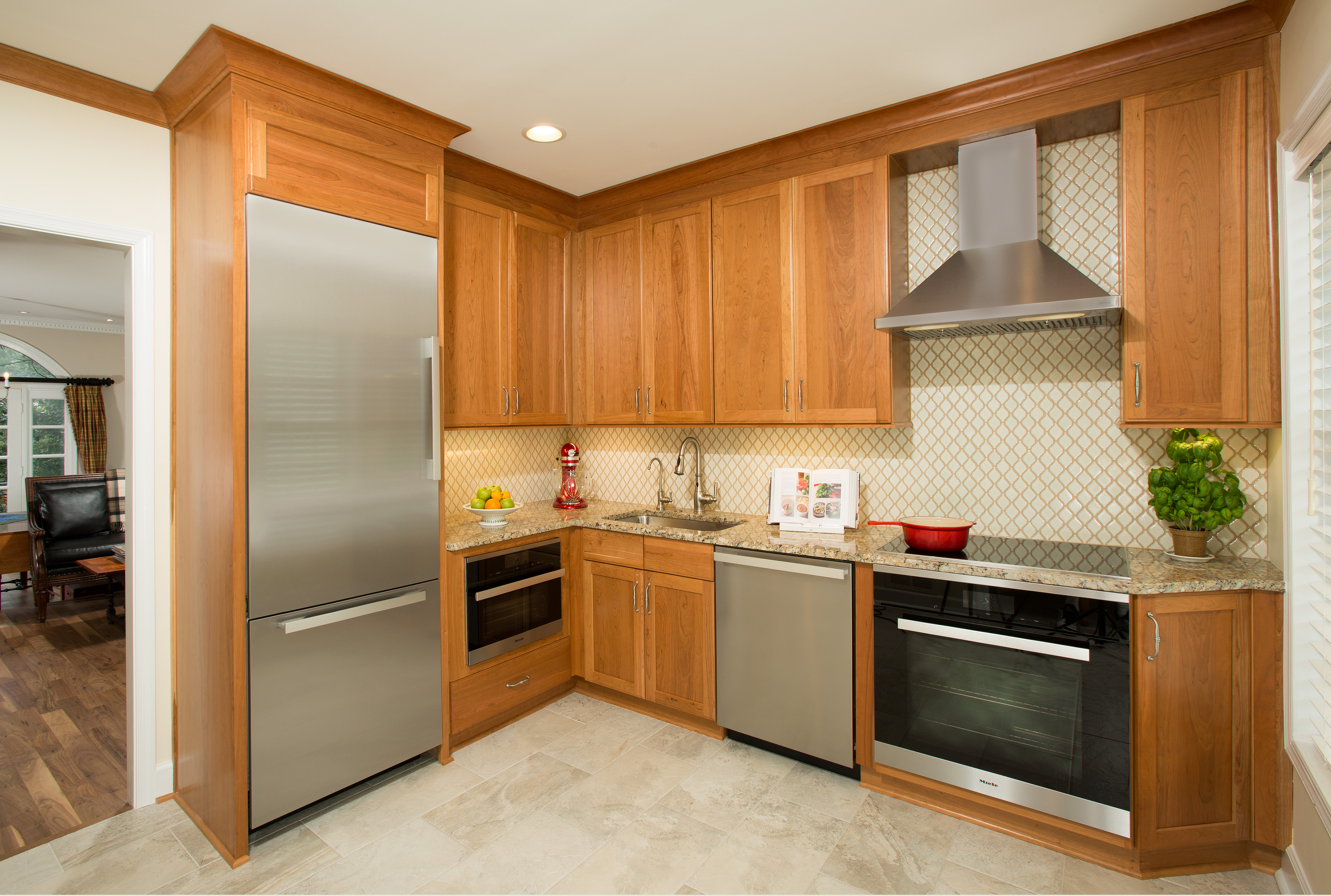
The kitchen itself has been handsomely re-made. Cherrywood Shaker-style cabinet facings and a stainless-steel refrigerator and cook top hood are key components in a simple palette that presents a warmly understated ambiance. Gallo Napolean granite surfaces and an Arabesque mosaic tile backsplash add lively accents.
 More problematic was installing a Miele steam and convection oven the couple had seen in a Sun Design Open House.
“We were worried that the plumbers and electricians wouldn’t know what to do with it,” Mary says. “Fortunately, Sun Design coordinated everything with manufacturer, working directly with the installer. Their expertise on this was invaluable.”
In the master bedroom, a pair of closets with bi-fold doors had proven inadequate for the couple’s wardrobe needs. But borrowing just three linear feet of bedroom floorspace, transformed one closet into a foot print for the 40 square foot walk-in affair the couple now share.
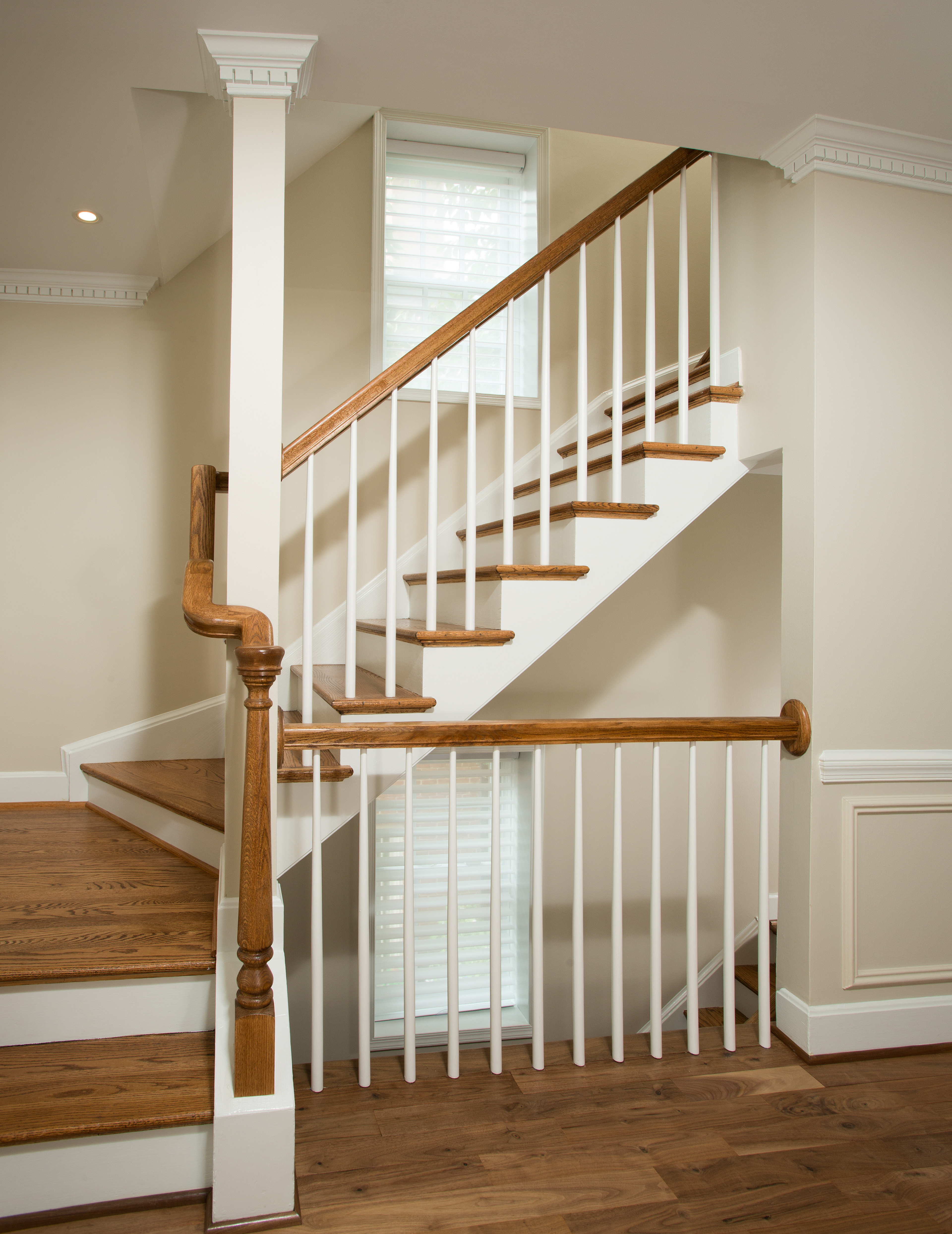
The new “continuous” hand railing eliminates the need for vertical posts; it’s a safety improvement that’s also more aesthetically appealing.
Deleting the unneeded second closet provided square footage needed for an enlarged master bath that now includes a 5′ x 3.5′ frameless glass shower complete with marble bench and hand-held nozzles.
To create a more functional vanity in a room that had only allowed one basin, Sun Design proposed a two-faucet “trough-sink” custom-made in Italy. It’s a space-saver, but also a “big improvement,” Mary says, “in a far more comfortable room.”
For ambiance: artic grey mosaic tile shower walls evoke a softly neutral tone. Meanwhile, black and white tile flooring in a fleur de lis pattern provides a striking visual element just underfoot.
Here, and throughout the house, Mary worked closely with lead designer Katie Coram and specialty designer Morgan Hutchinson in developing the home’s stand-out finishwork.
“Katie would present floor plan options on a CADD system, which made it easy to adjust and explore ideas. Morgan (who is now assisting Mary with furniture selection) provided superb guidance in color selection—which is what really distinguishes much of the house.”
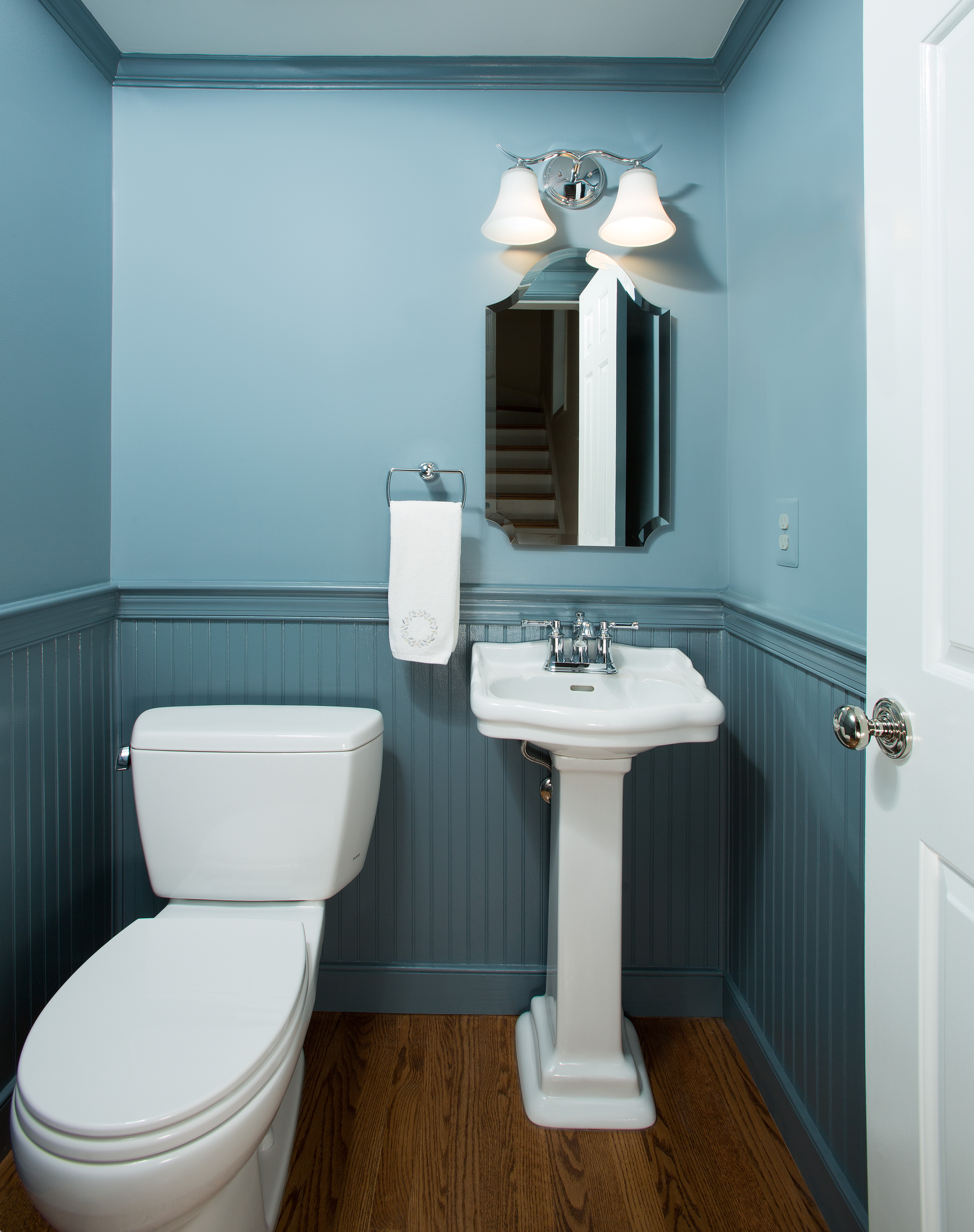 The Edgecomb gray in the entrance foyer, for instance, brightens up an entrance that had previously lacked warmth. The Hancock green color treatment in the guest bathroom and the Amsterdam wainscoting in the powder room are, likewise, players in a pageant of color and tones explored on every level of the house.
Flat ceiling paint and glossy trim style paint in formal gathering areas help to articulate corners and edges.
Pedestal sink, beadboard wainscoting and a color scheme that combines an Amsterdam blue with a Montpelier glossy trim style paint are among the elements differentiating the small powder room.
But perhaps most striking of all is the new “continuous” hand railing, which both safety measure and much m,ore aesthetically appealing.
“People who visit our house on this tour will see what’s possible in town house living today,” Mary says. “We’re very pleased with how it all came together, and hope visitors will enjoy the tour.”
For Information RE the open house visit www.SunDesignInc/events.
Headquartered in Burke, the Sun Design Remodeling has a second office in McLean. FOR INFORMATION: 703.425.5588 or www.SunDesignInc.com
John Byrd has been writing about home improvement for 30 years. He can be reached @ 703/715-8006, www.HomeFrontsNews.com or byrdmatx@gmail.com

