Master Bath as Personal Retreat
Stand-out interior design, precise space plans characterize a Michael Nash award-winning bathroom
By John Byrd
“There is no one style associated with the bathrooms we design,” says Michael Nash founder and CEO, Sonny Nazemian. “ We have been actively engaged in creating bathrooms of every size and design language for over 25 years, and have won more awards for our work in this part of the house than any other local contractor.”
“Every aspect of our business– the showroom, the talent pool– is aimed at making it easier for the homeowner to gravitate towards what pleases them personally, and to make informed design decisions they will enjoy long into the future.”
On this point, the veteran remodeler has long concentrated on keeping his client’s costs down. There are broad finishwork allowances within fixed price packages. All the labor is performed by Michael Nash employees. There are seldom change-orders.
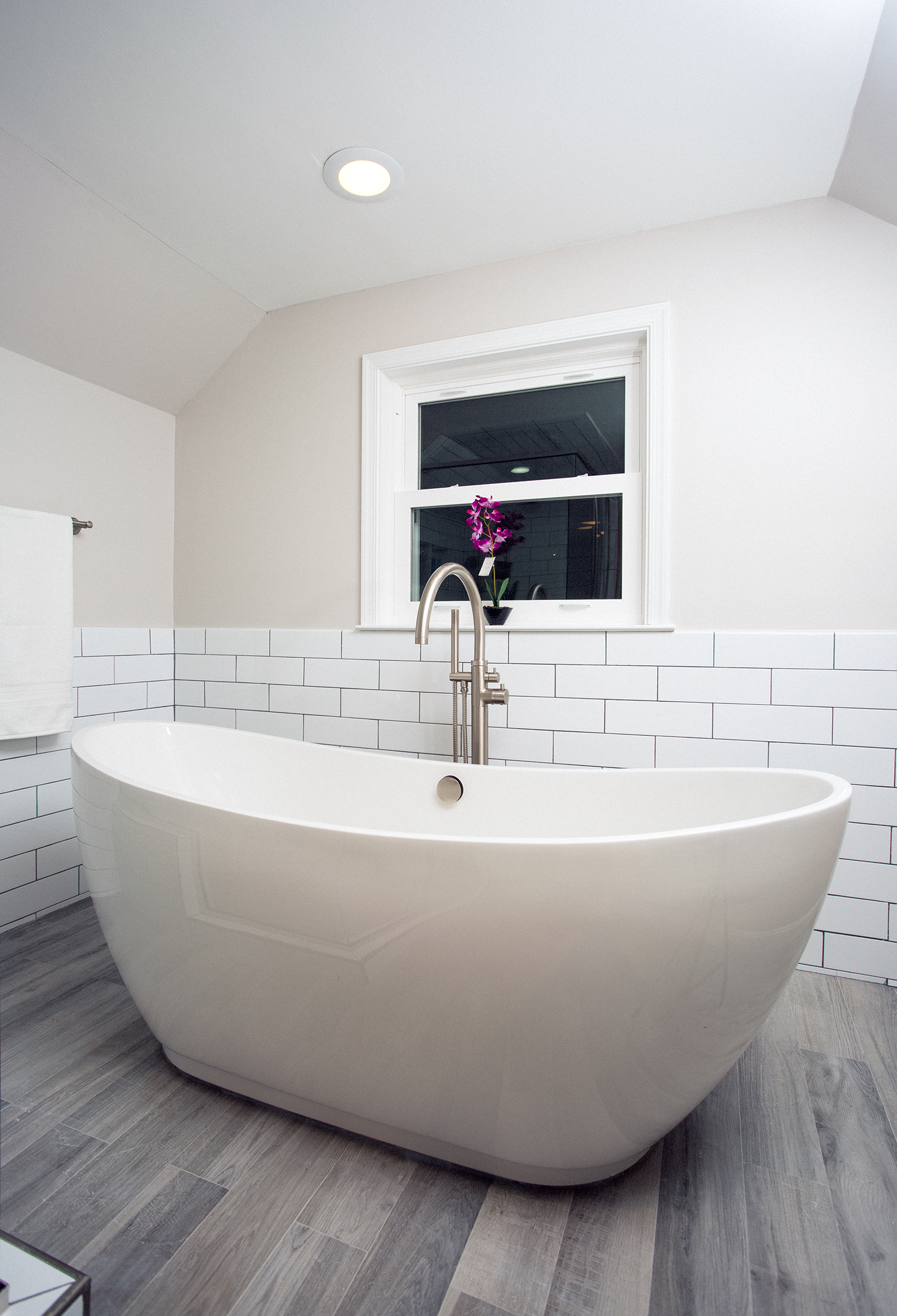
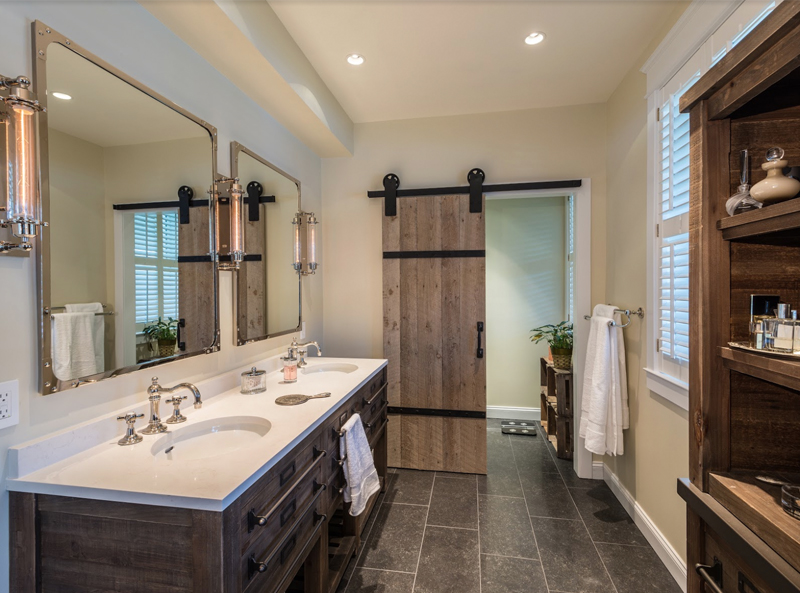
To form a niche for the soaking tub, the remodeler flattened-off the ceiling in the middle of the room. A new windowed gable on the north side of the house invites plenty of natural light.
Yet, despite these scrupulous controls, what stands out is the diversity of the bathrooms Michael Nash introduces into older homes. Space challenges few would consider taking-on resolved with ingenuity and clever engineering solutions. A portfolio that boasts the widest-ranging interior design vocabulary in the industy.
Three recent master bathrooms illustrate the firm’s mastery of the most remodeled room in any home.
Master bath formed in attic provides essential space solution for young family
Looking back, the makeover in the home of Andrew and Meghan Matteson began to take shape as a “possibility” shortly after the couple moved in with two small children four years ago.
“We really liked the neighborhood. But the house had limitations we hoped to overcome through remodeling, “ Meghan Matteson recalls. “Frankly, we weren’t sure what was feasible.”
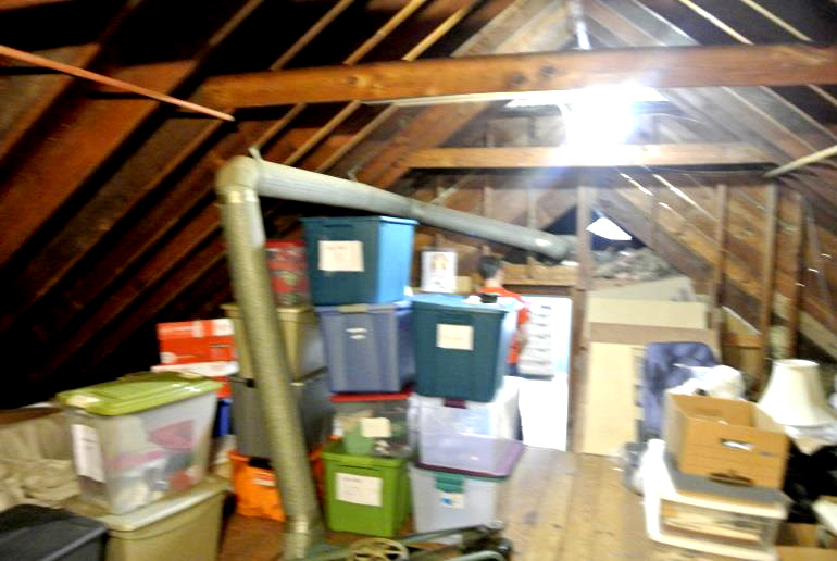
Speculating, an unfinished attic five steps further up from the top room seemed to offered some potentials as the footprint for a new master bath. However, most of floor space was taken up by an attic fan and flue pipes.
“We had spoken to several contractors…but didn’t hear ideas that gave us confidence,” Meghan recalls.
“There were several glaring problems,” Nazemian recalls. “The existing floor joists were too small to hold any additional weight. The pipe linkages needed for water and waste were down in the basement. There was no natural light, no heat source. Flue pipes occupied a lot of the mid room.”
Still, 700 square feet just at the top of the stair offered a perfect spot for a wardrobe and changing area that would free-up additional square footage in the sleeping quarters. Laying out the new floor plan sequentially, the attic’s remaining 176′ x 106′ footprint might just suit for a comfortable spa bathroom– if the plumbing problem could be solved.
From the start, two issues begged careful consideration: first, the capacity of existing floor joists to bear the weight of a generously “loaded” spa bath; secondly, the feasibility of routing water and sewage pipes to the targeted site.
On the first point: the attic had never been conceived as living space. The floor joists were undersized. To move around, one had to tip-toe gingerly; a heavy tub or shower was unthinkable.
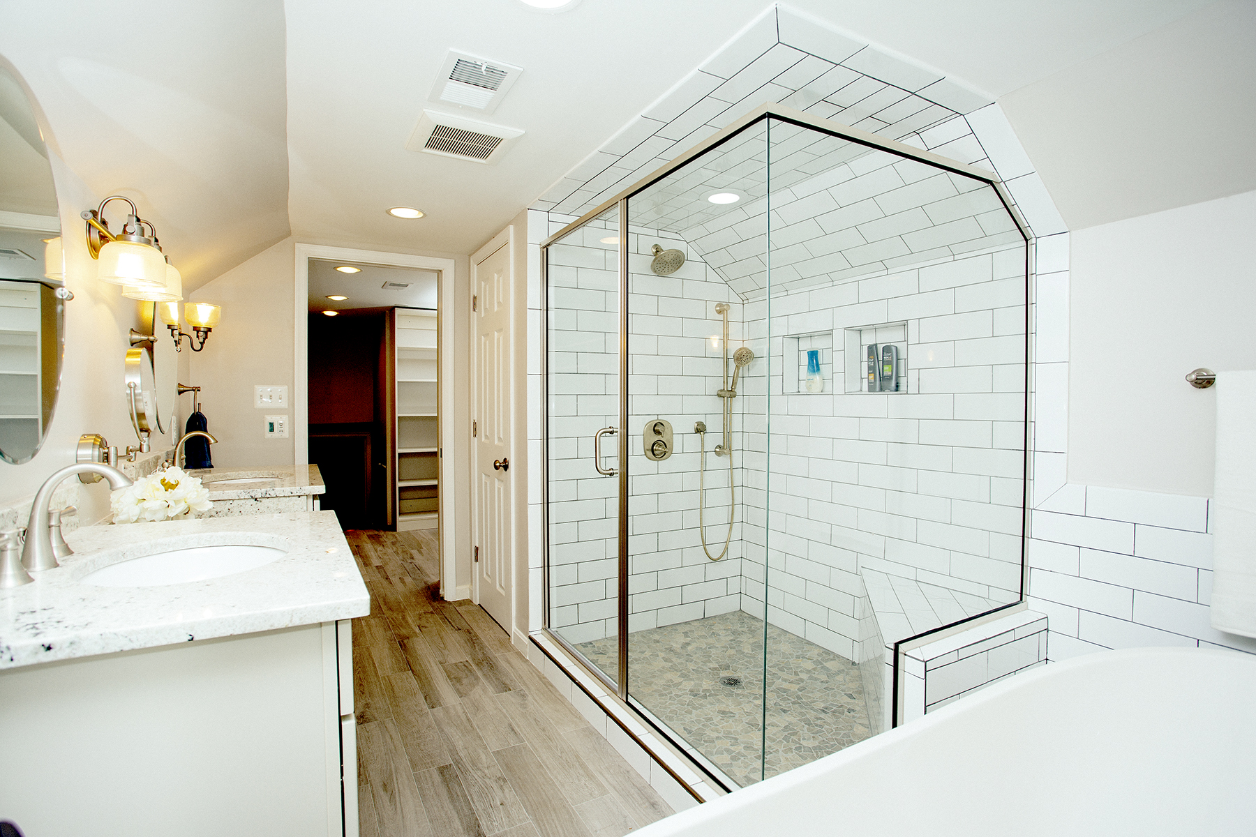
To help owners of a 60 year old Fort Hunt home gain a new master bedroom, Michael Nash transformed an adjacent (but very cluttered) attic space into a comfortable spa bath. A large walk-in shower with glass partitions and riverstone flooring wrapped in bright white subway tiling adds to the sense of spaciousness. Each partner has their own recessed cubby for toiletries.
“Our stating point was calculating new load bearing requirements based on the Matteson’s preferences for tub and showers; then we removed the floorboards and introduced “sister” joists to the existing system,” Nazemian explains “This more than tripled the room’s weight-bearing capacity, and created a lot of luxury purchase options.”
Linkage to water and sewer mains was another matter, as Nazemian recalls:
“Turns out we had to go all the way to the basement to tap into the main sewage line. All the plumbing and electrical were routed within existing perimeter walls. If there’s a place where remodeling must perform a kind of artful magic, it’s concealing infrastructure in ways that can’t be detected by the naked eye.”
Yet the resulting space plan formed two main chambers organized sequentially. Sixty-six square feet at the top of the stair was designed for his and her wardrobe needs. There are custom-sized shelves for sweaters, shoes, personal items. Better yet, it’s a well-lighted space with ample room to move around.
Continuing on, the new master bath now has plenty natural light courtesy of a windowed gable Nazemian introduced on the north side of the house. Since this is the point where power lines connected to the house, the transition to the new design entailed considerable interface with the electric company.
In maximizing spatial utility within a 100 square perimeter, Nazemian flattened off the ceiling in the middle of the room, then shelled-in a beveled slope that meets the walls where they are again completely vertical.
The design makes the most of available headroom, creating a recess for the vanities and wall mirrors. The “wood look” long-plank flooring in conjunction with the beige wall coloring further softens the room’s angularity. The floor covering also conceals a “radiant” system that makes it easy to adjust room temperatures.
A large walk-in shower with glass partitions and riverstone flooring wrapped in bright white subway tiling adds to the sense of spaciousness. Each partner has their own recessed cubby for toiletries.
His and Her vanities joined by a make-up table were designed specifically to accommodate daily needs. When the busy family schedule allows a little more indulgence, there’s the soaking tub.
“You can’t measure the improvements that have come from this remodeling in square footage,” Meghan says. “Functionally, it’s a whole new level of the house that gives the whole family a lot more usable room. The life enhancement value has been enormous.”
Retirees Get their Tropical Cocoon At Last
Meanwhile, in neighboring Chantilly, retirees Frederick and Dawn Febo decided last year to remodel their nearly 30 year old bathroom.
“We may be here for another ten years,” Dawn explains, “but we thought– if we’re going to remodel anyway, why not create something we can really enjoy?”
It was during this phase that Dawn wandered into the Michael Nash showroom on Lee Highway room and saw a bathroom display featuring stacked ledger stone.
“We hit it off immediately,” Dawn says of her meeting with Nazemian, “I was looking for a creative thinker to help me develop ideas; once I talked to Sonny there was no need to look further.”
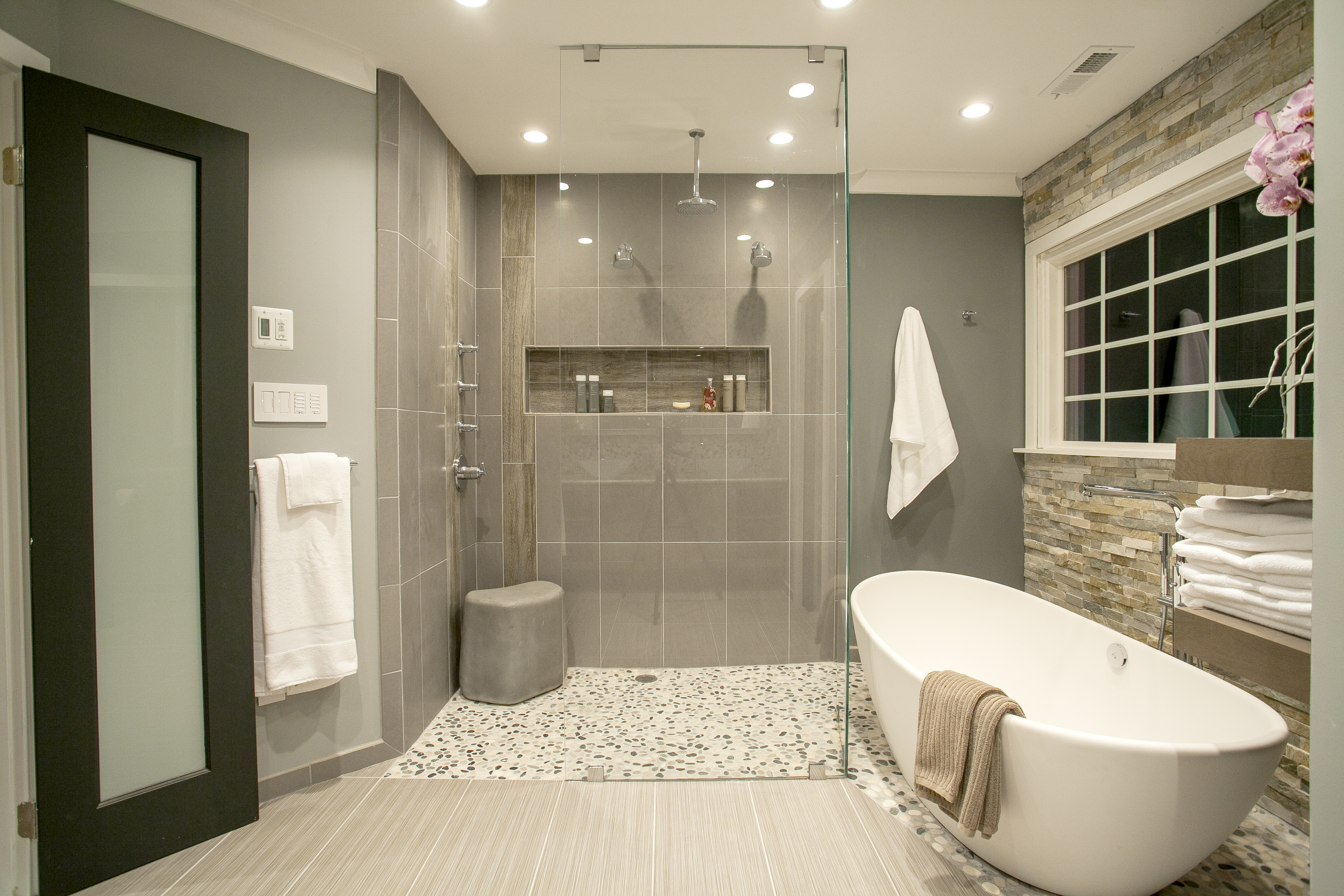
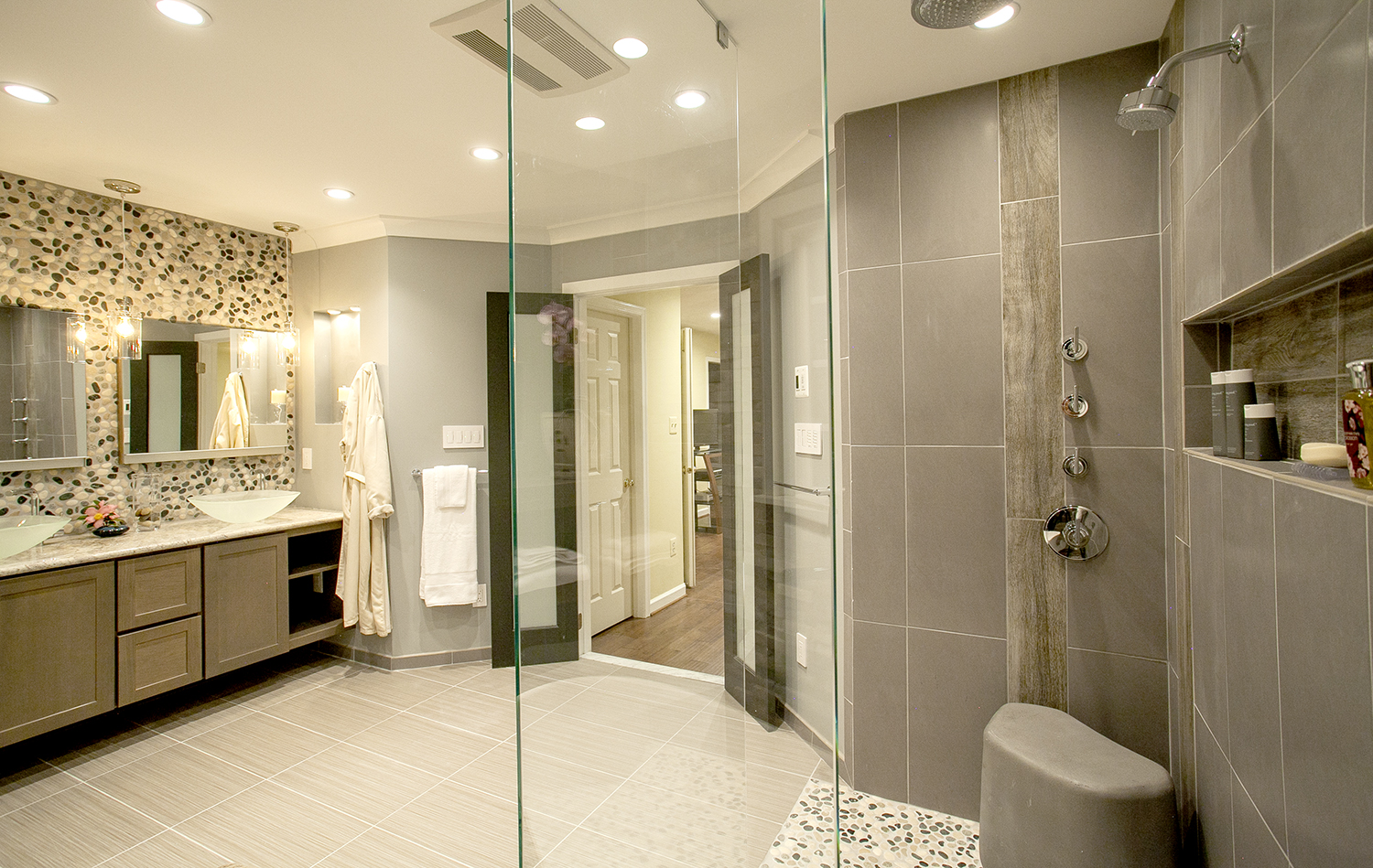
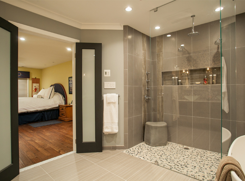
French doors with frosted glass separate the Febo’s new spa bath from the master bedroom. The interior design artfully balances textured surfaces, glass walls and a subtle interplay of colors and tones.
The overarching question for Febo was: how do you transform a dated “tract house” plan into something adventurously free-flowing while staying within the bathroom’s existing footprint?
“For starters, we wanted to replace the old shower with a walk-in design that wouldn’t require a built-in curb to keep the water in, but weren’t sure if this was even feasible,” she recalls.
Fortunately, in bathroom design inches can make a difference.
“We raised the floor about an inch, so that the shower is lower than before” Nazemian says, “The floor bevels slightly toward the drain, so there’s no need for a built-in lip around the shower.”
Ensconced behind two floor-to-ceiling glass walls, the 4′ x4′ open shower sits on smooth river rock flooring that connects it visually to a freestanding pedestal tub. Both bathing options are accessible from two sides. (You can shower– then treat yourself to a relaxing soak.)
The shower’s inside wall is understated granite with cubbies for personal items; the wall behind the tub was constructed out of golden honey ledger stone.
Nearby, there’s a two-plank dangling shelf designed for towels.
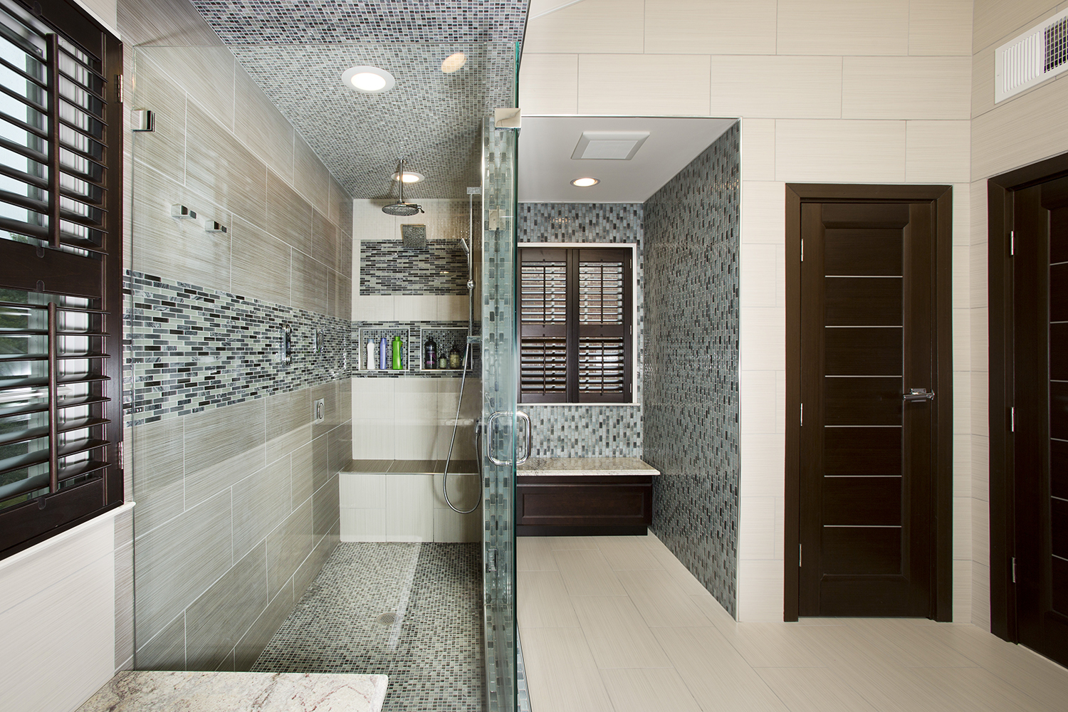
The Tran and Lin spa bath features an economical space plan with thoughtfully contrasted colors and textures. The green and blue glass wallcovering evokes cascading water; beige grass-pattern tiling draws the eye upwards into the cathedral ceiling. Solid mahogany woodwork re-balances the whole.
The riverstone abuts the bathroom’s main flooring: gray and tan porcelain tile– which picks up colors in the stacked stone behind the tub and in the vanity’s backsplash and custom-designed base.
“The effect is like shimmering light” Dawn says. “Everything is pleasingly accentuated, yet well-ordered and tranquil. A beautiful place to relax”
Bright and Comfortable…With Asian Accents
In Fairfax, Bruce Tran wanted a better space plan, but also an interior design that would express his family’s Asian sensibilities.
“We were tired of our bathroom’s basic vanilla décor,” he says. “The narrow shower; the cramped quarters. As a practical consideration, we knew we could gain floorspace by eliminating our mostly unused Jacuzzi. But then what?”
In fact, it wasn’t until Tran’s sister hired Michael Nash to execute a distinctly Asian-influenced interior for her home that Tran and his wife Terri Lin began to push forward with their own makeover.
“We had certain ideas when the research began– but needed professional guidance,” Tran recalls. “The Michael Nash show room became the place where we could stretch out and explore. Since the facility seems to offer every finish work option, you can take your time uncovering the ideas that you really want to live with.
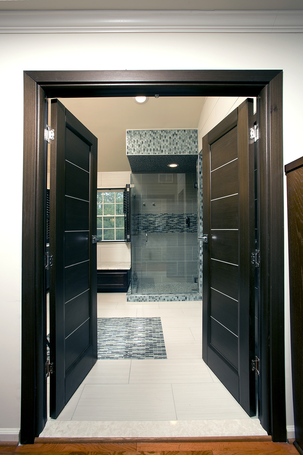
The 8.5′ x 4′ open shower, for instance, sits on multicolor tile flooring that connects it visually to the ceiling and to the brown and tan wall tiling in its soft grass-weave pattern.
There are recessed “cubbies” for personal items. The shower is also equipped with a digital regulator that allows each bather to program-in their preferred water pressure and temperature.
Mahogany doors mounted on a mahogany frame that closes over a marble sill provide bedroom-access to an Asian-influenced spa bath in Fairfax. These finishwork materials are in-play throughout the suite.
Nearby, there’s a custom-designed window seat for towels. Morning light enters here through the half-opened slats of a louvered windows shade.
As a primary color theme, 12”x 24” planks of light beige porcelain tile cover the floor and the rising 12 foot cathedral ceiling, presenting a soft neutral backdrop that perfectly equalizes a wall of blue green glass tile.
“It’s a kind of sand-color. But water is also very important to Asian culture,” Bruce explains.” “We were looking for an interior design that would present the effect of water cascading, and the blue-green glass tile around the shower window seat accomplishes this. Everything is pleasingly accentuated, yet well-ordered and tranquil. A beautiful place to relax”
For Information: 703/641-9800 or MichaelNashKitchens.com
John Byrd has been writing about home improvement for 30 years. He can be reached @ 703/715-8006, HomeFrontsNews.com or byrdmatx@gmail.com

