Bathroom Remodeling in Northern Virginia
A DESIGN SOLUTION AS BIG AS A BARN DOOR
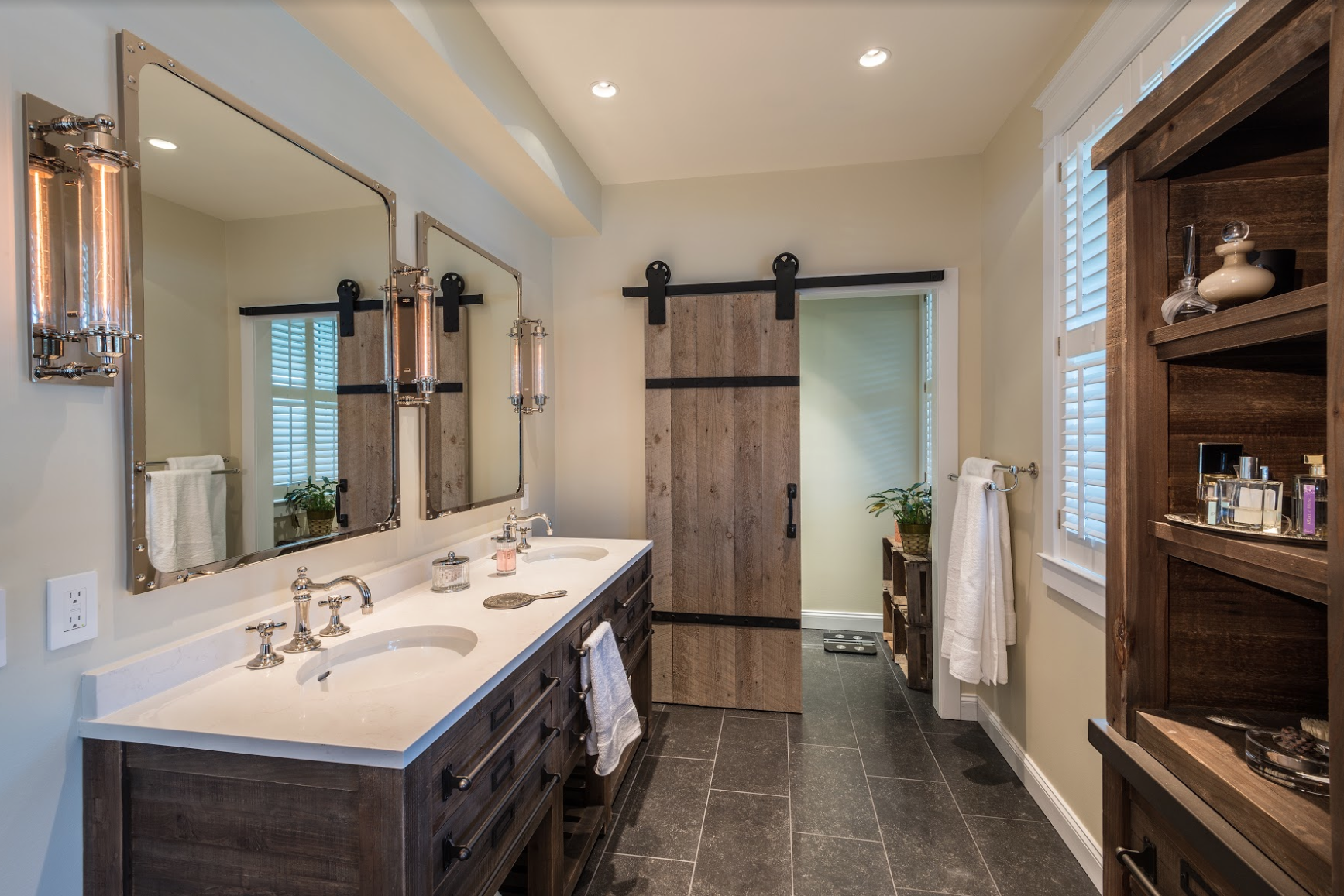
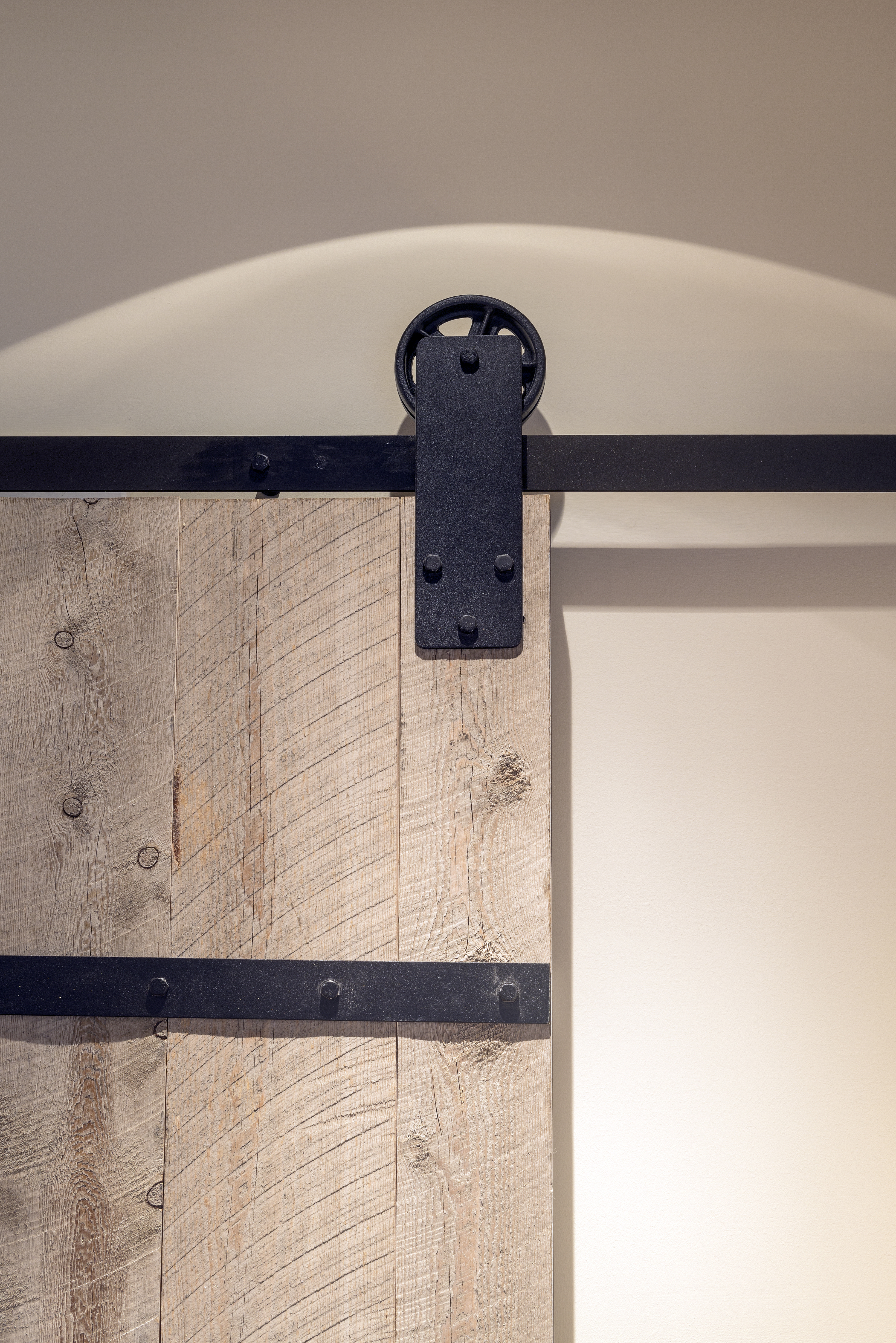
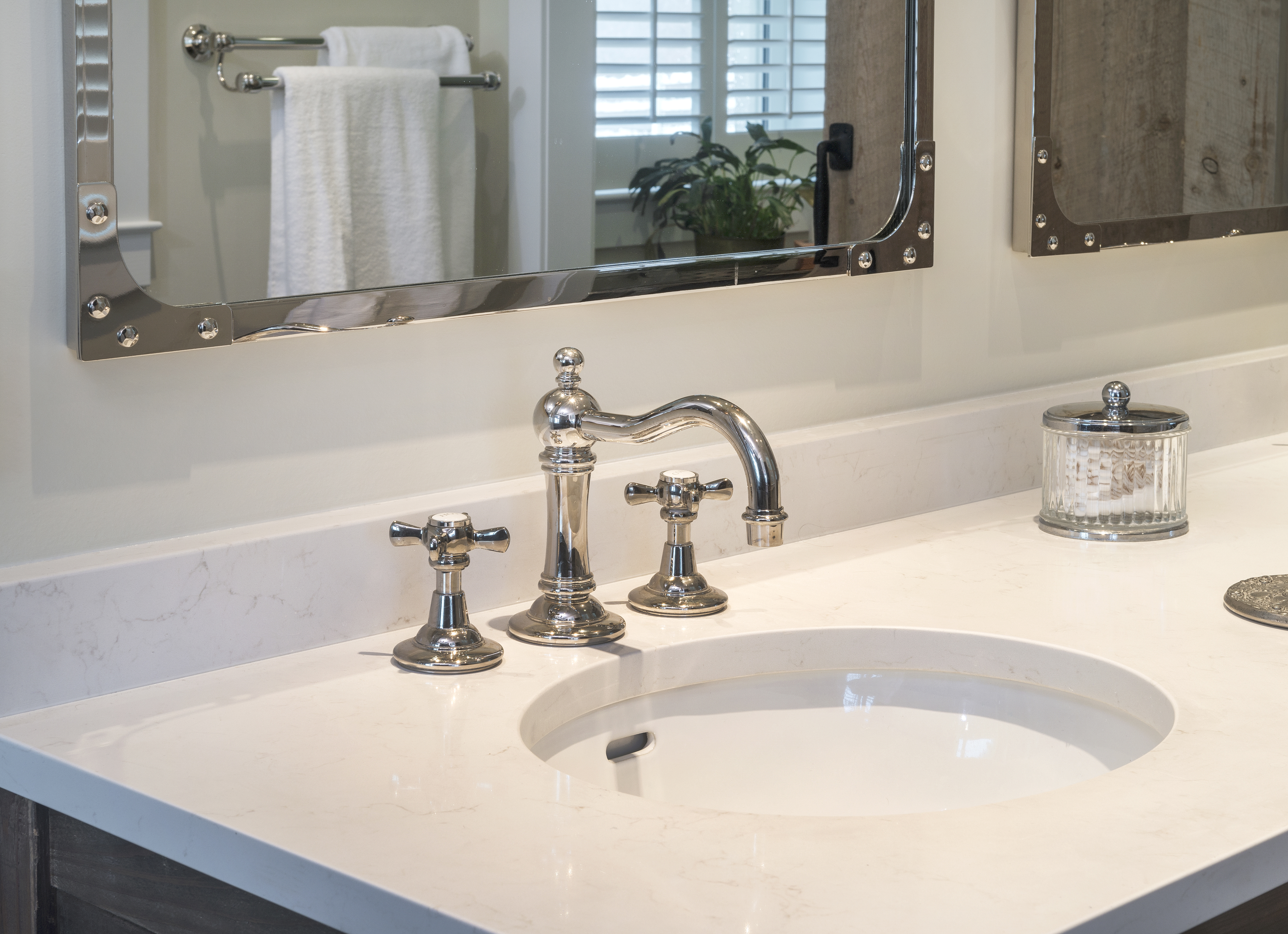
The interior to the new master bath is a study in textural and tonal contrasts. Porcelain tile flooring. Mirrors framed in polished nickel.
Plantation shutters. The door to the commode is reclaimed barn door mounted on antique rollers..
Master Bath Renovation Explores Themes from Great Falls’ Bucolic Past.
By John Byrd
Talk about rustic charm.
In 2007, Bill and Brenda Bosch purchased what boutique remodelers sometimes refer to as a “barn conversion” – specifically, a spacious modern home which, five years earlier, had been constructed inside the exterior of a 1935 diary barn.
With its metal roof, stucco siding and silo, the 5,800 sq ft five bedroom Great Falls residence fairly exuded nostalgic references to the community’s bucolic past. It was an eye-catching testament to the “unique living” credo, and a local landmark. It was offered convenient access to the city and a great place to raise kids.
Getting the house to owner requirements, however, entailed a commitment.
For starters, the second level primary living area (formerly, a hay loft) was too dark and poorly finished, and offered only limited views of the splendid setting through re-purposed skylights. An early renovation effort focused on “gutting” the kitchen, dining room and family room, and introducing a more appropriate glazing solution that included dormer windows in key locations.
More recently, as the children moved on to college, Bill and Brenda began to see the house from an empty-nester’s perspective.
The first level master bathroom was plainly still unacceptable. With its circa 1990s white ceramic tile, tiny vanity and walk-in shower stall, the design was like something out of a builder-grade starter home.
Moreover, at 90 sq ft, it was cramped and pinched, offering no opportunities for such upscale necessities as built-ins for toiletries and towels, a showering option for every whim, unhurried zones to dry-off and re-acclimate, and (especially) a breathtaking view of classic Virginia countryside.
Views, in particular, ranked high on the couple’s wish list.
“We wanted to see our beautiful surroundings from the bed, but this wasn’t feasible,” Bosch recalls.
The problem: the southwest corner of the house where the master suite was located was wrapped around 80-year old post-and-beam supports that held up the second floor. Given the critical structural consideration, the original master bedroom had been configured into an L-shape (sleeping quarters with a sitting room addenda). Moreover, under the existing plan, one entered the bathroom though an equally-size sitting room, an arrangement which Bosch saw as wasted space.
“We wanted to reconfigure the rear corner quadrant of the house to improve both the space plan and the view fields,” Bosch say, “I just wasn’t sure how to do it.”
Enter Chris Arnold of Foster Remodeling Solutions, the firm that had successfully renovated several aspects of a friend’s home over a ten year period.
As Arnold recalls: “We were asked for ideas for a sweeping interior makeover, but nothing could happened without implementing a significant structural change.”
Arnold’s plan: shift second floor loads to an 8” x 17′ steel beam attached to vertical supports concealed behind interior walls. The move would widen available bedroom floorspace by 50 square feet and add another 20 square feet for an upgraded master bathroom.
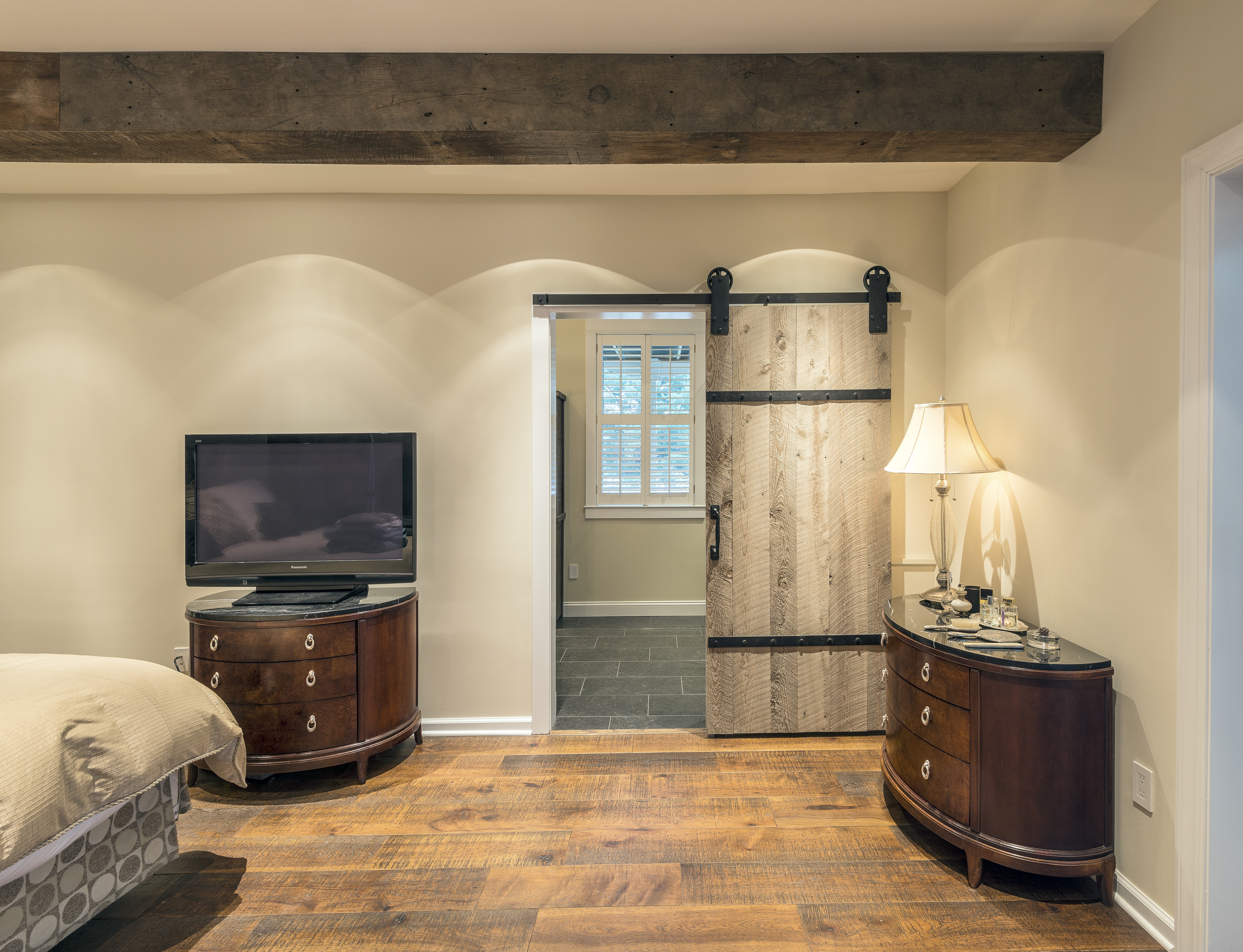
To reinforce the emerging design statement, the exposed steel beam is to be wrapped in reclaimed barn board. The new bedroom flooring is, likewise, made from old barn wood that’s been milled to specification. As a final grace note, one enters the commode via a reclaimed barn door mounted on antique rollers.
With the additional floorspace, the couple’s new king-sized bed is now positioned on a wider interior wall that features a spot-on view of rolling paddocks and grazing horses.
Though augmented by a comparatively modest increase in square footage, the new master bath is, likewise, far more comfortable.
“Brenda and I can occupy the new bathroom at the same time,” Bosch says, “which was difficult before.”
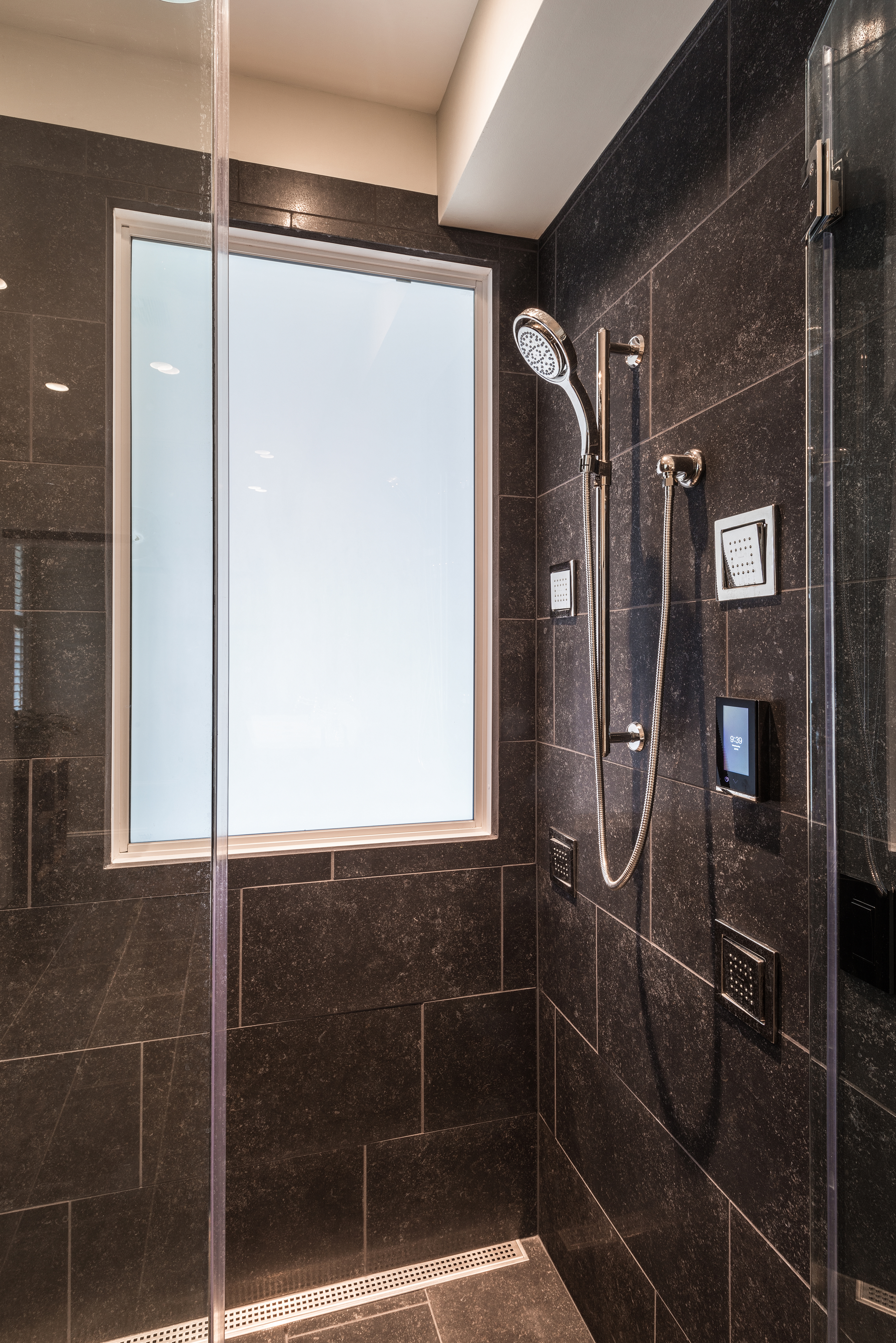
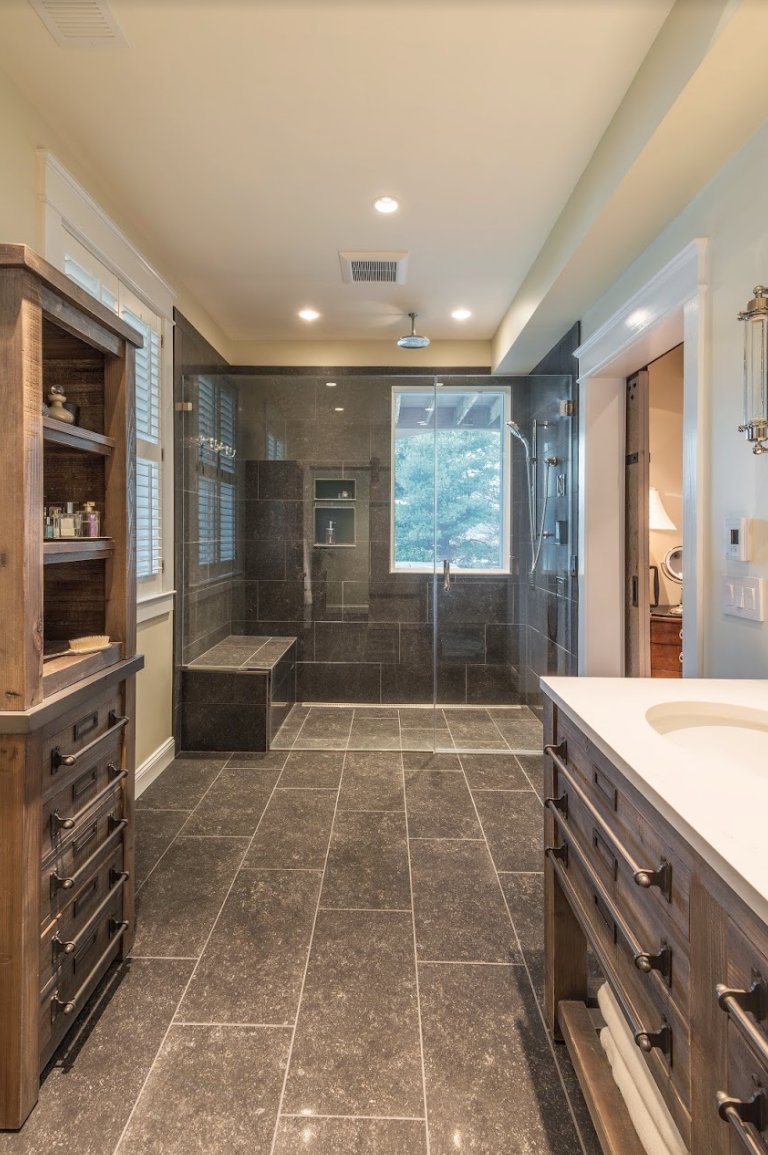
Meanwhile, at 21 square feet, the “curbless” walk-in shower – fitted out with a bench and personal cubbies – boasts many cutting-edge amenities, including a programmable control that remembers each user’s preferred water temperature.
Consistent the broader design goals, the shower now features a window with an adjustable screen that affords a panoramic view of wooded back acreage.
The interior itself is a study in textural and tonal contrasts that reinforces a softly relaxed ambiance.
The porcelain tile flooring – which Arnold found after careful research – is an exact match for natural blue stone. As an added nod to personal comfort, the flooring is heated via electrical coil integrated into the underside of the tile itself.
Other design details, explore themes from the 1930s and earlier. Period cabinetry provides drawers and shelving for towels and personal toiletries. Quartz counter surfaces and mirrors framed in polished nickel help to balance the light and dark contrasts. The scones are early-electric Edison-style replica with an exposed filament.
Foster Remodeling Solutions periodically offers workshops on home remodeling topics. For Information call: 703/550-1371, or www.fosterremodeling.com
_______________________________________________________________________________
John Byrd has been writing about residential architecture, building and remodeling for 30 years. His work has appeared in House Beautiful, Architectural Digest, Southern Living and many national and regional publications. He has also written and produced segments for HGTV and other cable outlets. His work has received numerous Press Association awards for excellence in journalism.
He can be reached at byrdmatx@comcast.net or www.HomeFrontsNews.com
THERAPEUTIC SOLUTIONS
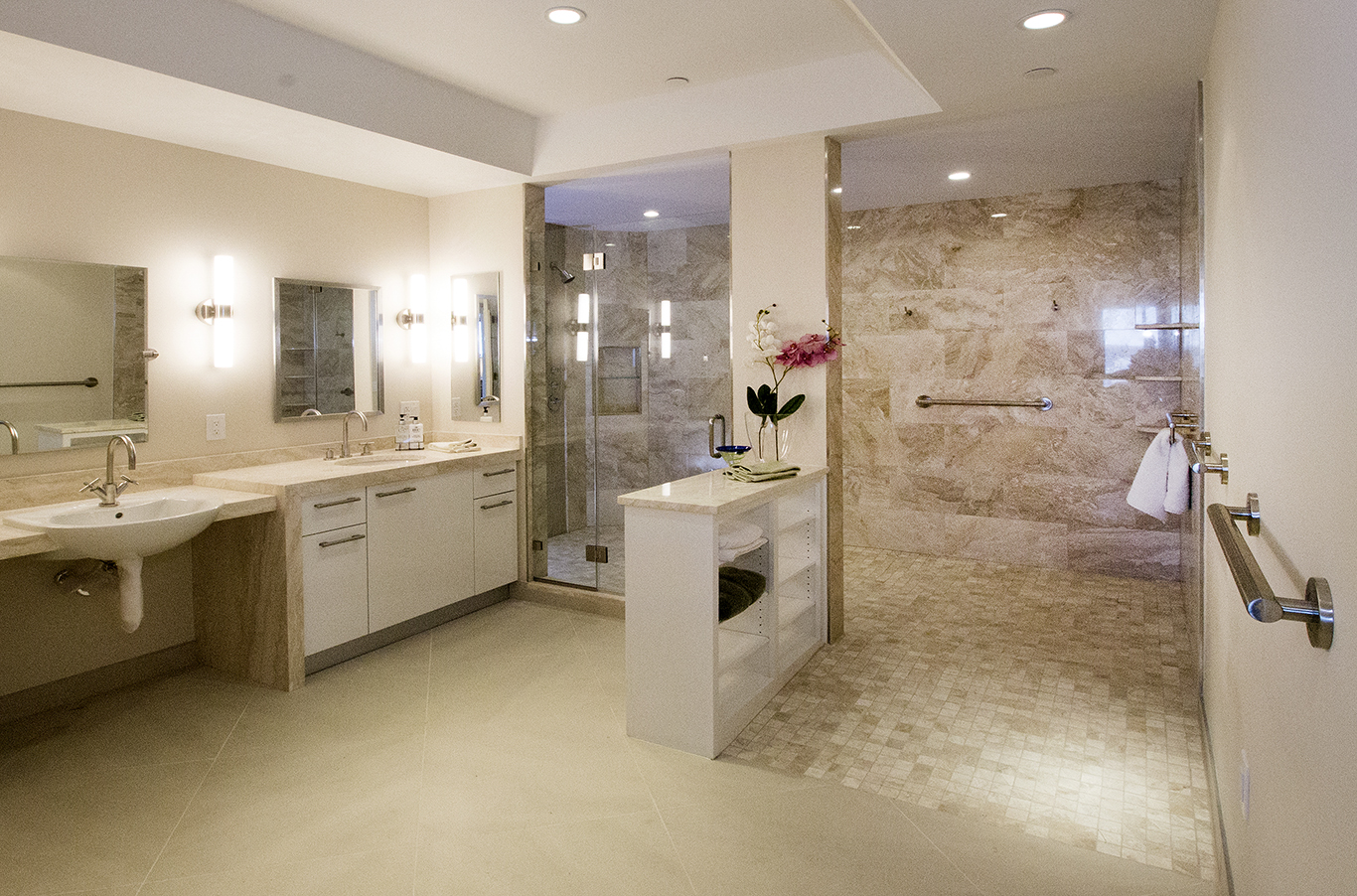
Glickman Design Build converted a traditional bathroom in an Arlington condo into a wheel-chair-friendly spa while the owner was vacationing in Florida. The project won a Chrysalis award for “Best Accessible Bath Design”.
Converting an apartment’s traditional bathroom into a wheel-chair friendly spa.
By John Byrd
Looking at trend lines, it is evident that older homeowners want readily-available therapeutic solutions, even in quarters that might once have been considered too small for larger amenities.
A north Arlington condo dweller struggling with a progressive neuro-degenerative disorder recently decided during a stay Florida that in the time had come to convert his apartment’s traditional bathroom into a wheel-chair friendly spa.
Despite the off-premise challenges, the owner asked Russ Glickman of Glickman design Build to complete the makeover before his return from the sunbelt—a period of about four week.
Experienced with condo build-out requirements, Glickman established the project’s logistical priorities immediately and went to work
Presented with some design option limitations, the remodeler selected finish work details on the owner’s behalf, careful to make choices that could be accommodated within the tight timeline.
The resulting solution was honored with a Chrysalis award for the nation’s “best accessible bath design.” Among the stand-out amenities: a wheel chair accessible shower; a sink and toilet complete with strategically placed grab-bars, skid-proof tiling.
Glickman periodically offers workshops on accessible living and Aging-In-Place topics.
IFOR INFORMATION: see www.GlickmanDesignBuild.com, or call 301/444-4663.
A SPA BATH WITH TROPICAL ACCENTS
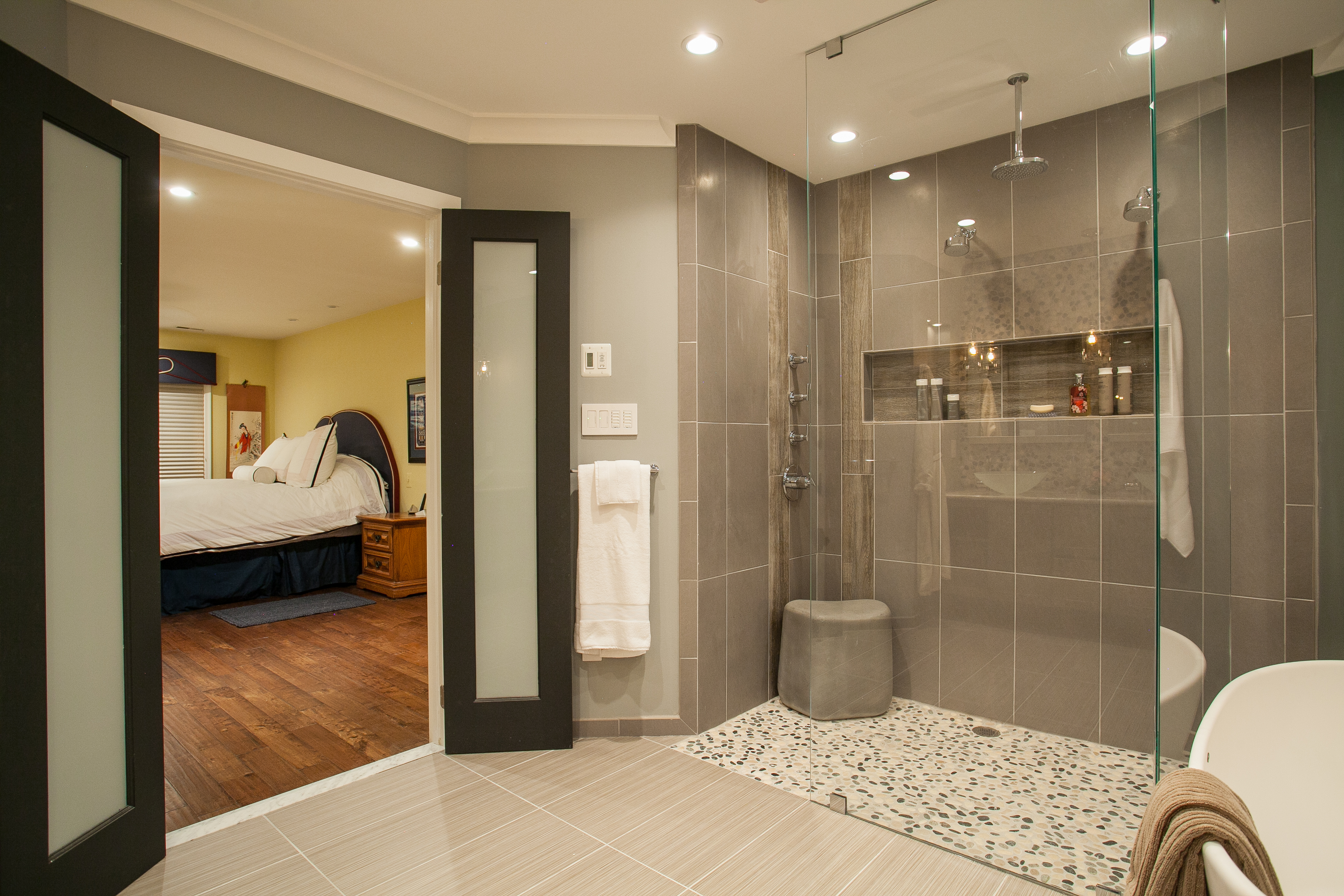
French doors with frosted glass separate the spa from the master bedroom. The spa bath’s interior design carefully balances textured surfaces, glass walls and a subtle interplay of colors and tones.
But No One Loves The Change More Than The Homeowners,
(Who Had Lived With The Old Plan for 28 Years)
By John Byrd
A spacious master bath renovation in a circa 1980’s center hall Colonial has won several peer awards for Michael Nash Design Build and Homes. The recently-completed Chantilly (VA) makeover was named a Gold award winner in the residential bathrooms category ($20,000.00-$50,0000.00) by Professional Remodeler Magazine.
The project has also won a “Best of American Living” Award from the National Association of Homebuilders (NAHB).
The winning interior design successfully converts a 180 square foot builder grade utility bath into an open, free-flowing spa bath. The remodel features a walk-in shower and freestanding pedestal tub artfully situated on river rock flooring. A custom-designed vanity and many original built-ins provide functional accommodations smoothly integrated into an interior that balances textured surfaces, glass walls and a subtle interplay of colors and tones.
Acknowledging the honor, Michael Nash president and CEO Sonny Nazemian, credited his design and production team:
“This is an award about outperforming the limits of a budget, “ Nazemian noted. “Our goal always is to collaborate closely with our clients, finding creative solutions that will help maximize their home improvement investment. This prize tells me we’re doing our job well.”
But for homeowners Frederick and Dawn Febo, who have occupied the four bedroom Colonial for 28 years, the award is also an acknowledgement of their commited research into many interior design considerations.
“The new space has wonderful effects; when you’re bathing, it feels like you’re outdoors,” Dawn says. “There’s much more natural light– it reminds me of the Caribbean.”
Not coincidentally, the Febos– who are both retired– decided to remodel their nearly 30 year old bathroom because they had concluded it would need a more contemporary look when they eventually list the house for sale.
“We may be here for another ten years,” Dawn explains, “but we thought– if we’re going to remodel anyway, why not create something we can really enjoy?”
Thus motivated, Dawn soon became a devoted patron of home shows, HGTV, and selected web sites.
It was during this phase that she wandered into the Michael Nash showroom on Lee Highway room and saw a bathooom display featuring stacked ledger stone.
Having already spoken to a number of bathroom specialists, she impressed with Nazemian, whose several remodeling credentials include a certification in kitchen and bath design (CKBR).
“We hit it off immediately,” Dawn recalls, “I was looking for a creative thinker to help me develop ideas; once I talked to Sonny there was no need to look further.”
In describing design challenges, Nazemian pointed out that there are more “decision points” in a bathroom than in any other part of the house.
“Homeowners who do their homework get the best results,” Nazemiam says. “Knowing the details you’re looking for can be a big advantage.”
The overarching question for Febo though was: how do you transform a dated “tract house” plan into something adventurous and free-flowing while staying within the bathroom’s existing footprint?
“For starters, we wanted to replace the old shower with a walk-in design that wouldn’t require a built-in curb to keep the water in,” Dawn recalls. “I wasn’t sure if this was even feasible.”
Fortunately, in bathroom design inches can make a difference.
“We raised the floor about an inch, so that the shower is lower than before” Nazemian says, “The floor bevels slightly toward the drain, so there’s no need for a built-in lip around the shower. These angles must be precise, of course. Water is the ultimate judge of whether a design works well.”
Ensconced behind two floor-to-ceiling glass walls, the 4′ x4′ open shower sits on smooth river rock flooring that connects it visually to a freestanding pedestal tub. Both bathing options are accessible from two sides. (You can shower– then treat yourself to a relaxing soak.)
The shower’s inside wall is understated granite with cubbies for personal items; the wall behind the tub was constructed out of golden honey ledger stone.
Nearby, there’s a two-plank dangling shelf designed for towels.
The riverstone abutts the bathroom’s main flooring: grey and tan poceilain tile– which picks up colors in the stacked stone behind the tub and in the vanity’s backsplash and custom-designed base.
“The effect is wonderful, like shimmering light” Dawn says. “Everything is pleasingly accentuated, yet well-ordered and tranquil. A beautiful place to relax”
Other stand-out features include:
Vanity mirrors that rise up when pushed from below—providing access to personal storage space complete with electrical outlets. The his and her sinks are frosted vessel glass mounted on a granite bianco romano counter surface. Storage? Dawn say that “everything that used to be somewhere in the bedroom now has a place of its own in the new vanity;
A powder room behind frosted pocket doors The ledgerstone motif repeated on the back wall provides a niche for displayed collectibles and support for a floating wall mounted commode. The water tank is behind the wall– out of view;
Dangling hand-made wooden shelves custom-designed as a convenient towel rack; also, an eye-catching vertical accent in a visually intriquing space.
A rainforest shower with many adjustable fixtures, including a 6” chrome finish shower head at the ceiling and several hand-held bodyspray options.
“We’re very pleased,” Dawn Febo summarizes. “A friend of mine described the new space as very sexy. Amazingly, the room is exactly the same size as before, but it feels much larger. That’s good design.”
Michael Nash Kitchen and Homes periodically offers workshops on home remodeling topics.
For Information: 703/641-9800 or MichaelNashKitchens.com
_______________________________________________________________________________
John Byrd has been writing about residential architecture, building and remodeling for 30 years. His work has appeared in House Beautiful, Architectural Digest, Southern Living and many national and regional publications. He has also written and produced segments for HGTV and other cable outlets. His work has received numerous Press Association awards for excellence in journalism.
He can be reached at byrdmatx@comcast.net or www.HomeFrontsNews.com

