Arlington Open Kitchen Makeover
Solution by Foster Remodeling Sharply Improves Cooking, Entertainment Functions Within Expanded Visual Continuum
Project Designer Clemens Will Head K&B Remodeling Workshop October 4
By John Byrd
Time spent abroad may decisively change one’s perspective.
Albert Morales and family had occupied a 3,800 square foot Craftsman-style home in Arlington for over a decade when an extended business tour to Brazil exposed the entire clan to leading-edge, post-modern interior design concepts.
 Perched in a furnished high-rise with great views, Morales soon found that he really liked the design sensibilities that have already taken hold in parts of Europe and South America, so when he returned home in 2014, he suddenly saw the family home as dated, dark and clutter-prone.
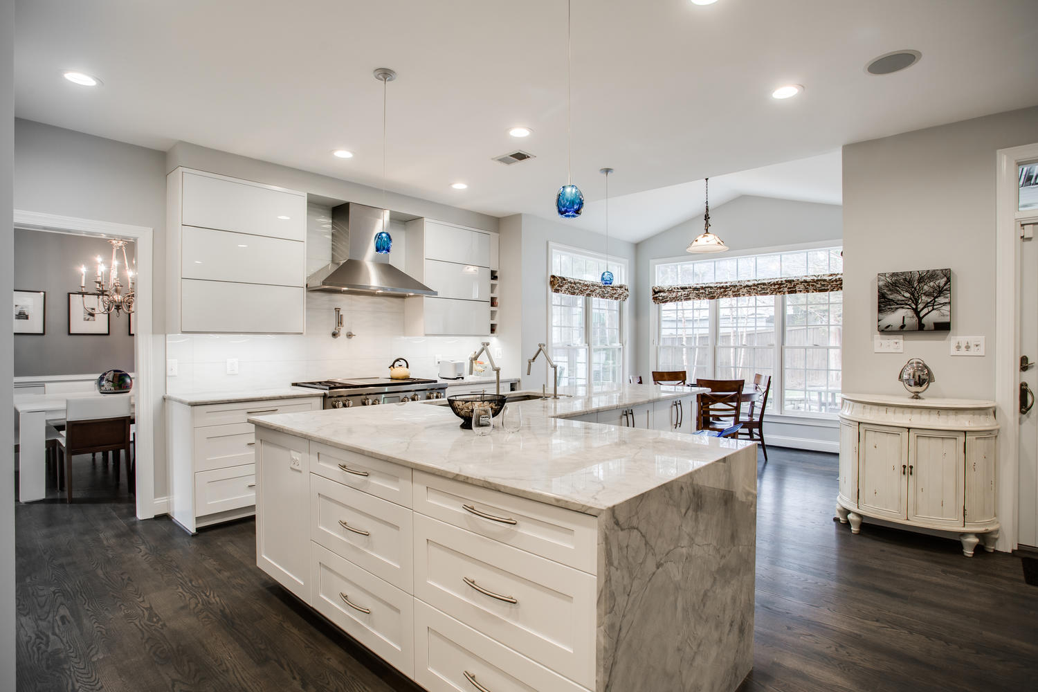
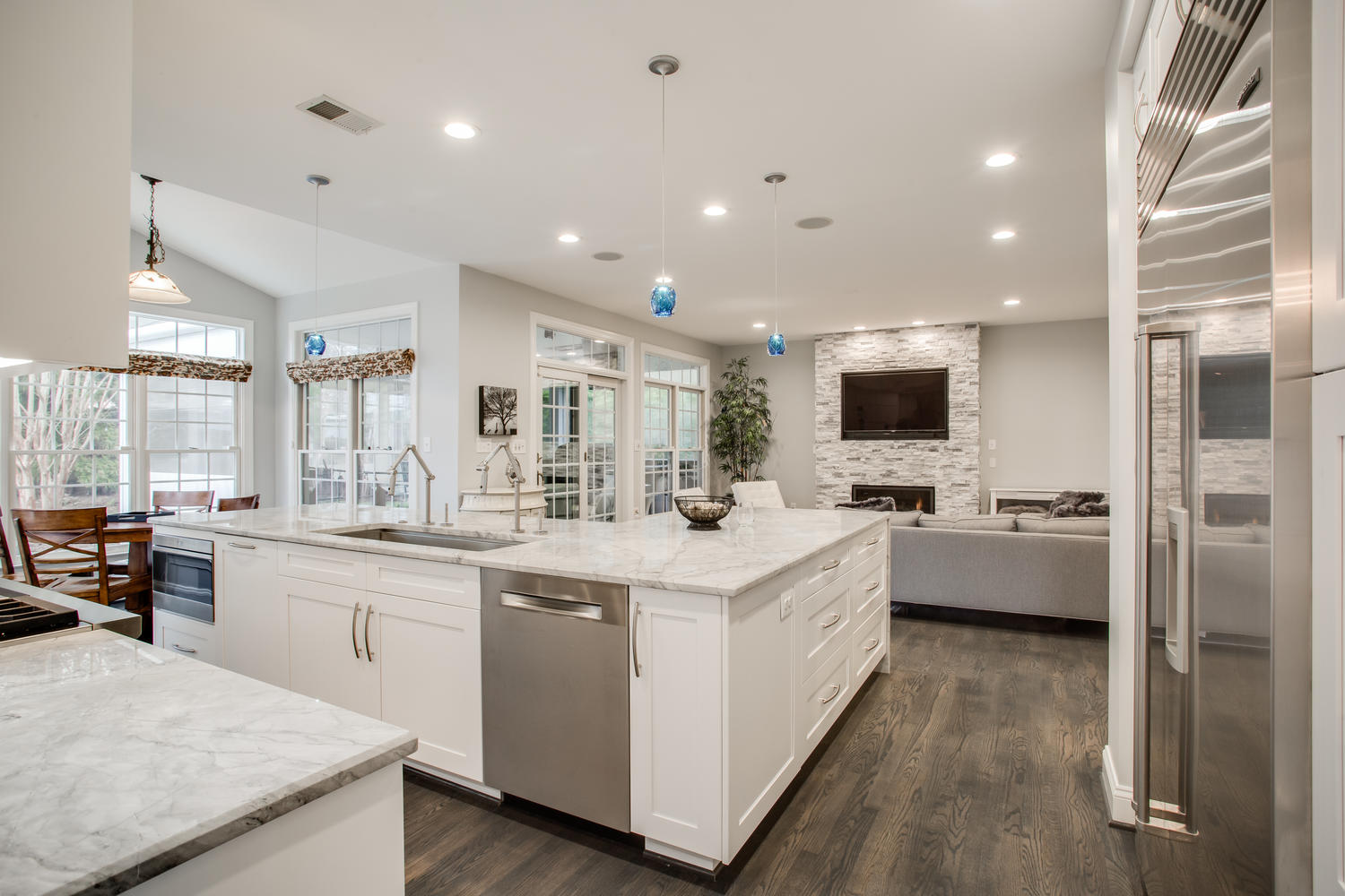
Dory Clemens at Foster Remodeling Solutions executed a comprehensive open kitchen plan in an 17 year old Arlington home while staying entirely within the envelope of the existing structure. By removing a partial wall and counter extension sequestering food prep stations from the family room, the design sharply improves circulation, natural light availability and visual continuum. The L-shaped prep island surfaced in quartzite is positioned for service to the breakfast room, dining room and family room.
Of particular offense: the 200 square foot kitchen which was configured around a ring of waist-high counter surfaces topped with, respectively, a cooktop range, a sink, a refrigerator each linked to a different wall.. The 10’x8′ breakfast nook to the north of the cook’s station offered a sunny spot surrounded by window walls, but was appreciably truncated by a front-facing kitchen peninsula. To the kitchen’s right, a partial wall that segued to a counter extension further divided the kitchen from the 16’x16′ family room.
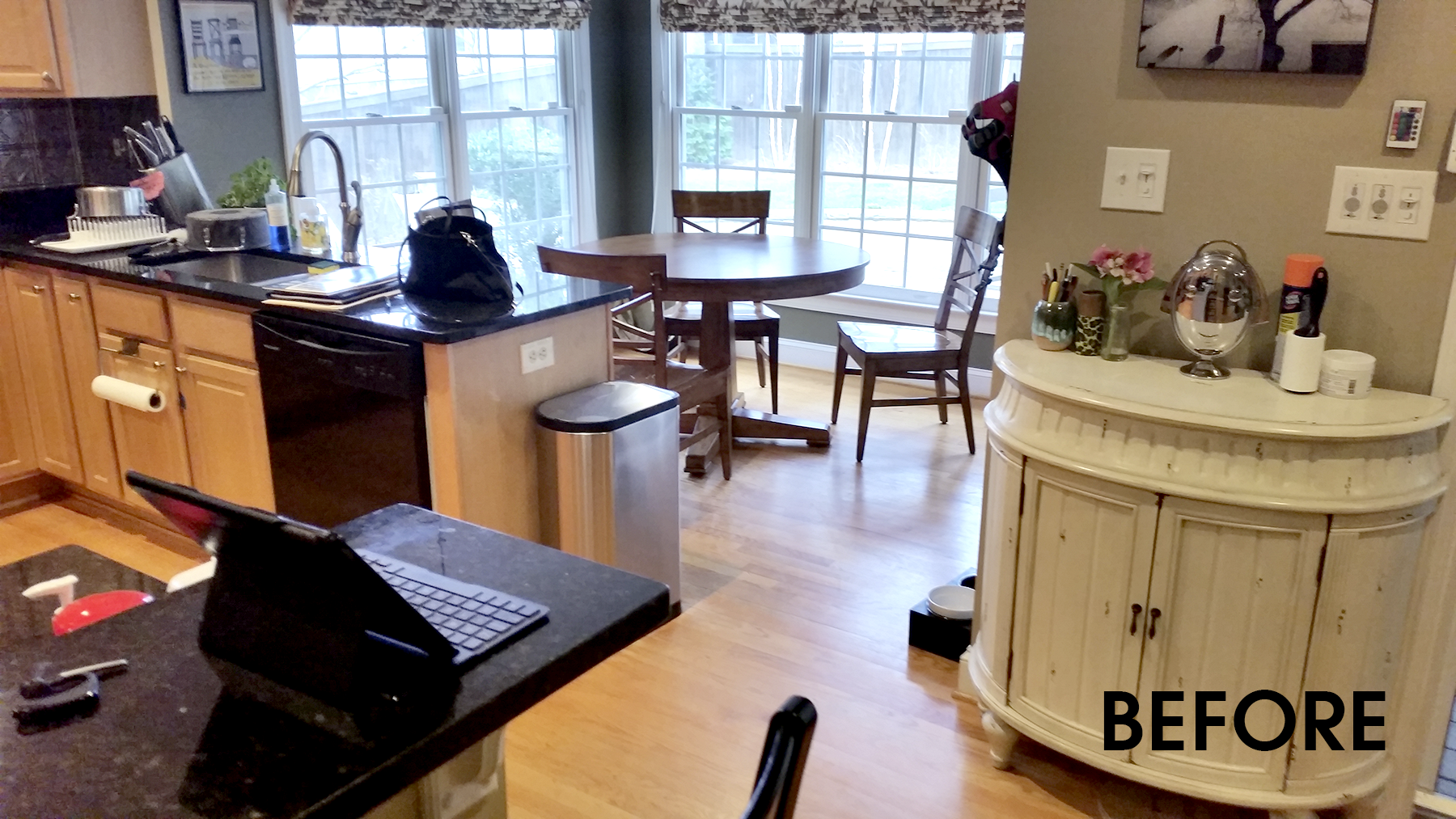 The intent, as all understood, was to “contain” entertainment and dining interactions safely out of the cook’s footsteps. But as Morales now saw it– all of these half-walls and working surfaces were little more than barriers that made it difficult for groups of more than eight comfortably convene.
BEFORE: Homeowner Albert Morales say the peninsula dividing the breakfast room and the family room was a continual sources of traffic jams whenever the family hosted gatherings of eight or more.
“There was a significant bottleneck in the kitchen whenever we entertained”, Morales recalls. “The widely-spaced positioning of appliances and utilities meant that the cook would traverse the entire length of the kitchen several times in the course of preparing a meal. Worse yet– the counters obstructed access to the family room, which opens directly to our outdoor cooking area.”
Beyond logistics, Morales also recognized that the kitchen’s “traditional” style no longer had much sizzle. The cabinets, counter surfaces, appliances were vintage 1980s– almost anachronistic. The lack of open sightlines in the entire rear of the house (nearly 550 square feet) made even large rooms seem small.
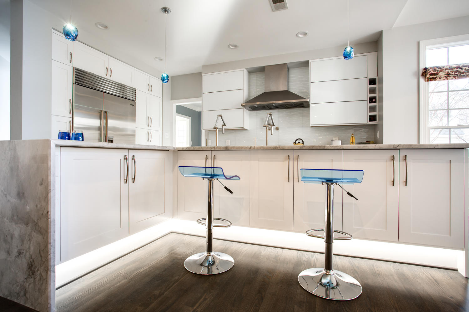
Mounted on a chrome base, the blue acrylic dining stools can be raised or lowered via the handle on the right. Concealed LED lights mounted inside illuminate the floor when overhead light are low.
As the yearning for a “fresh look” took hold, Morales and his wife began researching design ideas on line. Visits to a few design centers roused the couple’s interest in introducing more “open” plan in the rear suite of contiguous rooms. Images associated with the “transitional-style” interior design become the benchmarks for what was now conceived as a plan to comprehensively make-over of the entire first floor.
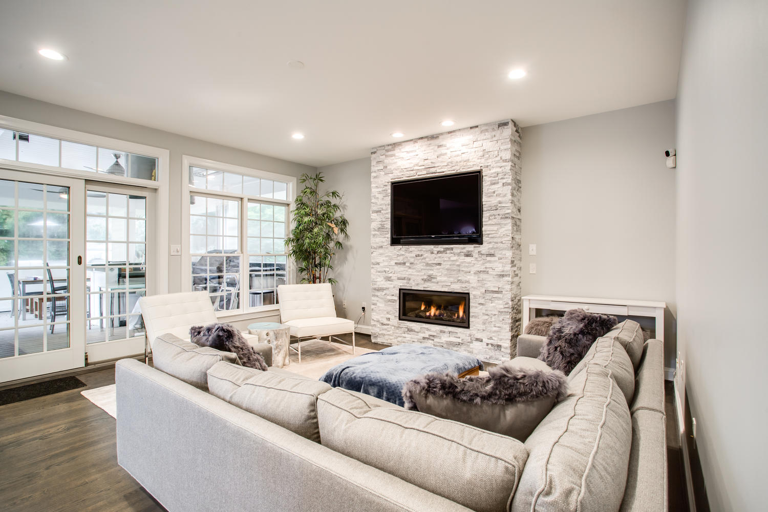
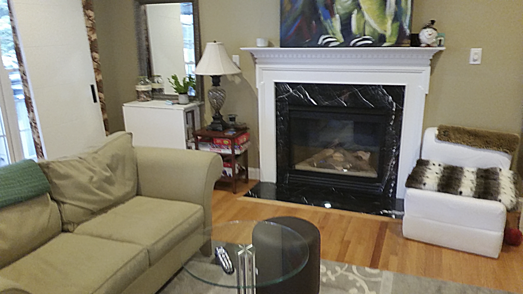
To fully integrate the family room into the open floor plan, Clemons re-designed an interior elevation on the home’s east wall. The traditional fireplace and mantle has been replaced with a “stacked stone” hearth that features a raised linear fireplace and a flat screened television. Sliding glass doors (left) access an enclosed porch with an outside kitchen.
In this period, Morales began to compile lists of remodelers, carefully considering several top contenders before finally deciding on Foster Remodeling Solutions.
“Several companies mainly just asked us what we wanted,” Morales recalls. “But Foster listened to our still-developing concepts and provided focused creative input that would help us find and shape our own vision. Part of our vetting process was to tell designers that this was as much their kitchen as ours. In the end, only Foster took the challenge– especially our requirement that the new interior design had to work from room-to-room as a cohesive whole.”
Clemons and Morales collaborated in the stone selection process, ultimately choosing grey and white ledger stones which were assembled into a flat panel.
Foster designer Dory Clemens adds:
“When introducing a transitional-style into an open plan, it’s important to develop design details that will reinforce each other within a visual continuum. A design motif may highlight a particular activity zone, but the broader interplay of focal points makes even large spaces appear cohesive and appropriately-scaled. Colors, textures, shapes contribute to this approach throughout. In the end, there are no conflicts. Only balance…within a three-dimensional panorama.”
The plan’s precision execution of several built-ins readily accommodated many existing cabinet styles and sizes, allowing the homeowners to save on customization costs. The work triangle formed by refrigerator, farm sink, cooktop range comfortably adapts to “thru” traffic. The original red oak floors has been sanded down and stained with a rusted graphite.
These values became especially relevant as the Morales gravitated towards choices for finishwork, cabinets and surfaces that are only now being applied in local kitchen remodeling.
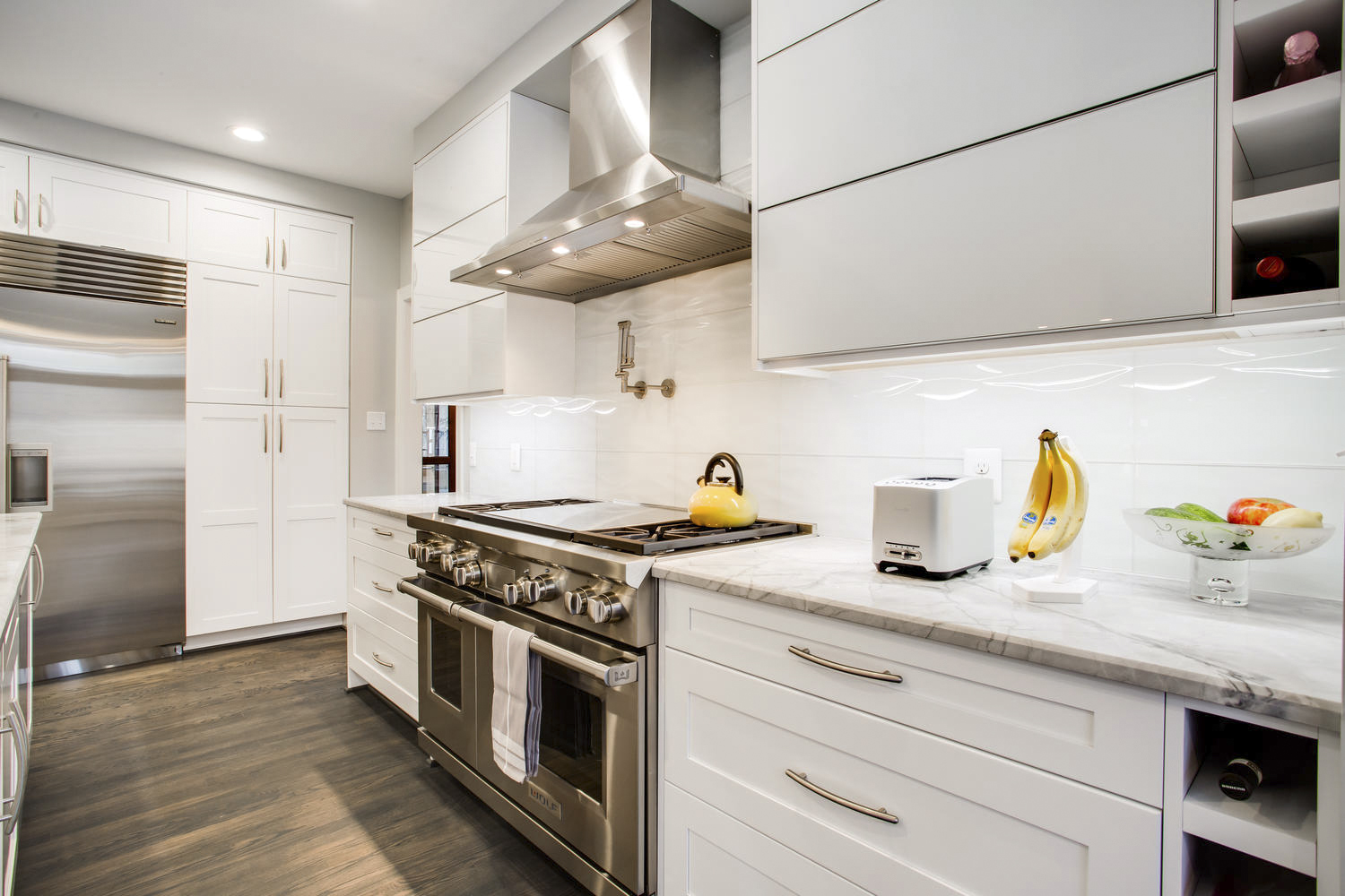
Glass cabinets on either side of the cooktop range, for instance, drop down- and out- when touched. The uppermost cabinet in the course has a bi-fold facing that opens up. A pair of triple elbow faucets arising in the 42” prep sink can entirelycircumscribe the
surrounding work space.
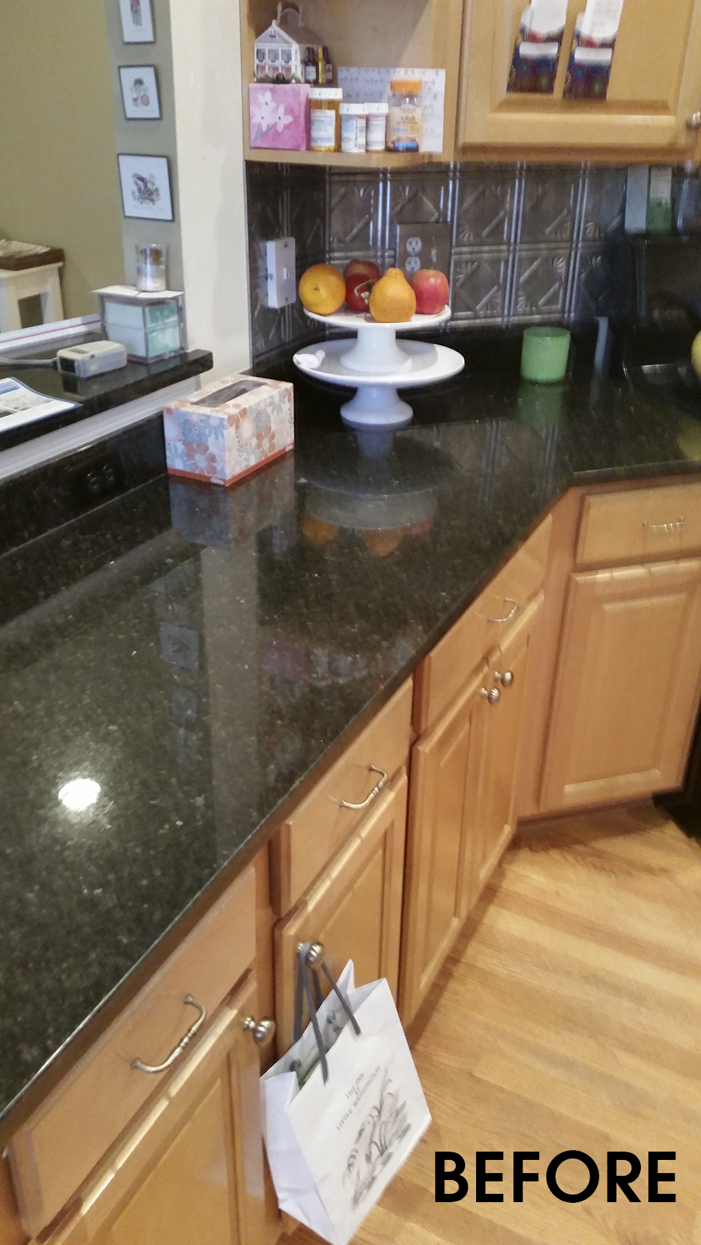
BEFORE: With cooktop to the right and pass-thru to the left, the old kitchen counter restricted traffic to and from the family room.
In front of the in-kitchen dining counter there’s a pair of blue acrylic stools on a chrome base that can be raised or lowered via a handle on the side. A shaft of light at your feet (courtesy of a concealed LED strip) helps guests find their seat in the dark.
Yet, despite leading-edge innovations, Clemens expanded the Morales budget considerably by incorporating existing cabinet styles and sizes into the new elevations and surfaces– thus, avoiding higher-end customization costs.
“Actually, the broom closet is about the only custom cabinet in the entire kitchen,” Morales says. “It’s such a fresh and lively interior…it’s hard to believe so many of the storage options were pre-designed.”
If Clemens’ schematic for the food prep island and counters has proven “spot-on” in re-configuring floor space, it has also given the Morales the freedom to explore a larger interior design palette. Removing the wall separating the kitchen from the family room not only added usable square footage, but also invited perspective on how each elevation might contribute to the suite’s interior design composition.
The 4-burner gas range includes a 24” griddle. The glass backsplash and waterfall edge counter set off by Shaker-style cabinetry explore an eclectic balance of post modern and traditional design sensibilities.
With the former fireplace and hearth deleted, Clemens next proposed a stacked ledgerstone column as backdrop for both a flat-screen television and linear gas fireplace insert. Against a wash of grays and white, the salt-and-pepper textured surface is an appealing element in a well-balanced whole, yet never busy or glaring.
In this same vein, designers assiduously sanded down the original red oak flooring that extends throughout the first floor, staining the revealed surface in rusted graphite.
Automated glass cabinets on either side of the cooktop ventilator move out and up when touched. The 42 inch sink on the food prep island is equipped with two triple elbow faucets.
The floor’s signature color and finish is now a key unifying element throughout the entire first level. Meanwhile, the quartzite (“Calcutta Moon Night”) counter surfaces offer distinctive theme as do the Aurora Blue Glass pendant lights which are suspended by a stainless cable.
And how well does the new space work?
“About five weeks after the new kitchen was completed, we hosted a party for our daughter’s softball team,” Albert Morales recalls. “There were about thirty-five people including parents. The easy circulation throughout the kitchen and the outdoor living area was exactly what we’d been looking for. Guests were impressed with how easy it is to access food, dine and comfortably interact with others. We’re very pleased with how the new space looks, and how it performs.”
While removing a wall made the kitchen more visible, colors, tones, and other detailing crisply articulate the new interior’s balance and warmth.
PROJECT DESIGNER CLEMENS WILL HEAD K&B REMODELING WORKSHOP OCTOBER 4 (click here)
Dory Clemens will be be conducting a Free seminar on “Kitchen and Bath Remodeling” at Foster Remodeling Solutions on October 4 starting at 6:30 PM. There will be a second seminar entitled “Small Space, Big Improvement” on October 21. For Information: 703/550-1371 or sign up now @ http://www.fosterremodeling.com/remodeling-resources/seminars-and-sign-up/
John Byrd has been writing about home improvement for 30 years. He can be reached @ 703/715-8006, www.HomeFrontsNews.com or byrdmatx@gmail.com

