SCANDINAVIAN POP TOP
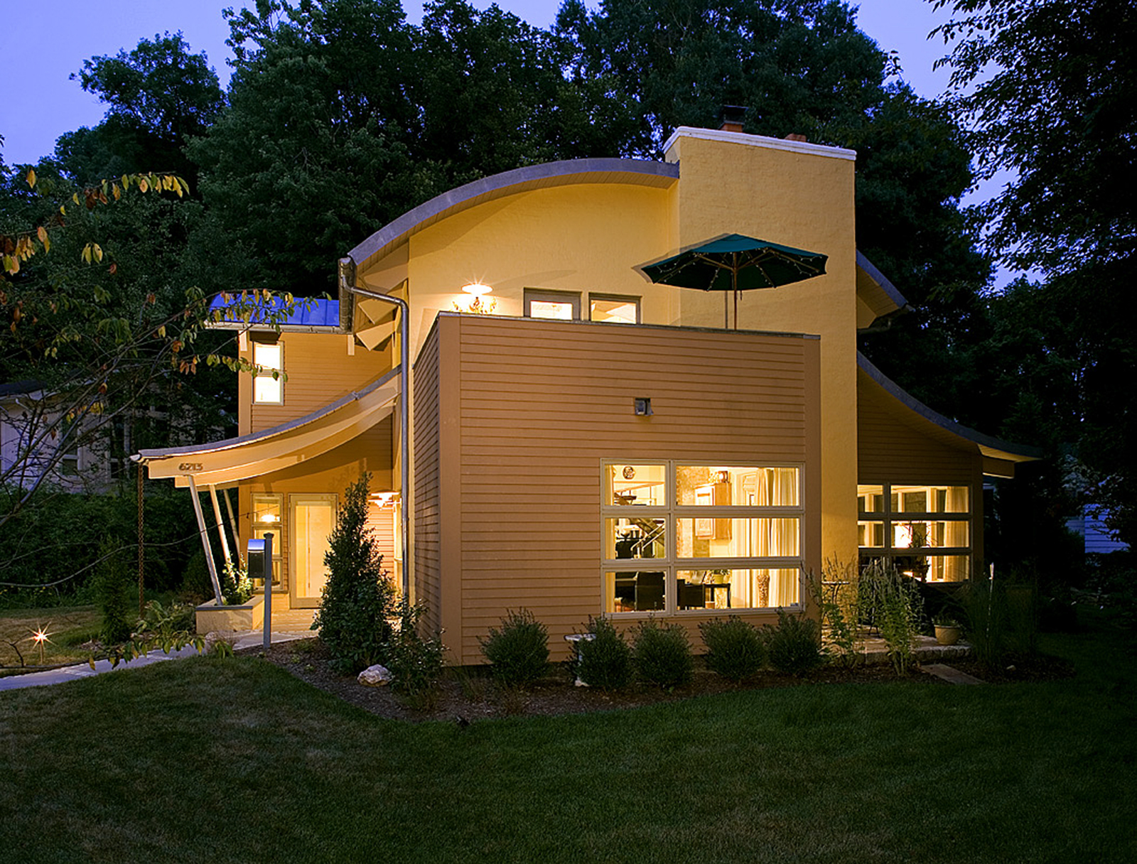
The home’s most striking feature — the curvilinear roof line — is a marvel of engineering and imagination
From a One-story Production House to a
Distictively Original, Two-story Custom Home
By John Byrd
Skip Maginniss of BMK architects has quietly acquired a reputation as one of greater Washington’s more original home remodeling visionaries, yet even those who already know his work will be impressed by a recently completed Bethesda project in which a smallish 1951 rambler is transformed into a two-story Euro-style villa complete with a curvilinear copper roof.
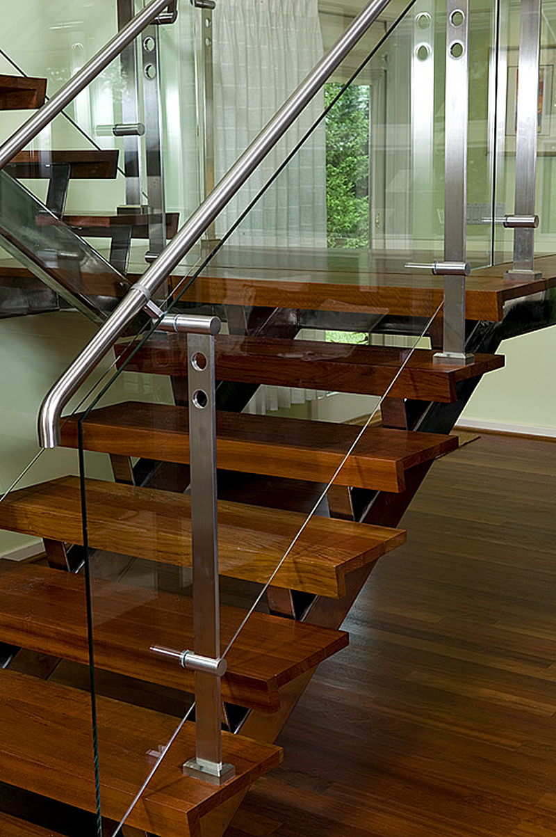
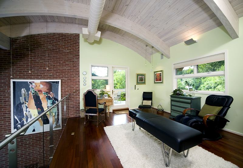
 Commissioned by a Scandinavian couple, the home’s enigmatic roofline recalls the “Rhinezinc”- capped structures of northern Denmark. Inside, the floorplan is appreciably open, incorporating a 2nd floor gallery that peers through a glass and stainless steel railing to a multi-zoned great room below.
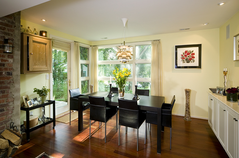
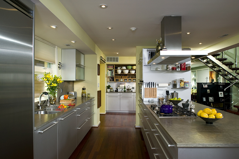
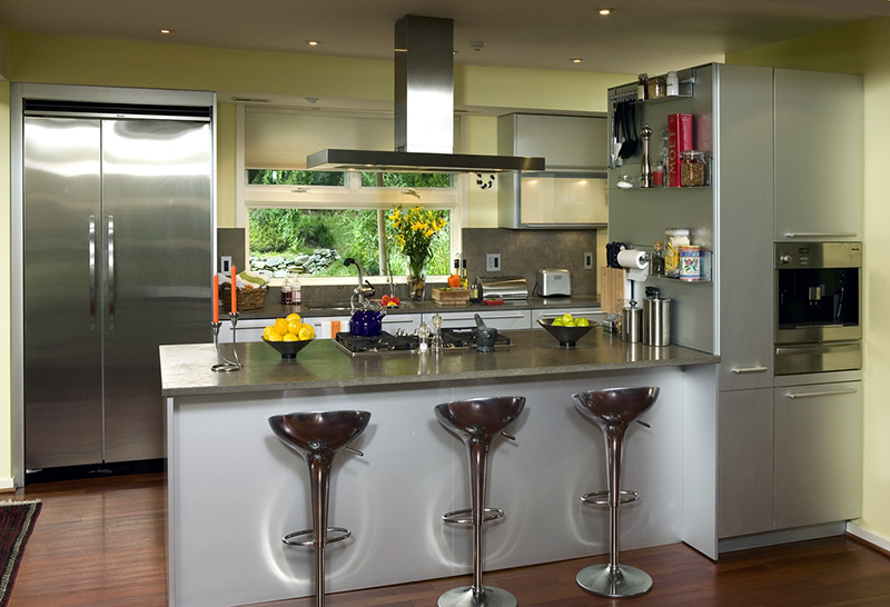
Downstairs, floors clad in merbau—a dark Brazilian hard wood—provide a textured contrast to stainless steel kitchen appliances and the exposed brick of the reconstructed chimney.
Forty feet above, yellow pine arches (supporting the deadload of several thousand pounds) lend the open vault a muscular aesthetic—as do a pair of sculptural chandeliers created by Danish designer Paul Henningsen. Surfaces of painterly colors—Skagen yellow, Celadon Green—combine with tones out of the New York school to create a highly original, curiously peaceful interior, visually linked to lovely rolling hills no one seeming to notice until Maginniss spotted them as design focal points.
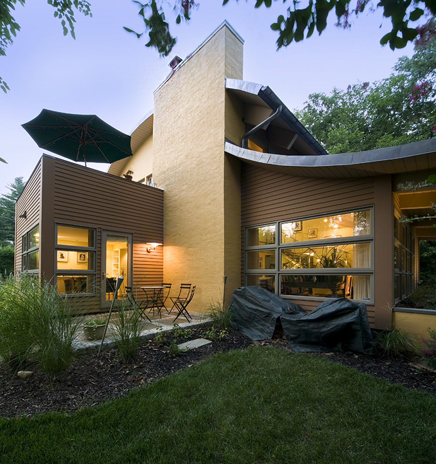 A complete metamorphosis. How else to describe the transformation of a one-story, circa-1951 brick rambler built into a spacious, well-apportioned showcase of postmodern eclecticism?
The original single story structure was 1,200 sq. ft., diagonally situated on a small lot. Today the home is 3072 sq. ft., with nearly half of that space on the new second level. The total project cost was approximately $800,000.00.
The home’s most striking feature—the curvilinear roof line—is a marvel of engineering and imagination. It started as a “what if,” a mere doodle on a napkin midway though the design process—yet ended up as one of the defining themes in a thoughtful architectural elaboration. The concave roof, for instance, inspired a pair of convex porch canopies. Inside, uniformly spaced supporting arches are visually countered by sets of upturning beams that swoop up from the living room as an artful, yet critical, component in the roof’s vertical support. One effect of this structural design: unobstructed sight lines within a voluminous space that seems to expand in all directions.
Almost every aspect of the home’s first-floor elevations have been redesigned: only one original entrance and one set of windows remain (and they’ve been upgraded). The second-level is, of course, wholly new, a textbook case of eye-catching forms shaped by owner functional requirements. Yet, despite an open interior that is more than twice the volume of the original structure, the well-insulated new house today requires less energy to heat and cool than it did when it was built.
 The owners’ program was clear from the beginning. They needed more living space—the rambler was “too small in every respect,” they said. The original 1951 floor plan had somehow accommodated three small bedrooms, a laundry room, a tiny kitchen galley, one-and-a-half bathrooms, and a living room/dining room combination.
True, an earlier remodeling effort had resulted in separate bumpouts for a utility room and front foyer—as well as a slightly enlarged dining room fitted with a bay window. But the low-ceiling structure made for cramped and dark living spaces
This new makeover would have to be expansive and audacious to create the living environment the owners wanted. Their aesthetic instructions, however, were minimal:
- a tongue-in-groove ceiling and exposed cedar siding for the interior;
- a metal roof that evokes the “silver, milky” Rhinezinc roofs traditional to northern Scandanvian countries.
- an interior design scheme that incorporates specific art, antiques and heirlooms
 Given the small lot size, a second-story “pop-up” was mandatory—but a radical reworking of the first floor was also needed. The new kitchen, nearly tripled in size, would be the center of family life and entertaining—with traffic flowing unimpeded from dining room to living room to family room.
When it was finished, the loft-like upper level was also incorporated into a new traffic pattern, with a steel and glass staircase leading to a spacious den (on the left), a master bedroom suite (on the right) and an upstairs patio that features a stunning view of rolling hills.
- From the loft/den, sequestered by a glass railing, one gazes down on the living room; opposite the overlook, a large picture window faces north.
- To the left of the window, a doorway leads to a rooftop patio built over the dining room; to the right, a hallway to a guest room and full bath.
Over-arching everything, the utterly unique curvilinear roof—a fabrication of copper, rubber, plywood, foam, and yellow pine tongue-and-groove planks.
Problems and Solutions
An immediate challenge was posed by the presence of the owners—who continued to occupy the home throughout the process! The porch was demolished, the roof removed, a second level built, the wiring upgraded, the main entrance moved to the opposite side of the house—all while the owners’ went about their everyday lives.
The Roof
That napkin doodle of a curved roof indeed forced many “creative solutions.” For example:
Problem. An 1,800-sq. ft. curved metal roof made of lead-coated copper is extremely heavy. Vertical support beams were ruled out because the owners wanted to preserve an unobstructed floor plan.
Solution. Fourteen custom-fabricated arched trusses (and 3 straight beams) were ordered from Unistructure, based in Arkansas. Shipped intact to the site, these laminated yellow pine trusses (as much as 30 feet long) were put in place on the walls of the new second floor. (For the expanded section of the first floor, the arches were inverted, creating a convex sloping roof over the new living room).
Next, the 2×6-inch tongue-and-groove ceiling planks were installed, tying the arches together and creating a wooden “shell” more than adequate to support the metal roof. Tongue-and-groove of heart yellow pine, two inches thick, was specified by the project engineer because of its strength.
Problem. A metal roof gets very hot in the summer—as high as 120 degrees. This extreme heat not only makes the house harder to cool, it’s detrimental to the structure itself. In northern Europe, where metal roofs are common, buildings sometimes collapse due to heat and moisture, even though the roof is fine.
Solution. A thin rubber membrane was applied to the underside of the copper. This membrane will disperse the heat to the edges of the roof. It’s in addition to a similar rubber layer previously applied on top of the tongue-in-groove ceiling (a step taken to keep the house and ceiling dry during construction).
Between the two layers of rubber, a double layer of 2-inch thick foam insulation was added, coursed like bricks to prevent the upward penetration of moisture originating inside the house (the lead and copper is impervious to moisture from the outside).
To protect and the secure the insulation, a 1/2-inch thick plywood covering was added. Finally, the outer membrane and metal roof sections were put in place and secured with massive 5-inch screws.
The result: a roof with an energy efficiency rating exceeding R-30, which—due to the lead coating—is expected to last well over 100 years.
Problem. To accommodate the home’s new height, the chimney had to be raised above the new roof line.
Solution. Re-deploy the bricks that had been removed from the existing exterior to raise the chimney. Bricks previously above the roofline are reassembled in their appropriate place. Impeccable matching throughout.
The Elevation
Once the owners agreed to a basic floor plan, the designer began working out the elements of the new elevation.
At virtually every corner of the house, two massive window casings come together to form an L-shaped window wall. This is true for both the upper and lower levels, and the effect is notably architectonic, inside and out. At night, the exterior glows with geometrical shapes of light and shadow. By day, the sunlight pours into a prism of interior glass and stainless steel.
The Scandinavian motif that began with exposed tongue-and-groove and metal roof, continues with the exterior color scheme and materials. The yellow brick washed in a Skagen-colored plaster is traditional Scandinavian. The new dining room, the shade of a pumpkin, also fits the scheme.
Indeed, one almost forgets that the dining room has replaced the screened porch; that the old bump-outs are now joined together and form the main entrance to the home. Meanwhile, the convex canopy over the entrance complements the roof over the living room.
The Achievement
The ongoing creative collaboration between the builder/artisan and his selected architect was a major factor in the success of this project. Design options were always in play, new solutions constantly being proposed. As a result, the finished product is uniquely artful, unusually durable, efficient to operate and beautiful by any standard.
Though the home started as a small production house amidst similar structures, it now rests in a mature, rolling landscape in a desirable section of the county. The curving roof line visually softens the home’s exterior, reinforcing the natural line of the landscape. Though radically changed, it is as much a part of the neighborhood as ever.
——————————————————————————————————————————————————
THE ORDINARY ROOM — EXCEPTIONALLY RENDERED
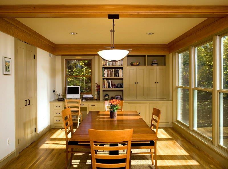
Breakfast room. Jensen’s hand-tooled ceiling trim, window frames and inset cedar shake cabinet facings evoke the finest design traditions, yet the room is equally warm and homey.
Want to Keep Down The Clutter And Present The World With Pretty Lines?
By John Byrd
If there’s a juncture where craftsmanship enters home remodeling, it’s the “built-in”. In the remodeling industry the term is broadly applied. It can mean drawers tailored to your cutlery; shelves sized for special books.
In the simplest context, a “built-in” is basic carpentry; at the higher end—it’s art.
Soren Jensen, principal of Danish Builders, produces work that notably falls in the artful end of the range. His originals—ranging from everything to a hand-crafted interior, to a garden trellis to a wine cellar—grace some of the most fashionable addresses in northern Virginia, Montgomery County and the District.
Recently he designed an interior to a Capitol Hill home for a Congressman. A wine cellar in Potomac has garnered national media attention. Yet he’ll design a mud room in Great Falls: a solution that converts a footprint between garage and kitchen into space so attractive the owners leave the door open just so they can see the effect from the kitchen table.
“When we’re working as the general contractor and designing the built-ins, there’s no middleman,” Jensen says. “It’s an arrangement keeps the client’s dollars concentrated on not only building, but my efforts to produce exceptional design.”
Typically, Jensen starts with exacting measurement of this clients home; presents schematics and other drawings. Often the homeowner evinces interest in design styles and especially in special woods, stones, specialty materials– which most be procured from selected sources.
As a rule, the wood employed in a project is milled and treated in Jensen’s 3,500 square foot woodworking shop, then transported to the client’s home where it is painstakingly assembled.
It is work with requires a mastery of logistics, one of the reasons the remodeler is so popular with busy professionals.
“There can be complicated considerations to creating work that will standout,” Jensen says. “My job is to figure out all the logistical, procurement and processing issues, and see that the project happens without surprises or set backs. When you and the client have mutually agreed to a high bar there are always challenges.”
Still, a quick assessment of recent work highlights the standard succinctly. From entire rooms to simple cabinetry, one finds a combination of elegant understatement and distinction that is Jensen’s signature style.
For instance:
Like something out of a fairy tale, a handcrafted breakfast room not far from the Potomac impresses the eye with its linear simplicity, then slowly reveals an underlying aesthetic perfect for its woodland setting.
Hand-tooled ceiling trim, window frames and inset cedar shake cabinet facings evoke the fine design traditions, yet the room is equal parts warm and homey.
Maple throughout, Jensen sized, prepped and painted the many constituent parts in his shop, then assembled on site to the enthusiast plaudits of the homeowner who wanted similar ideas in another part of the house. A library followed.
Arching 18th Century Elegance
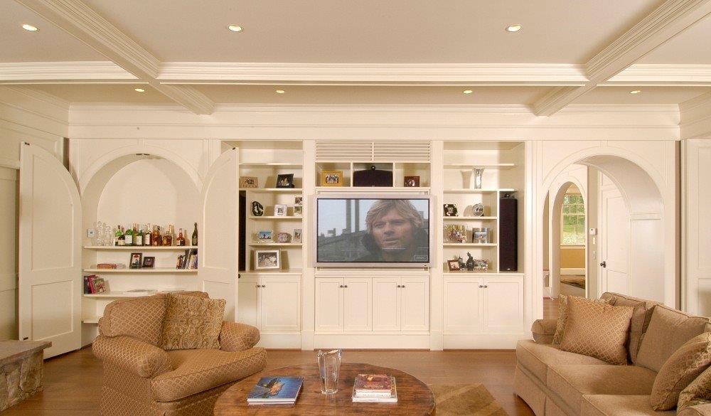
It is not merely the pair of matching arched doorways in the family room of this 8,000 square foot country home, but the same icon visibly reiterated in the adjacent dining room.
With graceful curved moldings and a hand-crafted keystone, Jennings borrows classic 18th century protocol, then sets up symmetrical relationships that establish a soft formality.
Matching book cases, coffered ceilings, a perfectly-centered cubby for the plasma TV and speakers– all counter-balanced by display shelves created for favored collectibles and photos. Nearby, a convenient recess for cordials and brandy snifters. A relaxing and graceful family room.
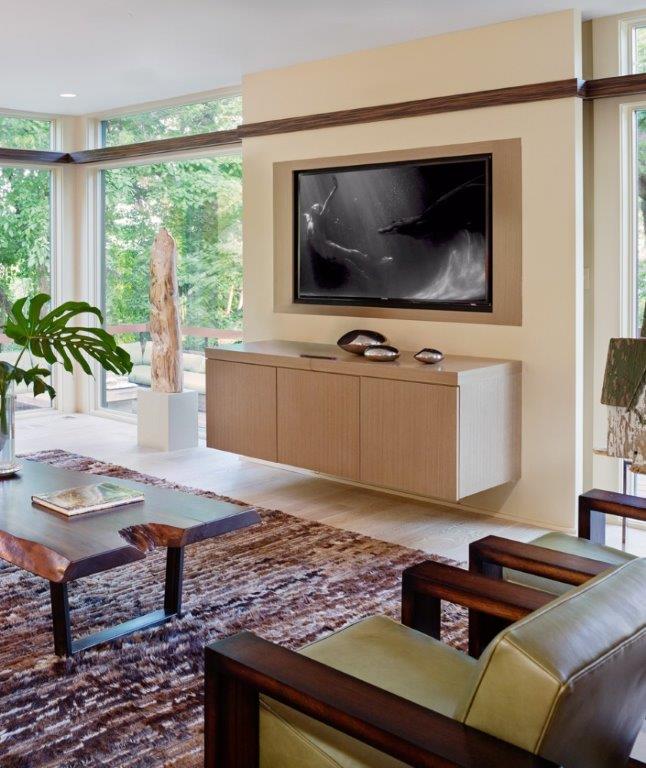
Cadenza and Backwall Set
Post-Modern Tone
A postmodern interior that fools the eye in almost every respect, the cadenza, backwall and plasma TV frame boldly highlighted in shades of platinum, blond and straw are, in fact, made from weng, a hand-assembled veneer that is created by cutting and milling maple into “slices” so fine that the grain patterns can be discerned in their deepest minutia with the naked eye.
A cut which captures a straight and uniform grain is especially prized.
Slices are then playfully transposed over one another in a search for a compelling– even iconic– combination of layered patterns.
The selected slabs are mounted, positioned and carefully laminated presenting completely unique natural wood surface.
Classic Window Seat Gains New Function
“Ideas for built-ins are often simply an inspiration that occurs in the process of executing an assignment”, Jensen says.
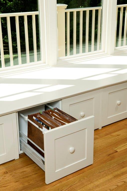
Working in a kitchen half-buried in an avalanche of household maintenance literature, “to do” lists and documentation, the remodeler hit on the happy idea of adding pull-out drawers inside a window seat to a home in McLean
The decorative cabinet facing is so understated that visitors never suspect there are usable drawers under the bench so comfortably occupy unless one is accidentally left open.
Soren Jensen periodically offers tours of his woodworking facility. FOR INFORMATION: 301/279-0255 or danishbuildersinc.com
_______________________________________________________________________________
John Byrd has been writing about residential architecture, building and remodeling for 30 years. His work has appeared in House Beautiful, Architectural Digest, Southern Living and many national and regional publications. He has also written and produced segments for HGTV and other cable outlets. His work has received numerous Press Association awards for excellence in journalism.
He can be reached at byrdmatx@comcast.net or www.HomeFrontsNews.com

