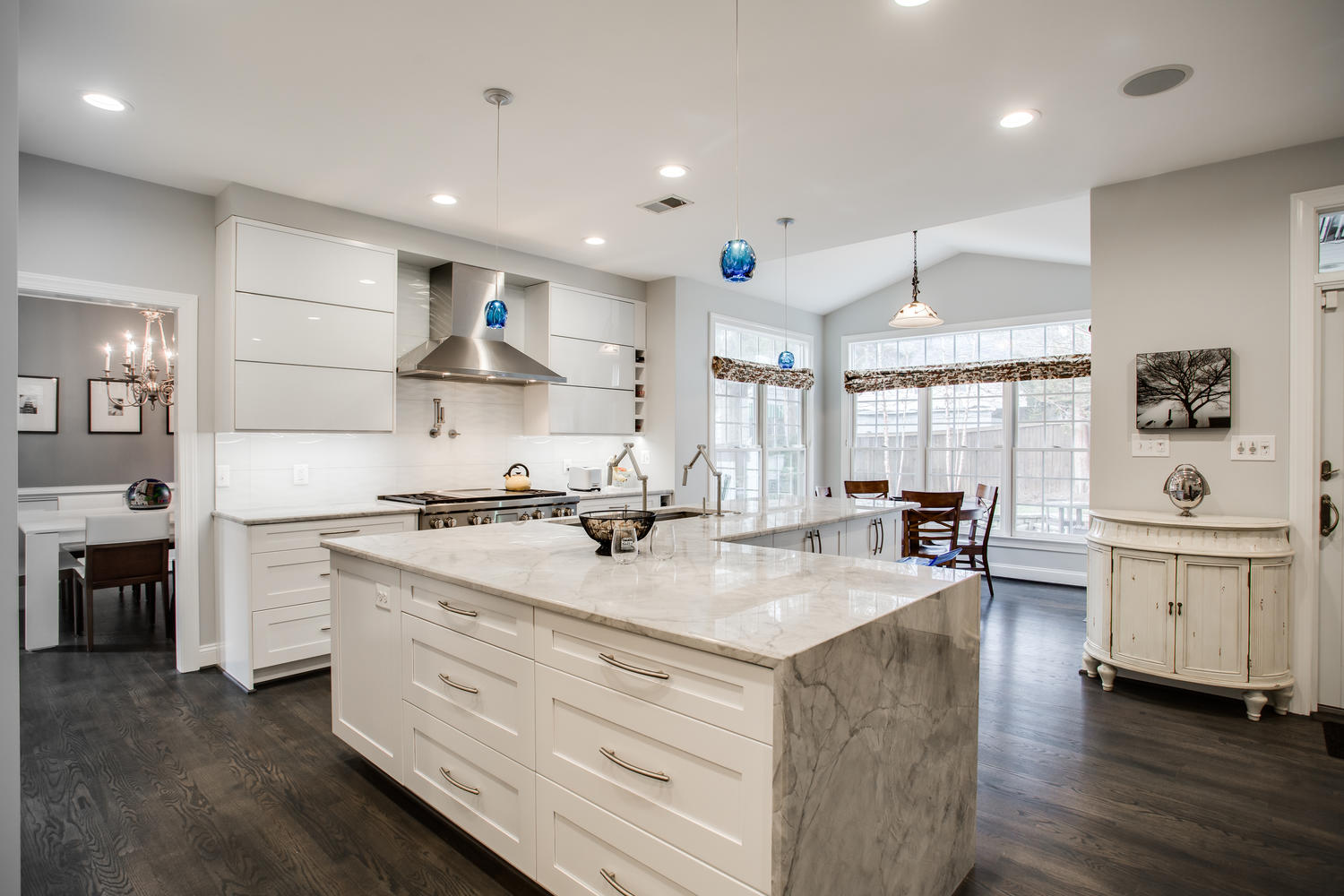
Great Falls kitchen renovation emphasizes family interaction
Open sightlines, playful elements featured in custom-designed solution
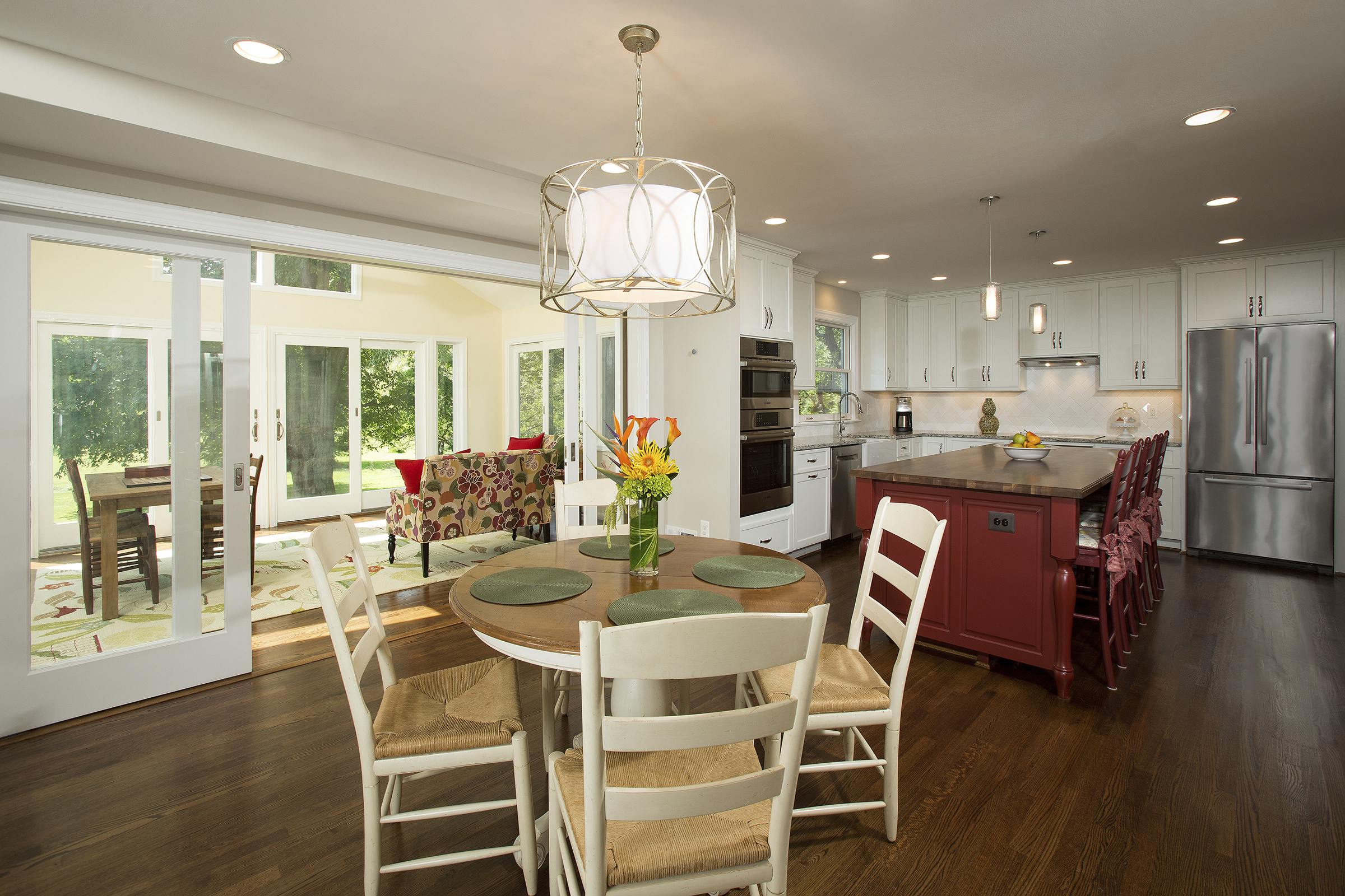
A recently renovated Great Falls home demonstrates how “open” floorplans are being effectively introduced into homes that previously employed a more traditional room configuration. To accommodate the needs of Joseph and Allison Lopez and their two young boys, Sun Design Remodeling enlarged the kitchen by relocating the formal dining room and creating a stronger visual linkage to a backyard filled with old stand trees.
By John Byrd
As remodeler Craig Durosko sees it, “There’s a design revolution now underway in northern Virginia.”
Plainly, it embraces an emergent “transitional-style” school of interior design, and is dependent on more broadly accepted building practices such as finding innovative ways to eliminate ceiling-flush bulkhead in already cramped kitchens. But the driving societal impetus is “the willingness of homeowners to make the property their own,” Durosko says.
“Not long ago, people bought a house that roughly suited their agenda and adapted to it,” Durosko explains. “Today, homeowners want solutions suitable to their lifestyle requirements, and are willing to change even the basic template of the existing house to achieve a higher level of personal satisfaction.”
In a changing world, this may mean modifications that incorporate retired parents, or strategies that downsize the home satisfy new “empty nester” priorities.
It may also mean changes focused on creating a more family-friendly environment for a household bustling with active children.
Case in point: the comprehensive first floor makeover to the circa-1970’s Colonial-style home of Joseph and Alison Lopez.
Viewed as an adaption, the Lopez renovation highlights the kind of breakthrough interior design modalities now being applied to traditional floorplans in older homes.
The original 2,700 sq ft house (which the family purchased ten years ago) was built around a standard center hall template with a front-facing foyer and living room that segued to a rear dining room, kitchen, and family room configuration. To gain more living space, Lopez had converted a 280 sq ft screen porch into a sun room three years ago–but the changes didn’t resolve other inherent problems with the plan itself.
“The rear rooms were too dark and cramped, “ Joseph Lopez says. “Yet there was a lot of wasted space.”
Other shortcomings:
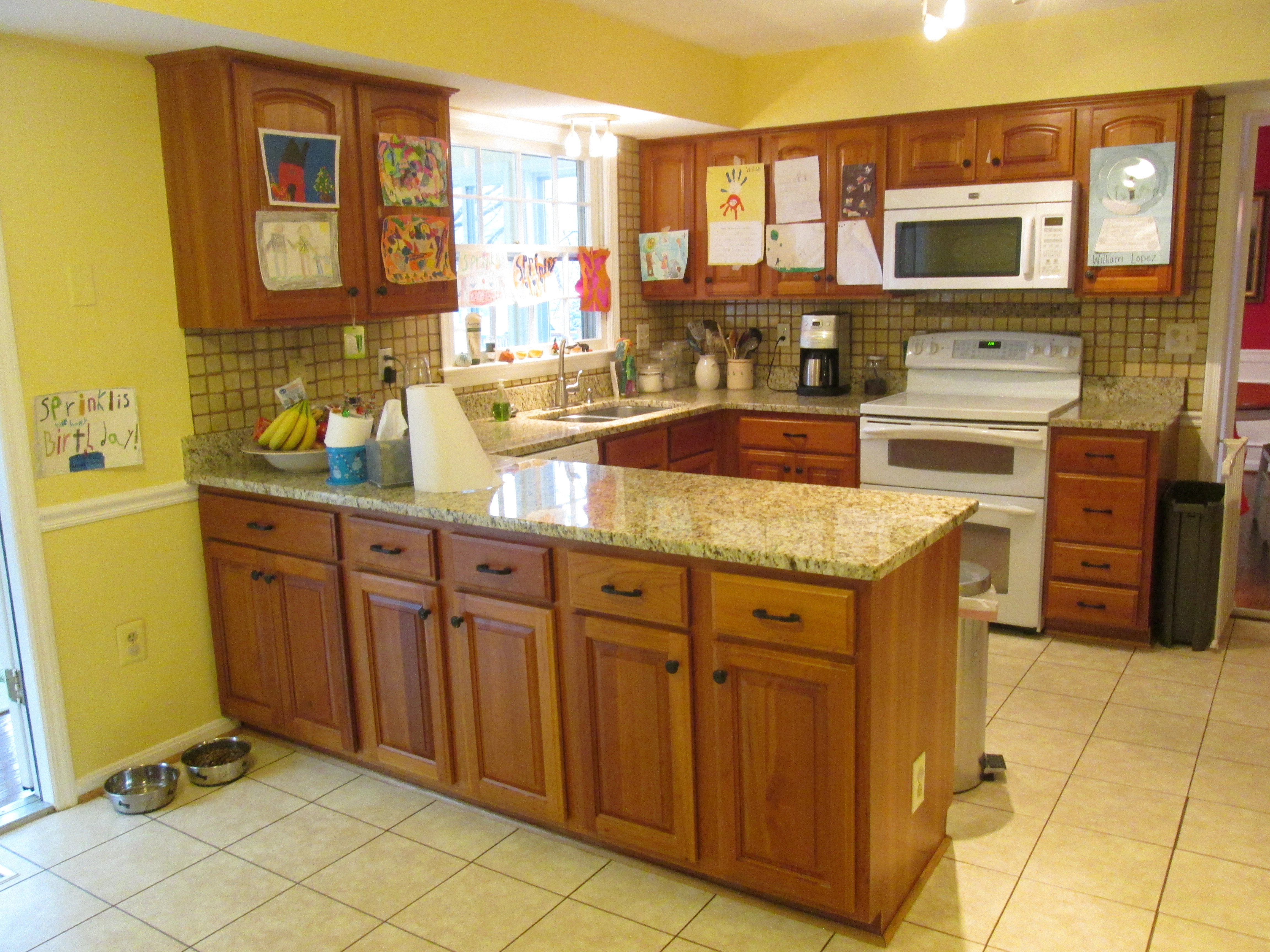
• With grade-school aged twins about the house, circulation in the kitchen was problematic. The traditional U-shaped counter space in the kitchen was as much a barrier as an asset. Storage capacity was limited. There was no place to display the children’s drawings which hung from cabinets, appliances– everwhere.
• The living room and formal dining room were mostly unused– consuming a lot of first level square footage without much family benefit.
• The family room interior– which included a working fireplace– was notably dated.
• View and access to the lower-level play room from the kitchen was obstructed by a landing two steps down that required a 90 degree turn.
• Despite a beautiful setting that backs into a 50 acre tree-filled easement, there were no clear sight lines from the kitchen to the back yard where the boys were usually at play when not in school.
“We had started thinking about making changes before we moved in,” Joseph said. “We had many ideas– but didn’t know what would work.”
Enter Sun Design’s lead Designer Jon Benson and specialty designer Katie Coram.
“The first consideration was how to create a space plan that was consistent with how the family actually uses the house,” Benson recalls. “Everyone acknowledged that the dining room was too small and that the sizable living room didn’t have much of a role in the family’s everyday life– so there was some useful square footage we could re-deploy.”
BEFORE: U-shaped counters, typical of production house kitchens before 1980, tended to inhibit through-traffic. Eliminating the needs for ceiling flush bulkheading (above cabinets) permitted tallers cabinets and a significant increase in storage capacity.
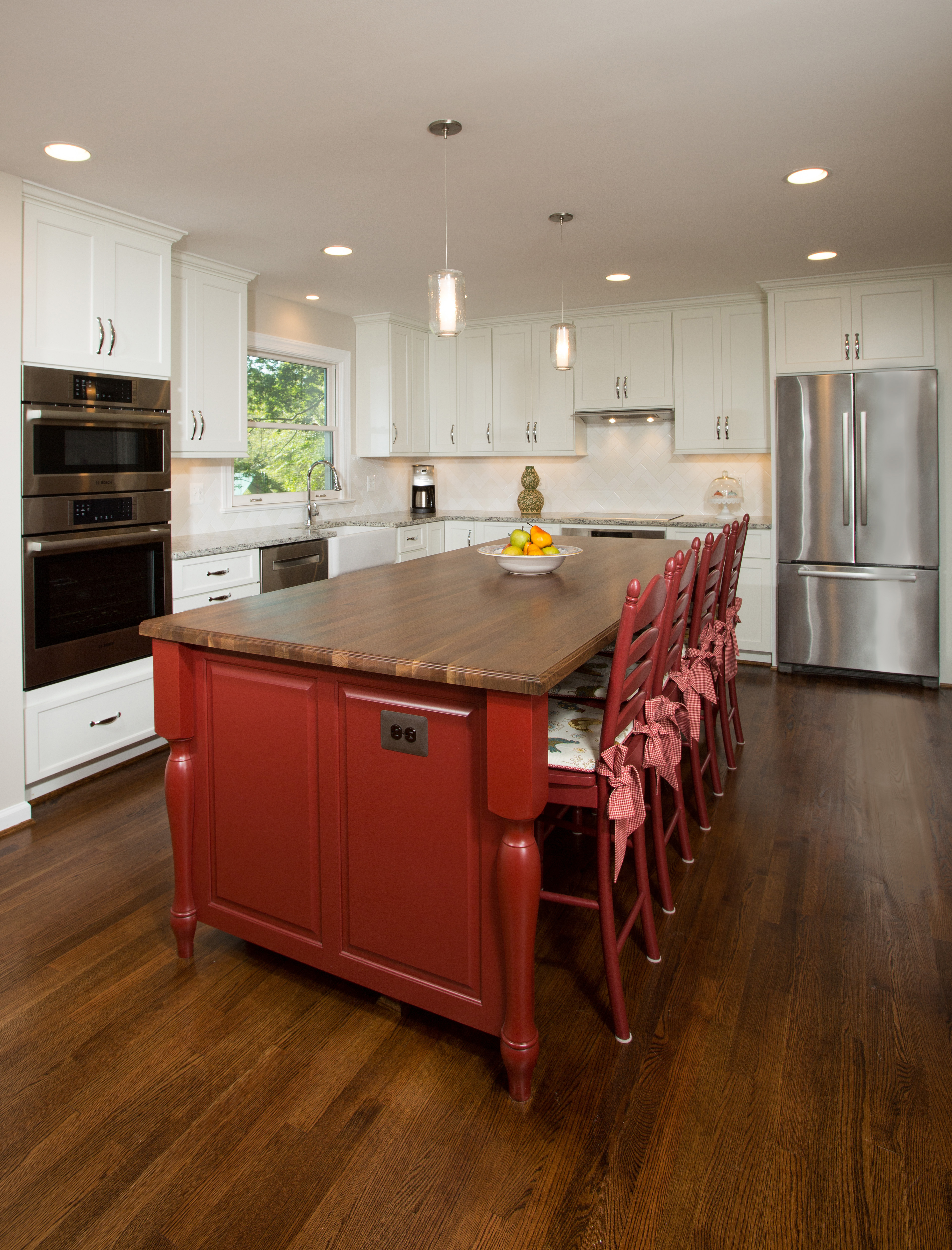
These observations in mind, Benson drafted a plan that deleted the wall between kitchen and dining room to form a 30′ x 14′ family kitchen. The larger footprint created the space needed for a four-seat food prep island and dining counter, a breakfast area and a substantially enlarged pantry.
It also allowed for direct access to the staircase leading to the lower level.
With the kitchen extended, Benson cut a new door to the downstairs and installed a straight staircase, making it easier for Alison to keep an eye on the boys from upstairs.
To improve natural light and sight lines, the designer eliminated the partial wall and sliders leading to the sun room, then designed a twelve foot opening utilizing “by-pass” sliders on a double track that telescope into the wall.
The result: Alison can easily keep an eye on the backyard from anywhere in the kitchen. Equally appealing: a stunning indoor-outdoor continuum that brings the pretty wooded setting into visual range from every part of the renovated kitchen.
“The beautiful view is one of the main reasons we bought the house to begin with,” says Joseph. “Having it available in the rooms where we spend a lot of time is wonderfully fulfilling.”
Converting the unused living room into a spacious formal dining room with fireplace, likewise, satisfied the family’s need for an entertainment venue. As a bonus, the kids now use the dining room to start their homework just steps from Alison in the kitchen.
With space planning issues under control, Alison huddled on finish work details with Katie Coram.
The kitchen’s original vinyl flooring was replaced with hardwood; re-routing ceiling level HVAC vents created the headroom needed for taller, more capacious cabinets. The island doubles as food preparation support and a counter for in-kitchen dining.
“It was great bouncing ideas off of someone with her interior design talents,” Alison recalls. “There were so many details– cabinet styles, colors and finishes; best granite options for the island counter top. Katie recommended a hound’s tooth pattern for the backsplash– which really improved on the white brick-style design I had been considering.”
The stand-out inspiration, though, was Coram’s suggestion that the family’s “kitchen art” could be better presented in a 9′ x 5.5′ message board mounted on the wall between the kitchen and the entrance to the dining room.
A steel surface covered in porcelain, the board accommodates photos and art held by magnets, but also offers a handy place to jot down “to do” lists written in an erasable felt tip pen.
“It’s a fun piece,” Alison says. “Just looking at it makes me smile.”
Sun Design Remodeling frequently sponsors tours of recently remodeled homes as well as workshops on home remodeling topics. Headquartered in Burke, the firm has a second office in McLean. FOR INFORMATION: 703.425.5588 or
John Byrd has been writing about home improvement for 30 years. He can be reached @ 703/715-8006, www.HomeFrontsNews.com or byrdmatx@gmail.com

